


Branding case — Color 8
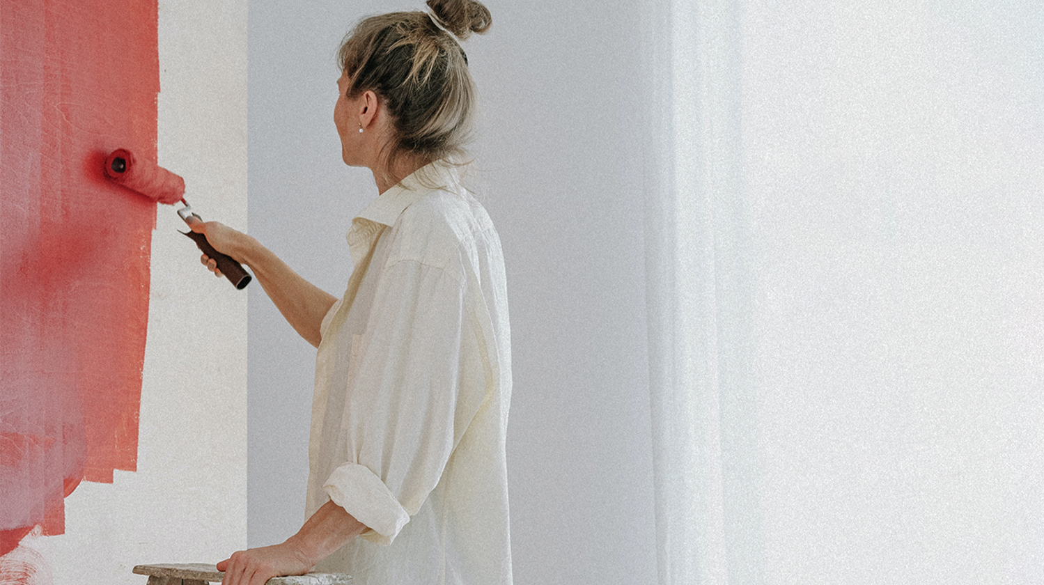

The one who has tamed the magic of colour has learned to control his state of mind. That is exactly what the Colour8 project is about. Russian designers have faced a problem in 2022: the world’s leading interior paint companies have left the market. So, Igor and Anna Gromov decided to create their own brand of paint, which would not be inferior to foreign analogues. Anna is an interior designer, and her experience was the basis for the idea.
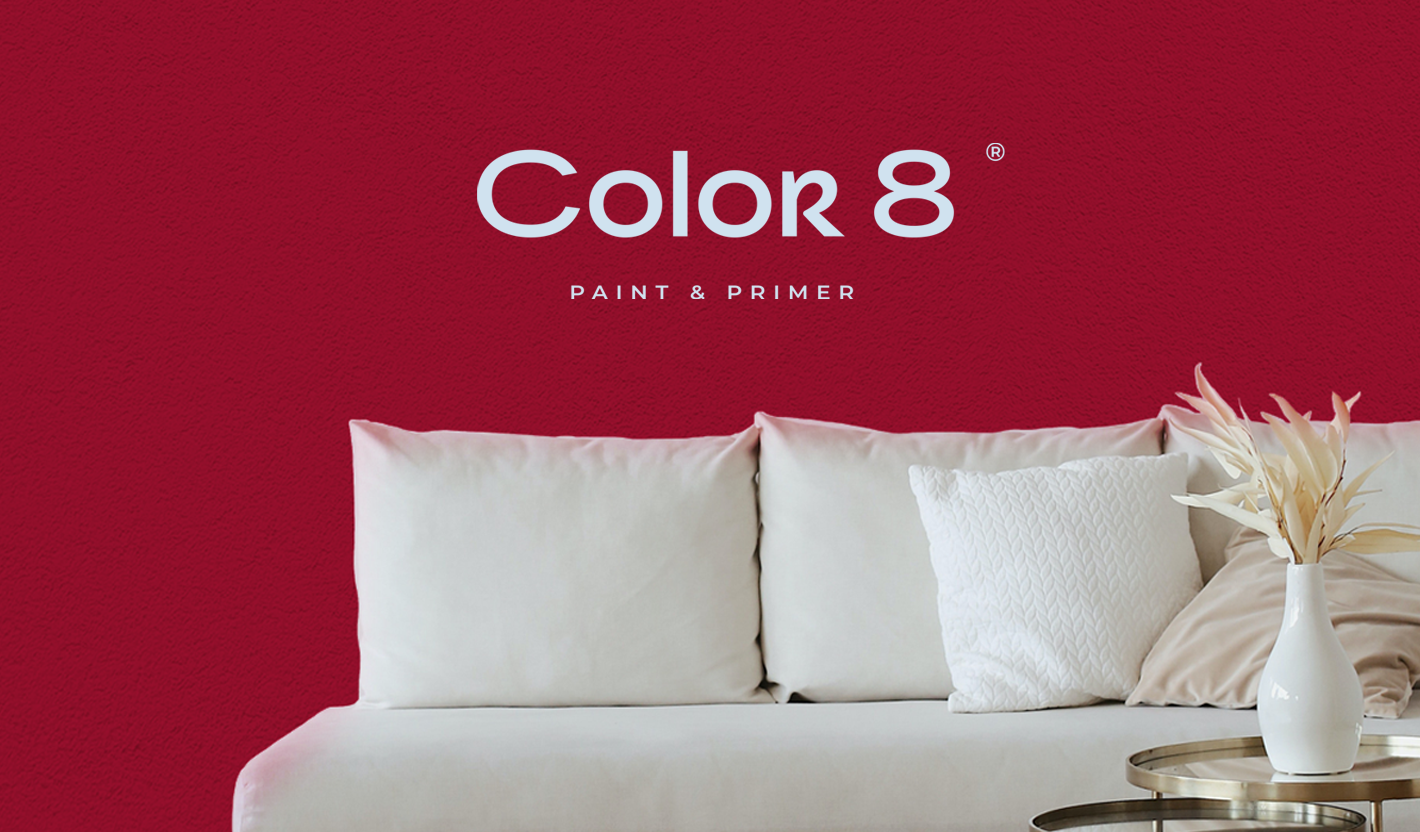
Colour 8 is a premium water-based paint and primer for indoor areas. Our task was to develop a naming, logo and corporate identity to help the brand establish its vibrant place in the market.
Colour 8 is a premium water-based paint and primer for indoor areas. Our task was to develop a naming, logo and corporate identity to help the brand establish its vibrant place in the market.

When developing the naming, we suggested using the number 8 in one of the names. The eighth colour of the rainbow is roughly how we would describe the unique colour schemes the company offers. The number 8 is also associated with infinity. Igor and Anna liked the idea, and during discussions a new name, Colour 8, was born.
The logo looks like it was written with a flat brush — discreet and structured, with clean lines and well-proportioned proportions. The letter R softens the composition and adds a special mood to the concept. An artistic detail that reveals the creative nature of the brand to the designers.
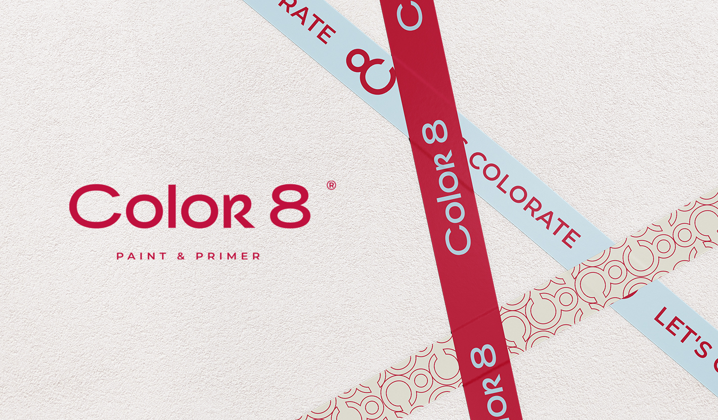
"Harmony is the balance and symmetry of forces" is perhaps the best explanation for the iconic logo concept. The eight, taken as the basis, contains the letter C. The clean, concise lettering frees the monogram of hidden meanings and acts as a starting point for creative experimentation. The image also fits perfectly into the corporate pattern we used for the brand’s adhesive tapes.
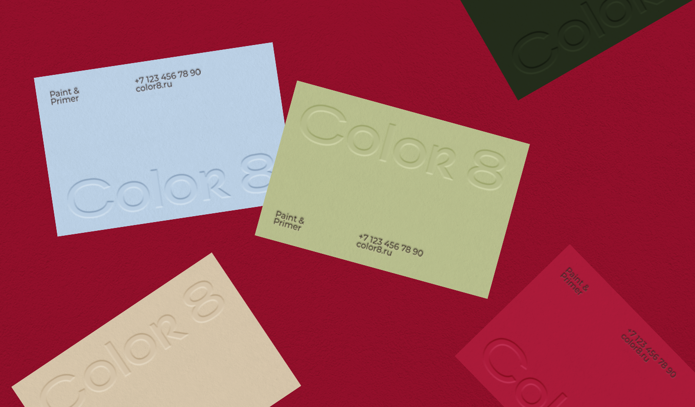
Anna’s interior projects make full use of colour — bright walls, large fill areas. The designer fell in love with juicy business cards when she first saw the concept. At that time we had just presented the corporate style. After approval, we ordered a multi-coloured batch at once.
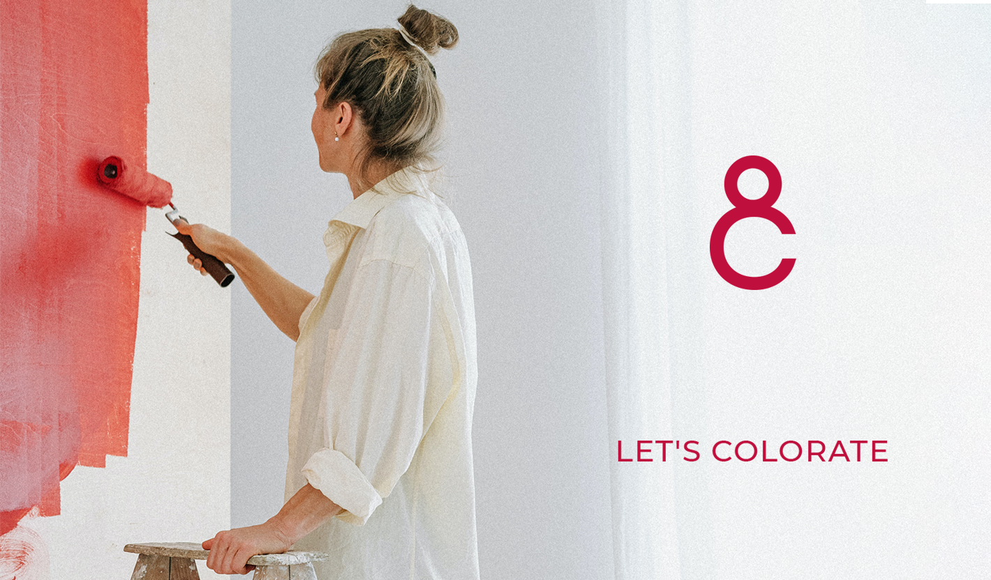
The resounding slogan Let’s colourate emerged during the development of the concept. Translated into Russian, it means 'Let's colour'. It’s bold, interesting, playful and completely in keeping with the brand’s expressive nature.
The corporate identity came out juicy and energetic. "You hit the target so precisely" was the first thing we heard from Anna after the presentation of the concepts.
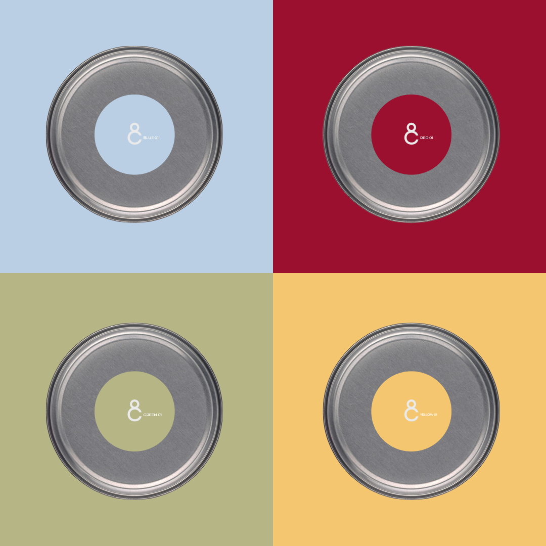
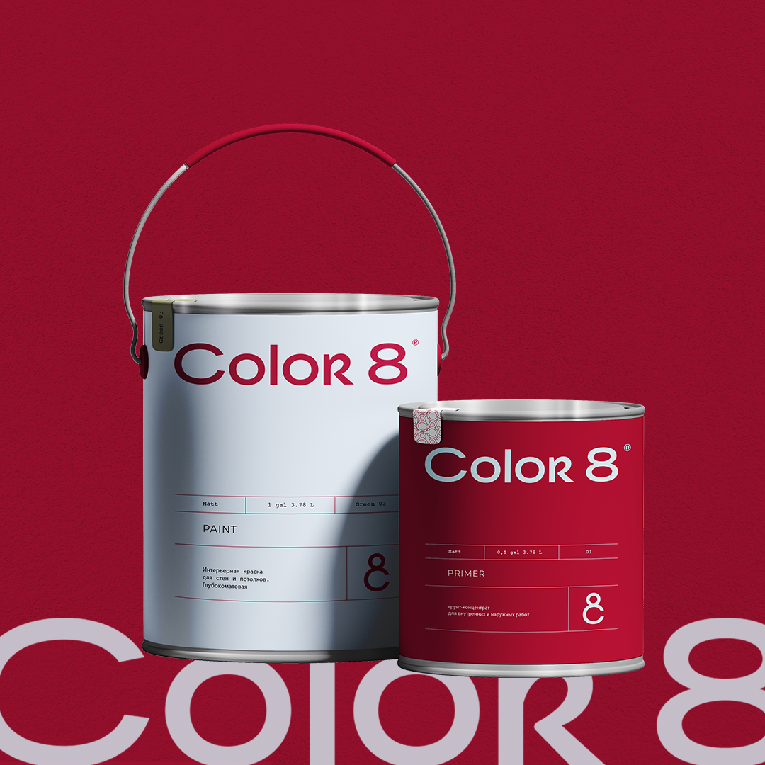
The can labels are a particular source of pride for us. The minimalistic design will look great in a shop window. And on construction sites, paint and primer buckets are easy to distinguish from each other — we have thought about this and made them in different colours.
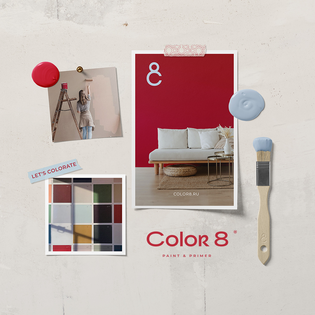
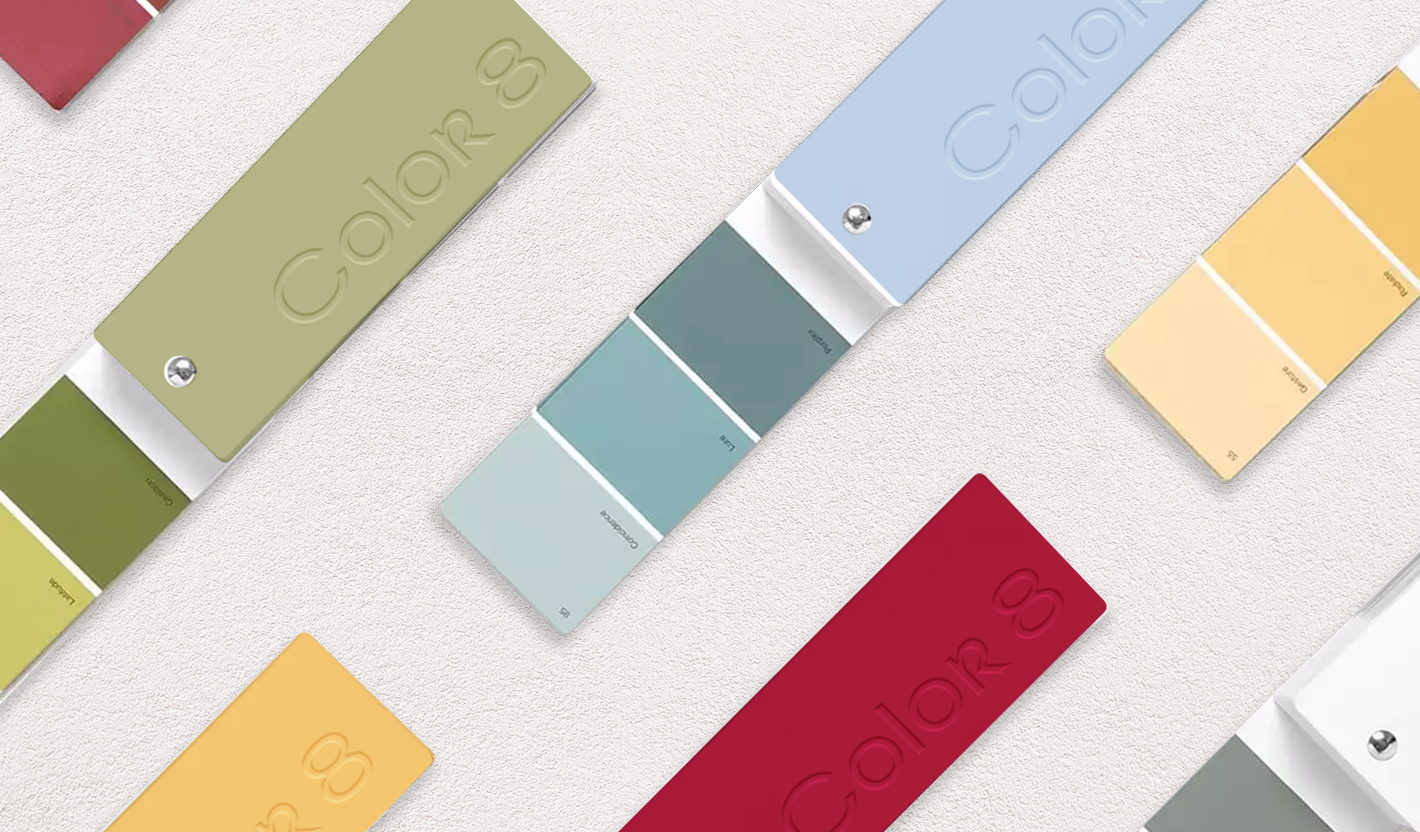
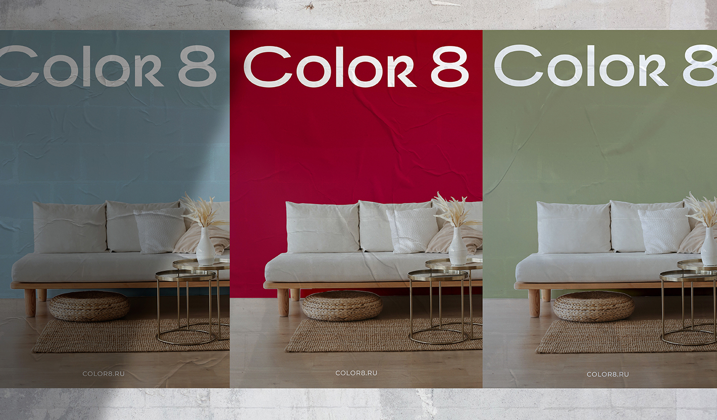
The signature colour palette is made up of sophisticated shades which work together harmoniously: juicy berry-red is the basis, complemented by hacqui, soft blue and sandy yellow. Vibrant but delicate — a technique which allows the brand to underline its upbeat personality while still conforming to the premium segment.
Selecting the right shade is a fascinating process for the designer and the client. However, during the discussion, we realised that each professional sees their ideal colour palette differently, from fans to paint-on plaques. We then conducted an expert survey, in which our design clients kindly agreed to participate. We are now working on the most versatile and user-friendly palette, which will soon see the light of day.
Igor and Anna approved the logo concept for Colour 8 at the first time without a single edit, and soon they approached us again — already for another of their businesses, the Glazok optician’s salon in Moscow. The project is already implemented and presented in our portfolio.
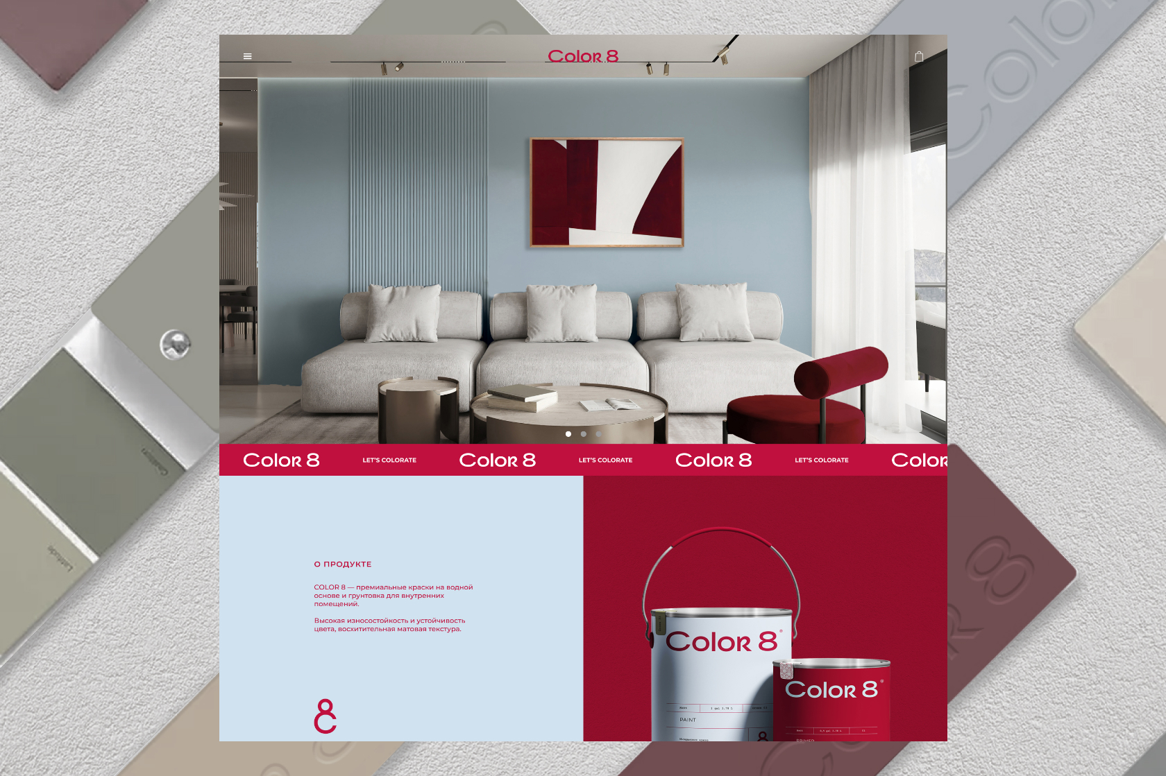
The juicy, colourful world of Colour 8 has found a virtual space of its own. A minimalistic website whose main detail is Colour. The web resource is currently under development. As soon as it is launched we will tell you about the design solutions that make it special. Soon.
