


Branding case — Глазок

Glazok
Quality optics isn’t just about vision. Eyewear is a beautiful accessory that attracts attention and makes the image memorable. Understanding this interrelation, the customer also pays attention to the salon’s appearance when choosing a salon. With these inputs we started developing the logo for Glazok optics.
We already knew the owners of the salon from our first joint project. In the spring of 2022, the office’s designers designed the name and logo for the Color 8 interior paint brand. The collaboration was so inspiring and productive that in the summer Igor and Anna Gromov entrusted us with the creation of a new brand identity — now for their optics.
We already knew the owners of the salon from our first joint project. In the spring of 2022, the office’s designers designed the name and logo for the Color 8 interior paint brand. The collaboration was so inspiring and productive that in the summer Igor and Anna Gromov entrusted us with the creation of a new brand identity — now for their optics.
The bureau’s designers have created a logo with a style that is not tied to status and emphasises the company’s unique positioning — modern and high-quality optics for everyone. Without being pretentious, but with a sense of dignity.
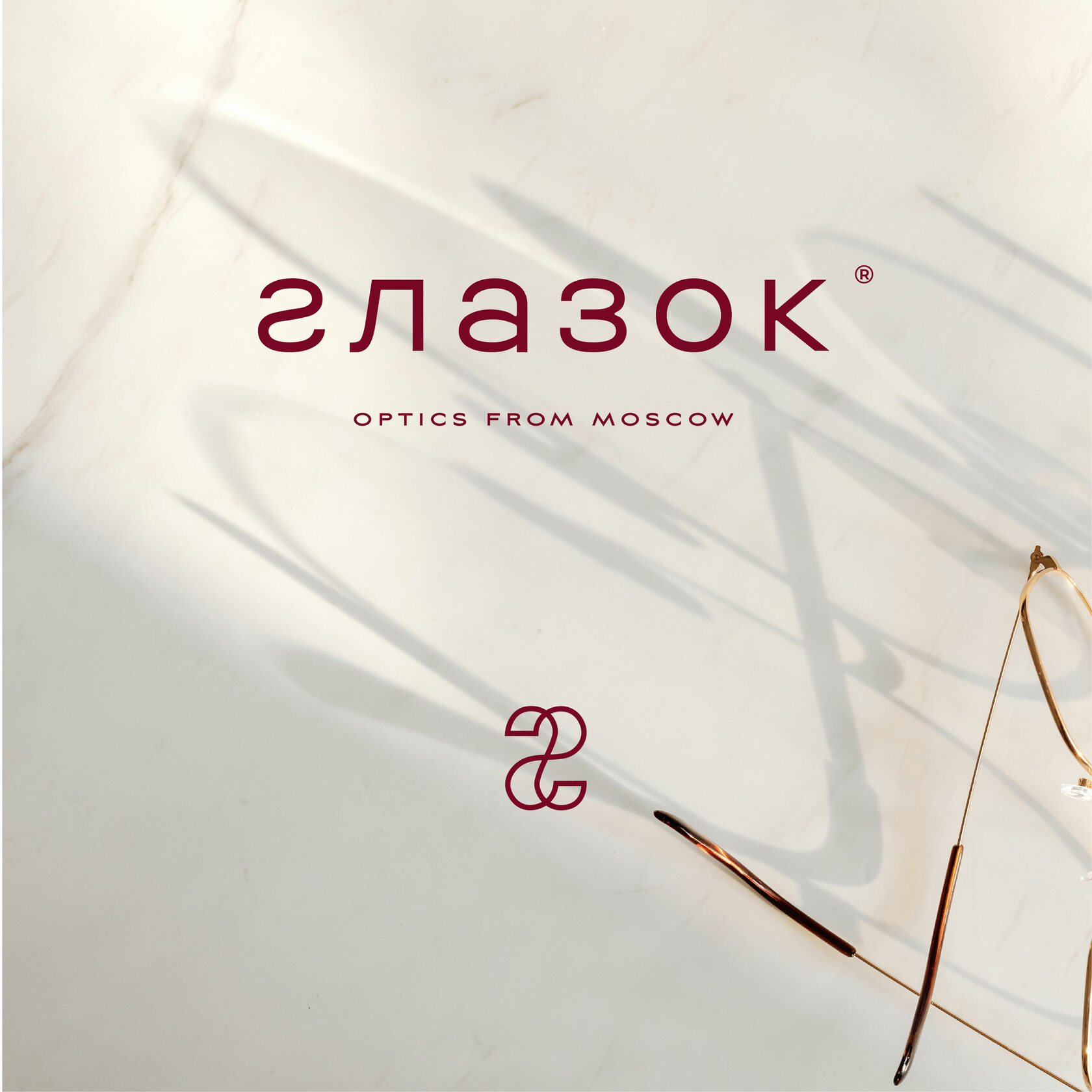

Sincerity and friendliness can be felt from the first letter of the logo — it’s lowercase. As a continuation of the conversation, as communication on an equal footing: I am just like you, you can address me.

The sign combines the image of glasses and the letter G — it is easy to read in the context of the clinic. We avoid overt images of optics, adding meaningful depth to the sign.
The owner Anna is an interior designer and has her own take on style, preferring minimalism and interesting colour schemes. In working on the Glazok project, we took her wishes into account — to create a memorable style capable of attracting a new audience.

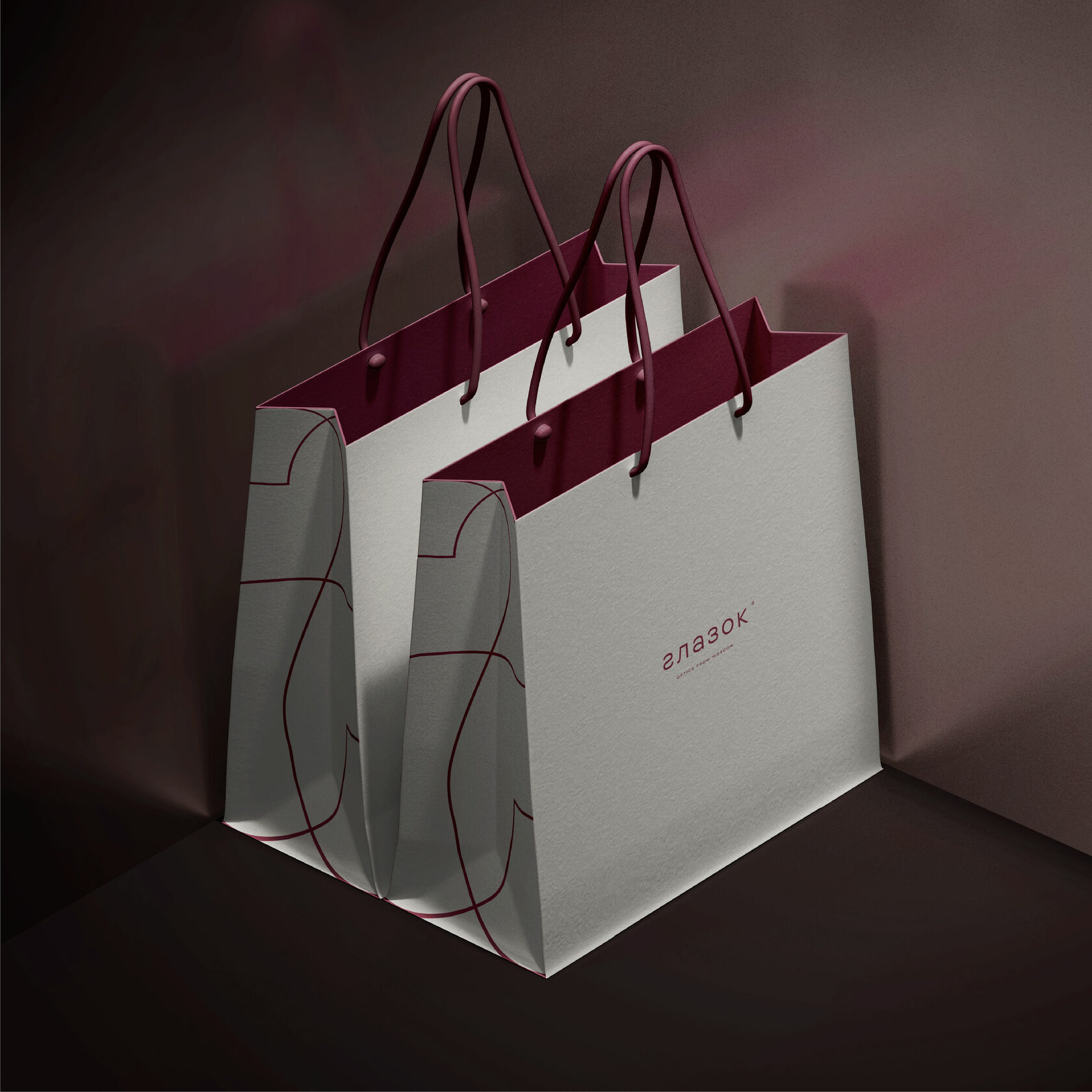
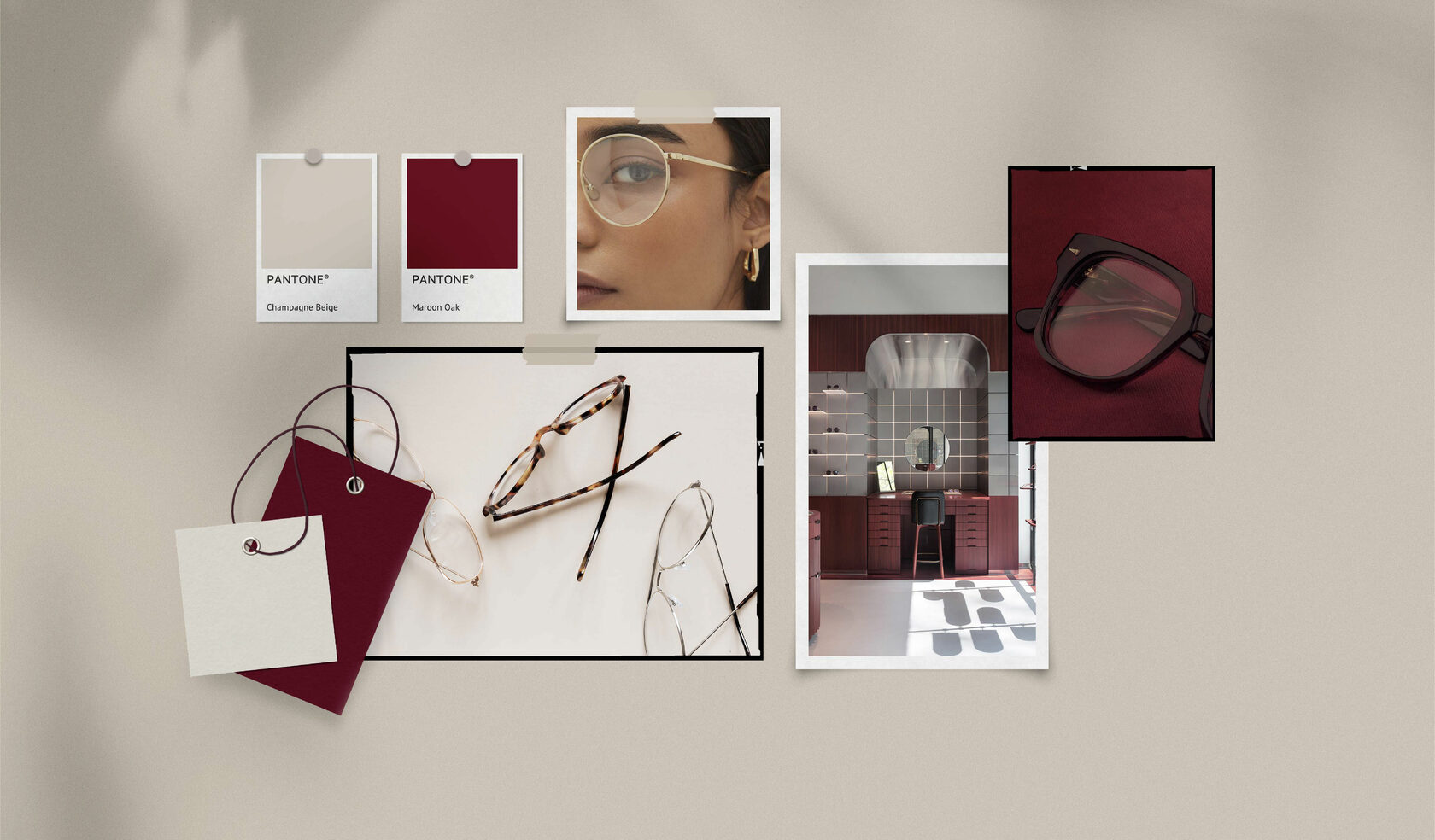
We’ve created a neat and austere, yet dynamic and effortless look. The corporate identity has acquired character and personality. The unconventional design of the optics is also projected through the colour scheme.
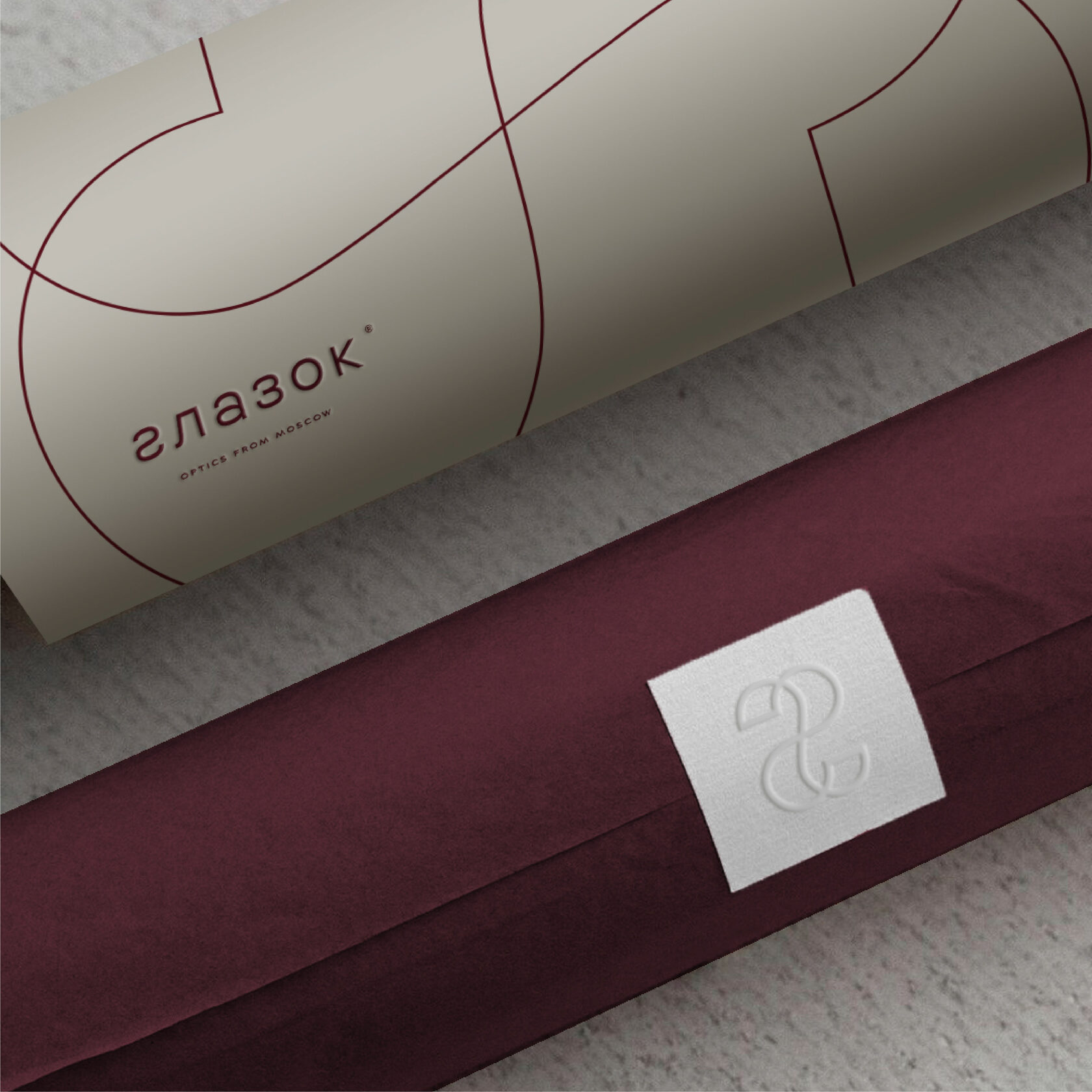
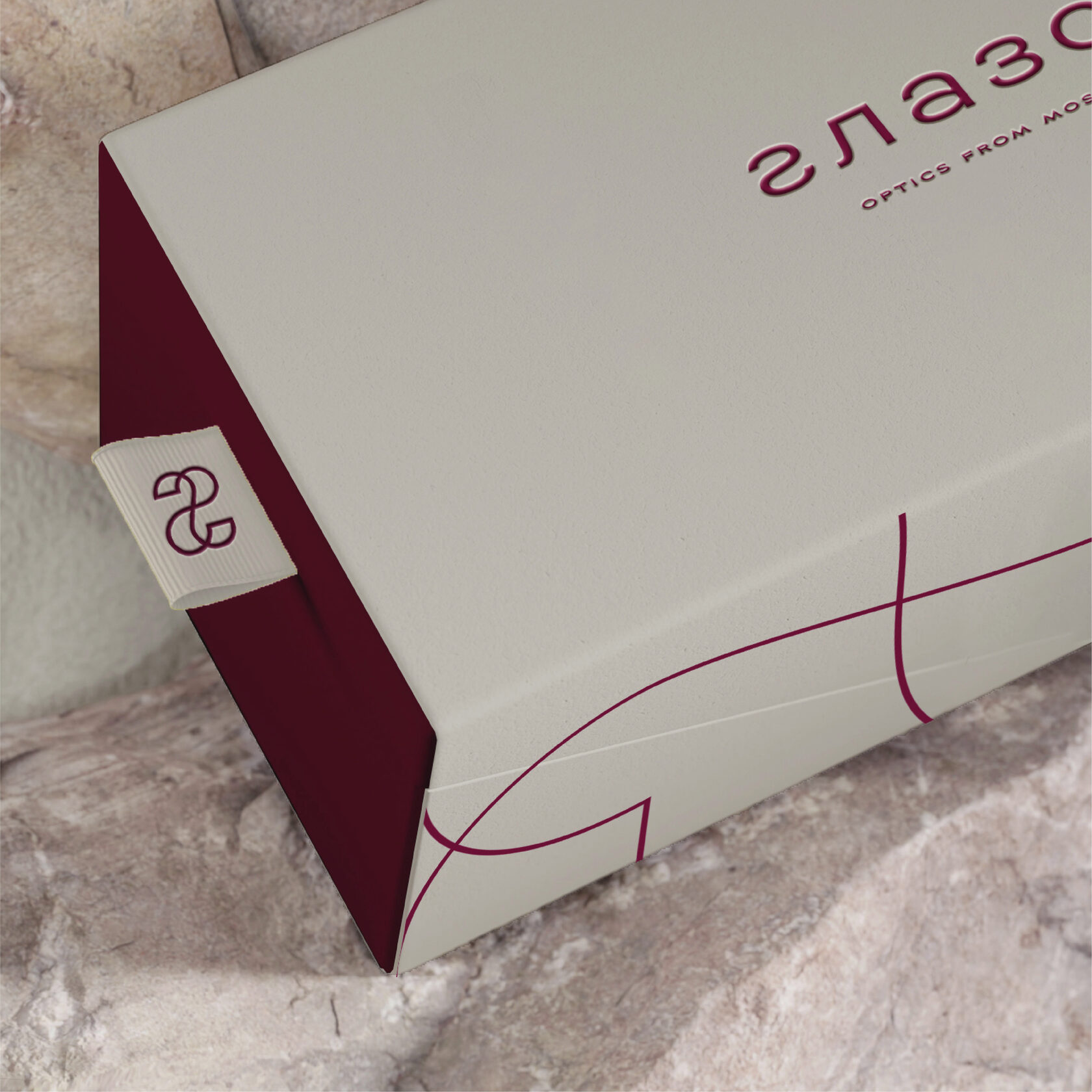
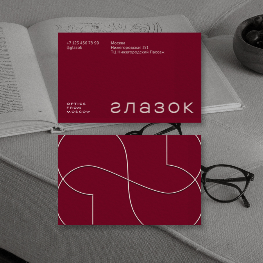
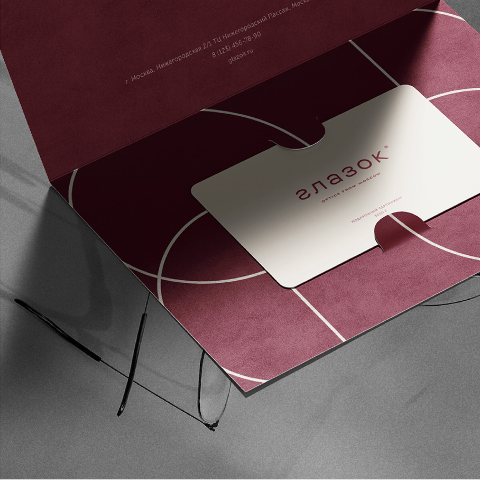
Burgundy, coffee-milk, terracotta. Glazek’s signature colours not only reflect Anna’s love of bright hues, but also match the interior of the optician’s shop. The design of the salon in Moscow is done in burgundy shades. In order to avoid drastic changes and renovations, we have taken the corresponding colours as a basis.

The descriptor 'Optics from Moscow' emerged when we created an experimental, complementary logo concept. Then we decided to go beyond the agreed terms of reference and got creative on the topic — what could be the capital’s optics salon. The logo turned out to be too extravagant for Glazk’s conservative audience, but the clients really liked the descriptor — we were happy to move it into the final concept.

The most inspiring solutions are born when there is an absolute attunement between designer and client. And above all — trust. We are grateful to Igor and Anna for the opportunity to feel and create from heart to heart!

Style is a reflection of the inner world. So special, so deep, so perfect in its own way.
