


Branding case — Wilton


WILTON is a powerful team of architects and designers committed to creating modern and functional buildings — in the Crimea and throughout Russia. The founders of the bureau have been in the profession for more than 20 years. This is an incredible experience and their own, years-long established system of values and views on project development processes.
The company was in need of renewal and the creation of a new brand. In six months of joint work we designed the naming, logo, corporate identity and a series of presentations about the directions of the studio.
The company was in need of renewal and the creation of a new brand. In six months of joint work we designed the naming, logo, corporate identity and a series of presentations about the directions of the studio.
Naming has an associative character. A sentiment we picked up from talking to the company’s founders. WILTON is English to the core, doesn’t chase fashion and doesn’t look back at his neighbours. He does his work honestly, being timeless and preferring stability. He has good taste and pleasant manners. Working with WILTON is easy and reliable. He’ll make sure he follows up on quality and defuse the most tense moment with good humour.
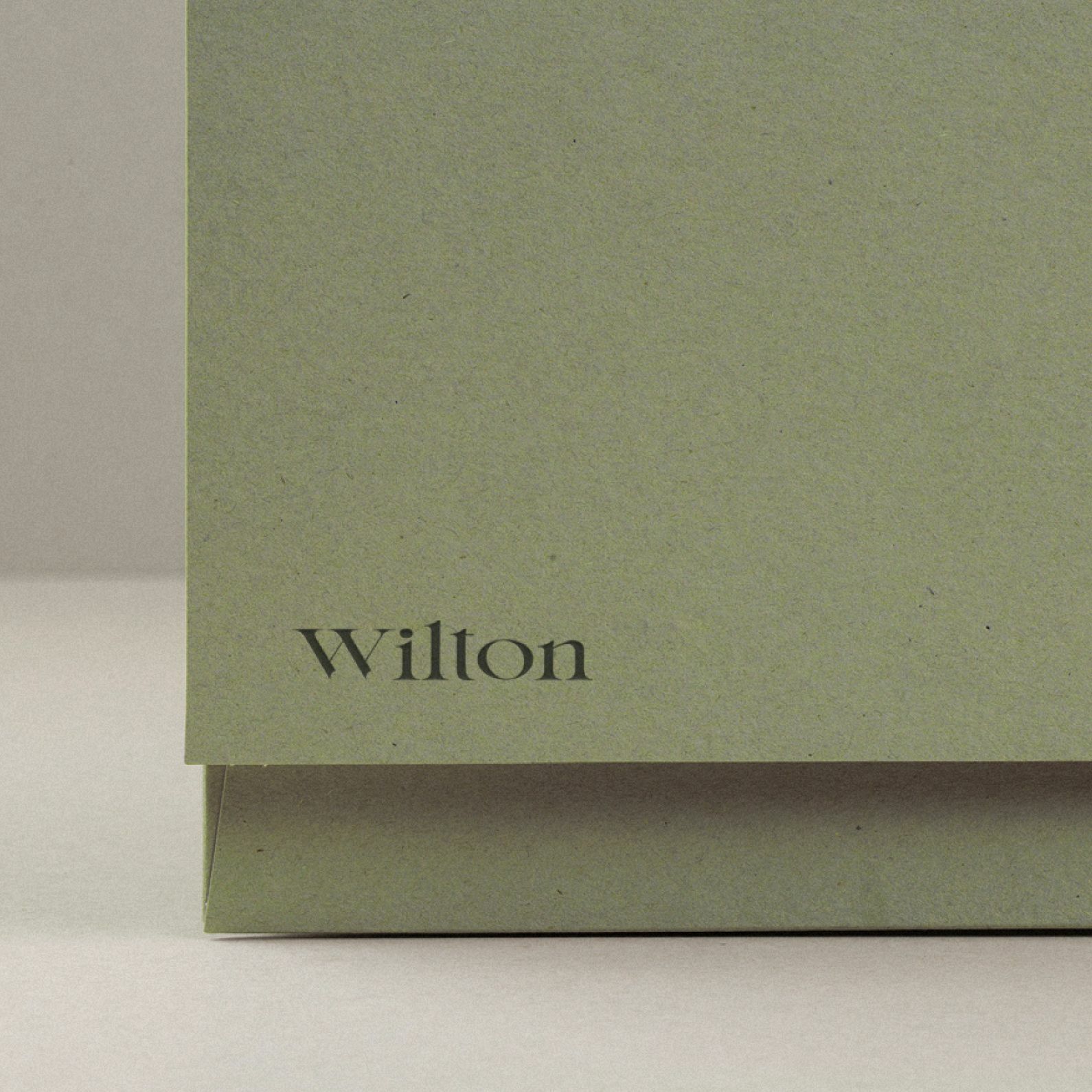
The typography of the logo is understated and elegant, but not lacking in softness through its rounded forms. The letters have a unique shape — we’ve hand-drawn them using a classic serif typeface as a base.
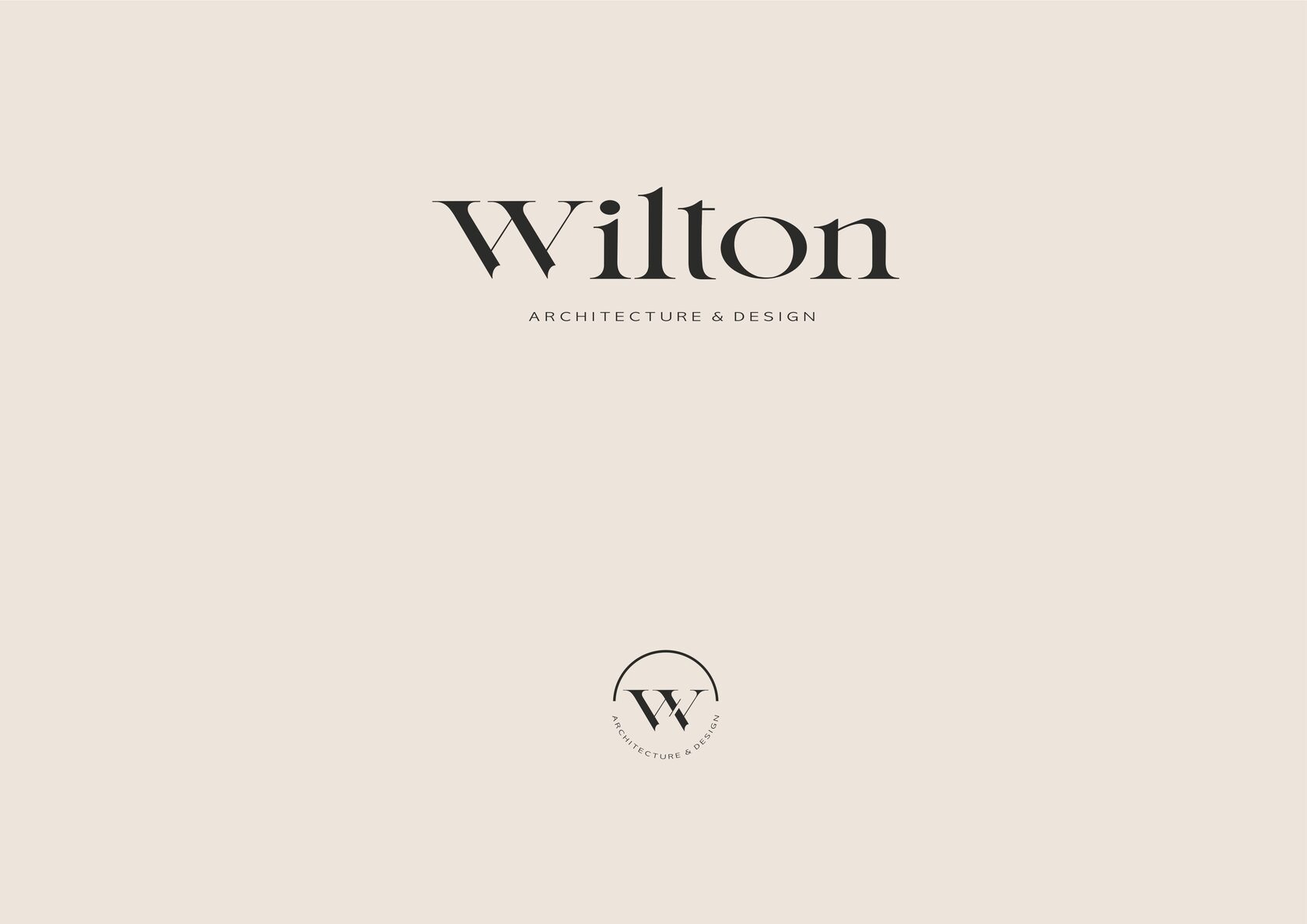
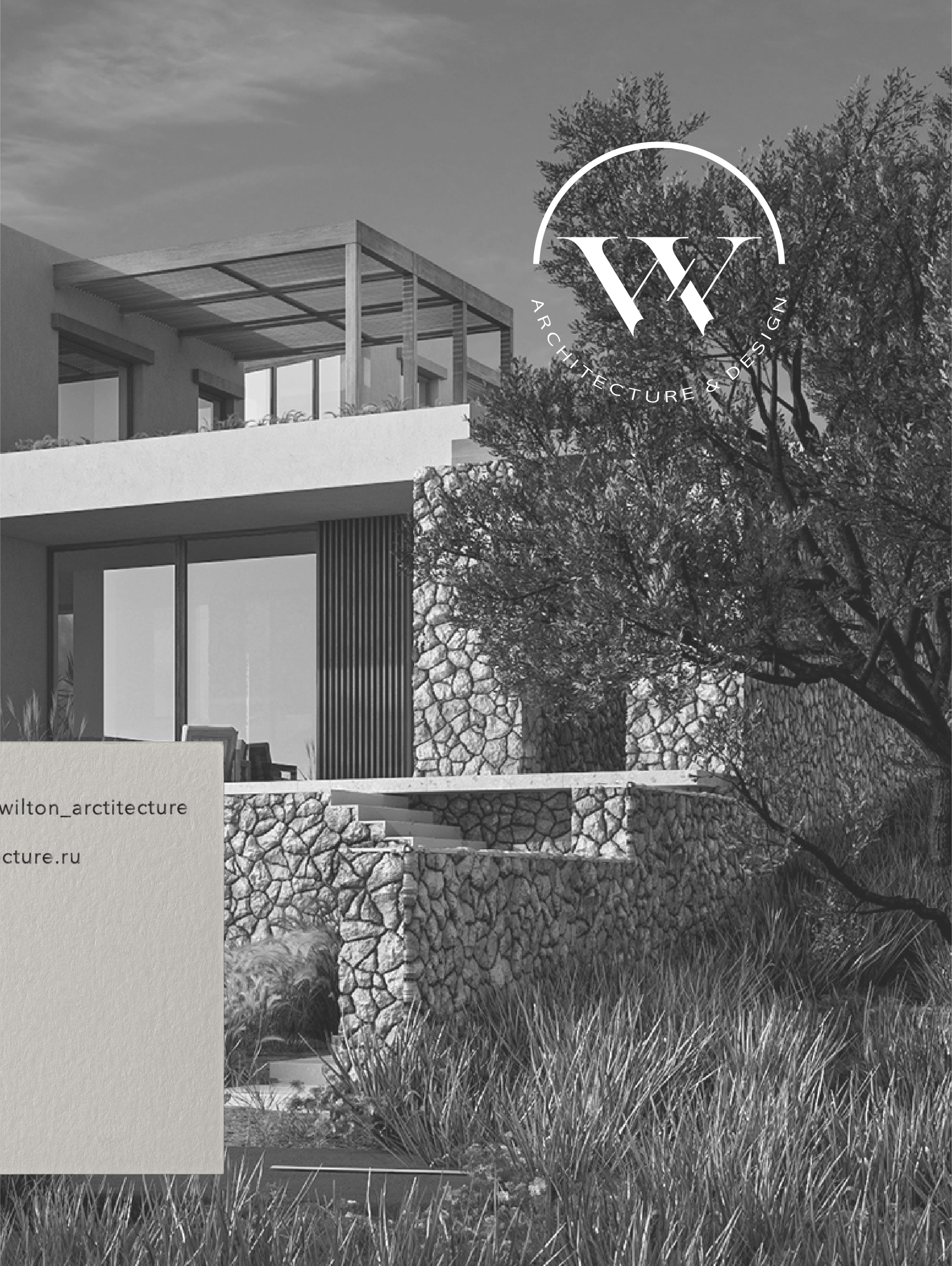
The logo and monogram contain only letters and geometry, making it possible to read meanings without being bound to ready-made codes. Hear and realize — as Wilton’s creative life philosophy.
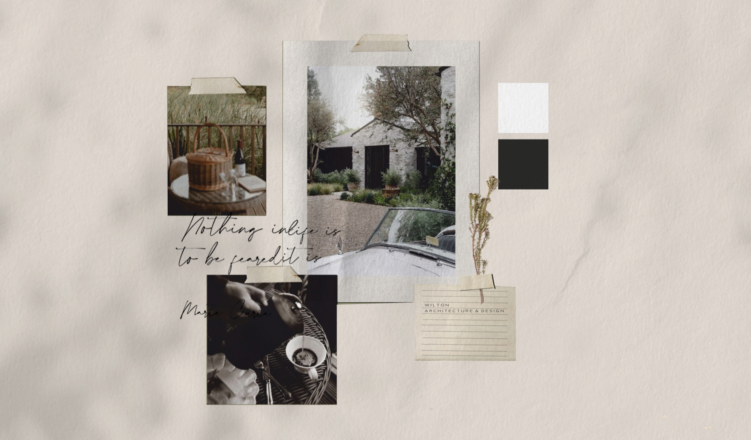
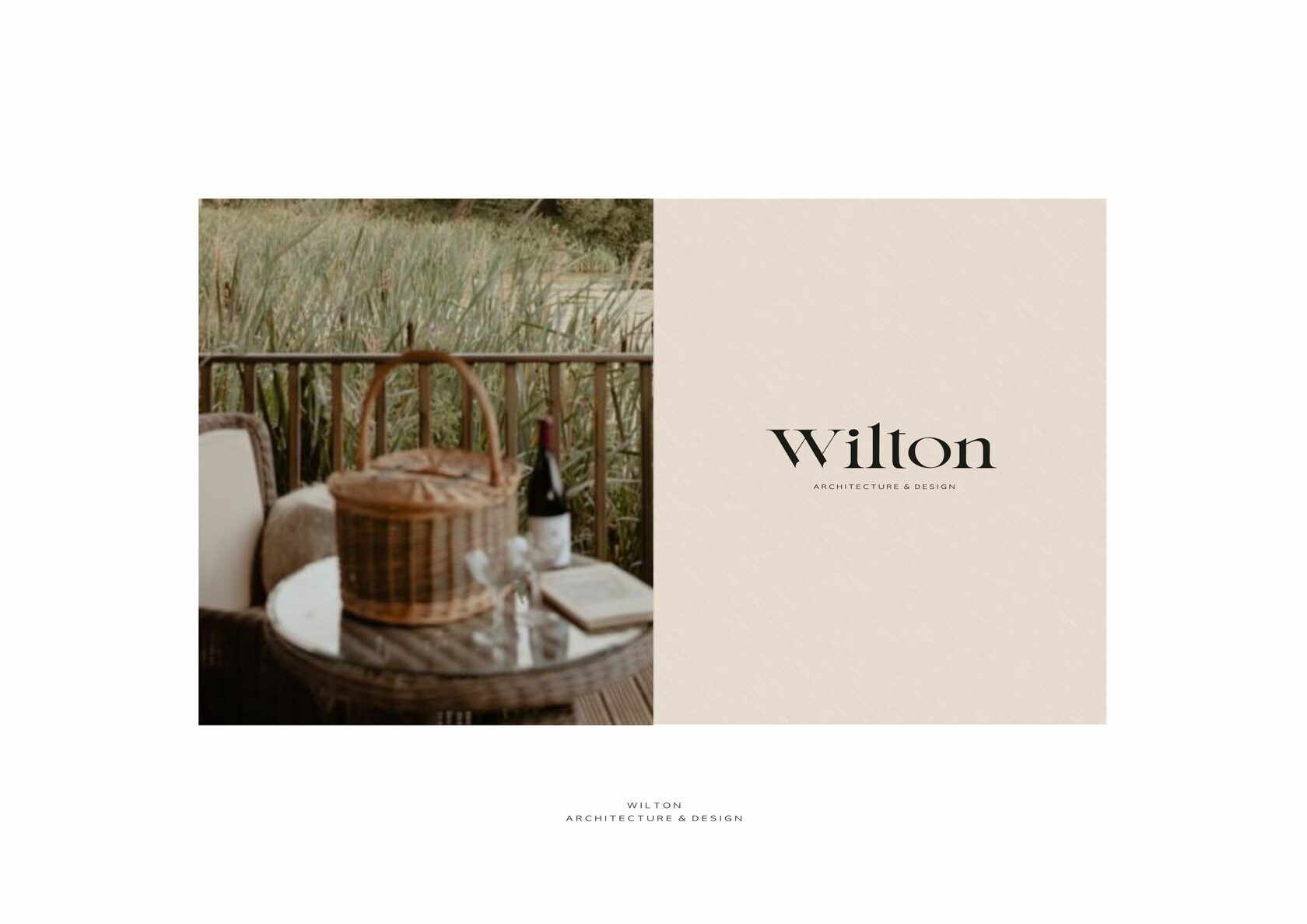
The aesthetics of the visual concept lie in the feeling of lightness of life, when nature itself envelops the mind with the aroma of serenity and visual harmony. To feel, to breathe fully and to contemplate.
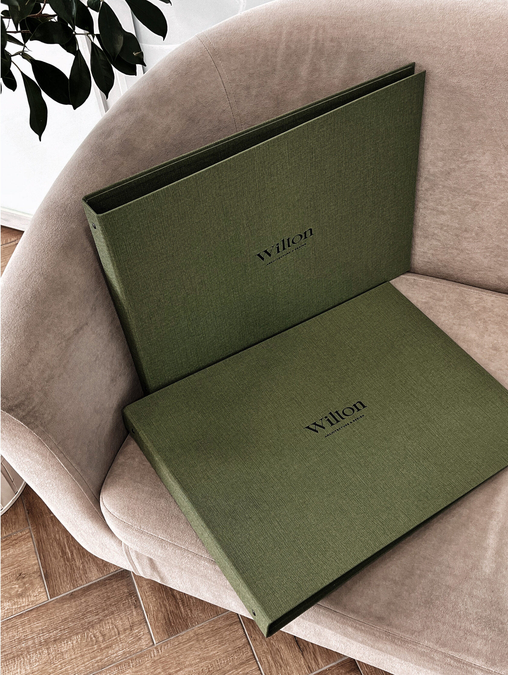
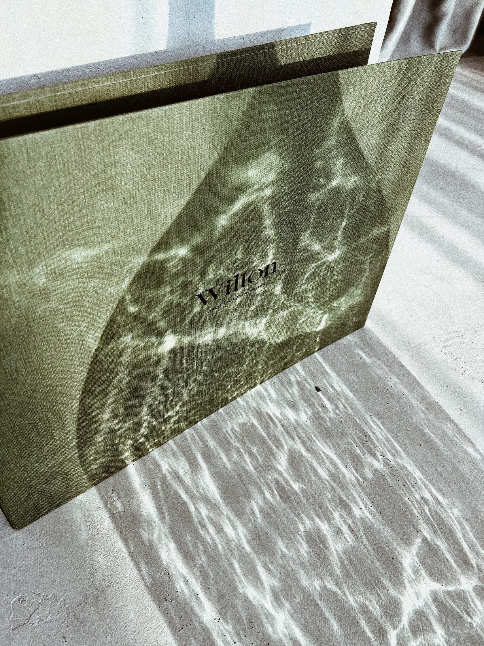
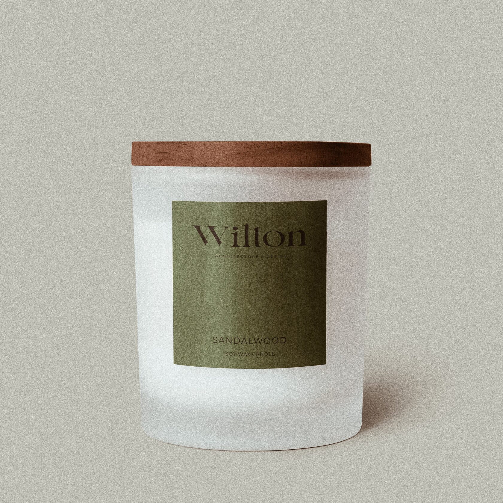
Tactile and visual sensations accompany WILTON customers throughout the entire collaboration. At the moment of filling in the brief or when the project has already been completed. Every touch becomes special thanks to premium printing.
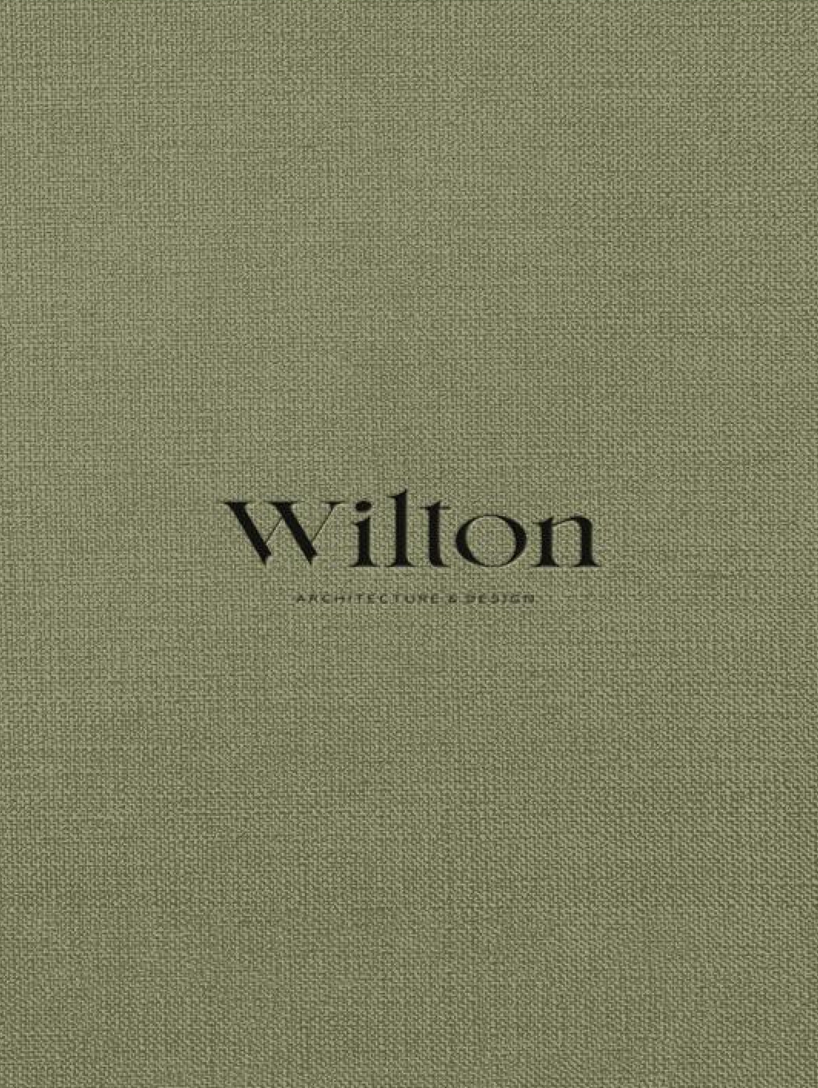
When choosing the signature colours, we opted for muted natural shades — calm and soothing. A pleasant aesthetic of wisdom, fullness and harmony.
Quality design underlines the value of intelligent work. WILTON customers are used to choosing the best, and at every stage of their interaction with the company they receive proof of a high level of professionalism.
Intuitively or consciously, every touch of a brand is an experience that will accompany clients with a pleasant aesthetic aftertaste for a long time to come.
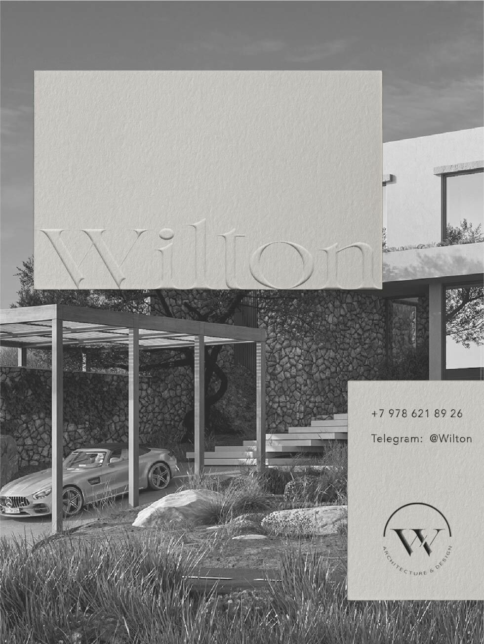
Behind one business card there can be a big architectural project. A business card with convexity is the perfect start for a serious collaboration.
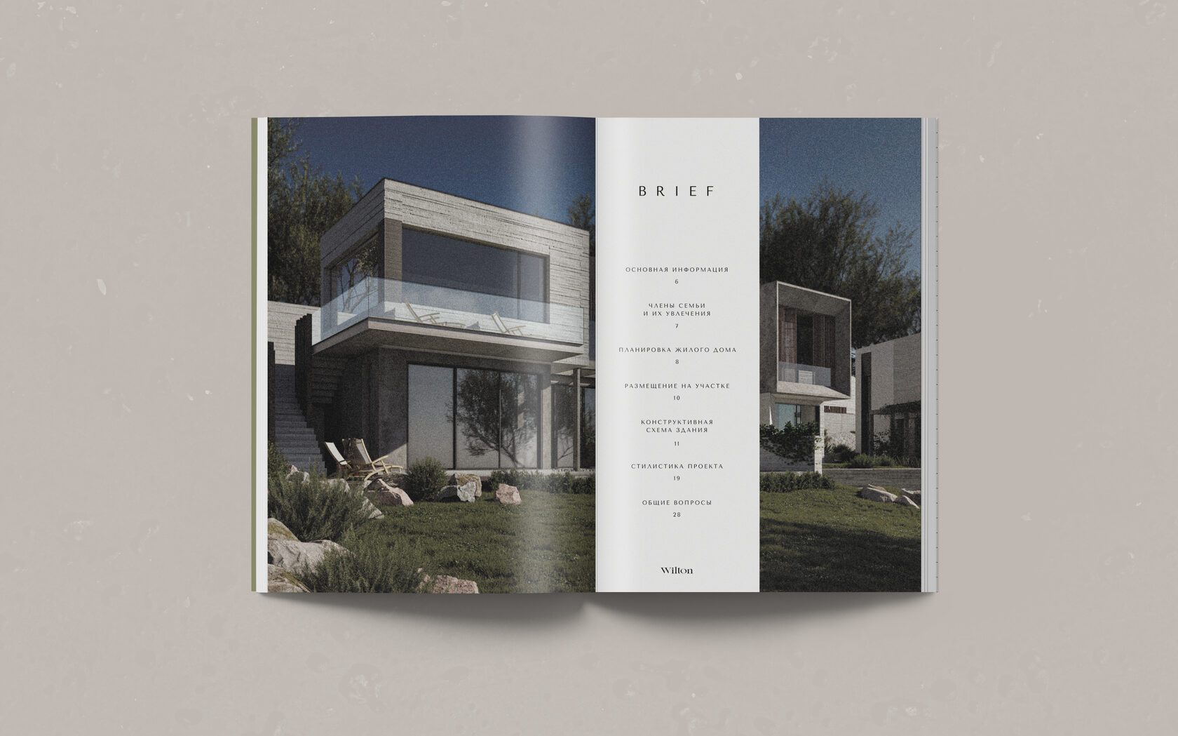
In order to introduce WILTON to future partners and customers, we have developed a series of presentations about the lines of work. The content of each of the books includes an address by the founders and a story about the company, fundamental principles, a detailed description of services, mission and values. The reader is also introduced to WILTON’s landmark projects.
The information in the presentation gives a comprehensive overview of the company’s activities and inspires trust from customers. We are incredibly happy to know that the work we dedicate ourselves to helps true professionals create incredible projects and their clients gain a reliable partner and enjoy working together.

