Branding case — ART-ALIBI
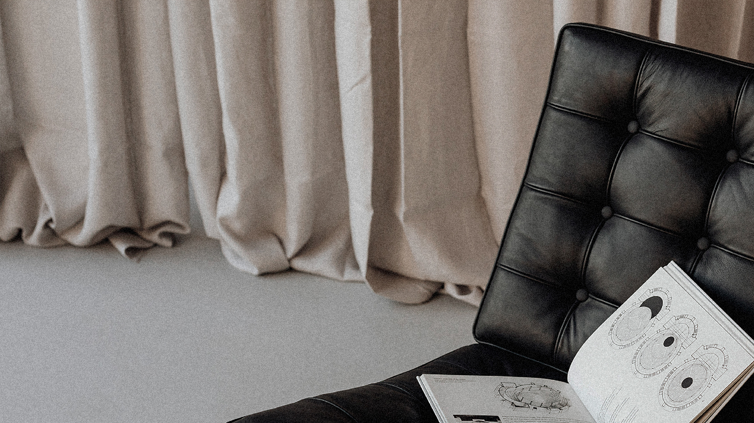

Olga Davydova’s team designs residential and public spaces. At the time of the corporate identity development, ART ALIBI already had a brand platform. We were given the task to create its visual component, to express in the graphic meanings and ideas, which had already been set by the brand-strategists.
About 'art of place', 'sincere individuality' and love of Coco Chanel. A corporate identity in which each element has its own unique meaning, valuable to the studio team.
About 'art of place', 'sincere individuality' and love of Coco Chanel. A corporate identity in which each element has its own unique meaning, valuable to the studio team.
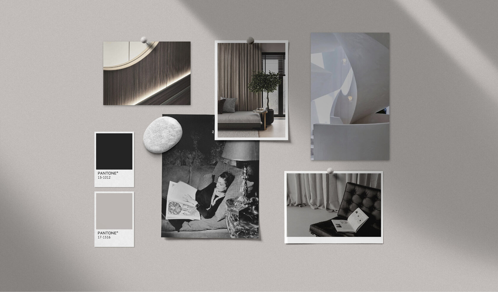
We invite you to get acquainted with ART ALIBI corporate identity.
A perfect, adjusted design inevitably dissolves into time and becomes a piece of art. The font we have chosen for the logo is no less iconic in the typographic world than Arne Jacobson’s Egg chair in furniture design. It’s a minimalist, elegant, impeccable classic of Swiss graphics.

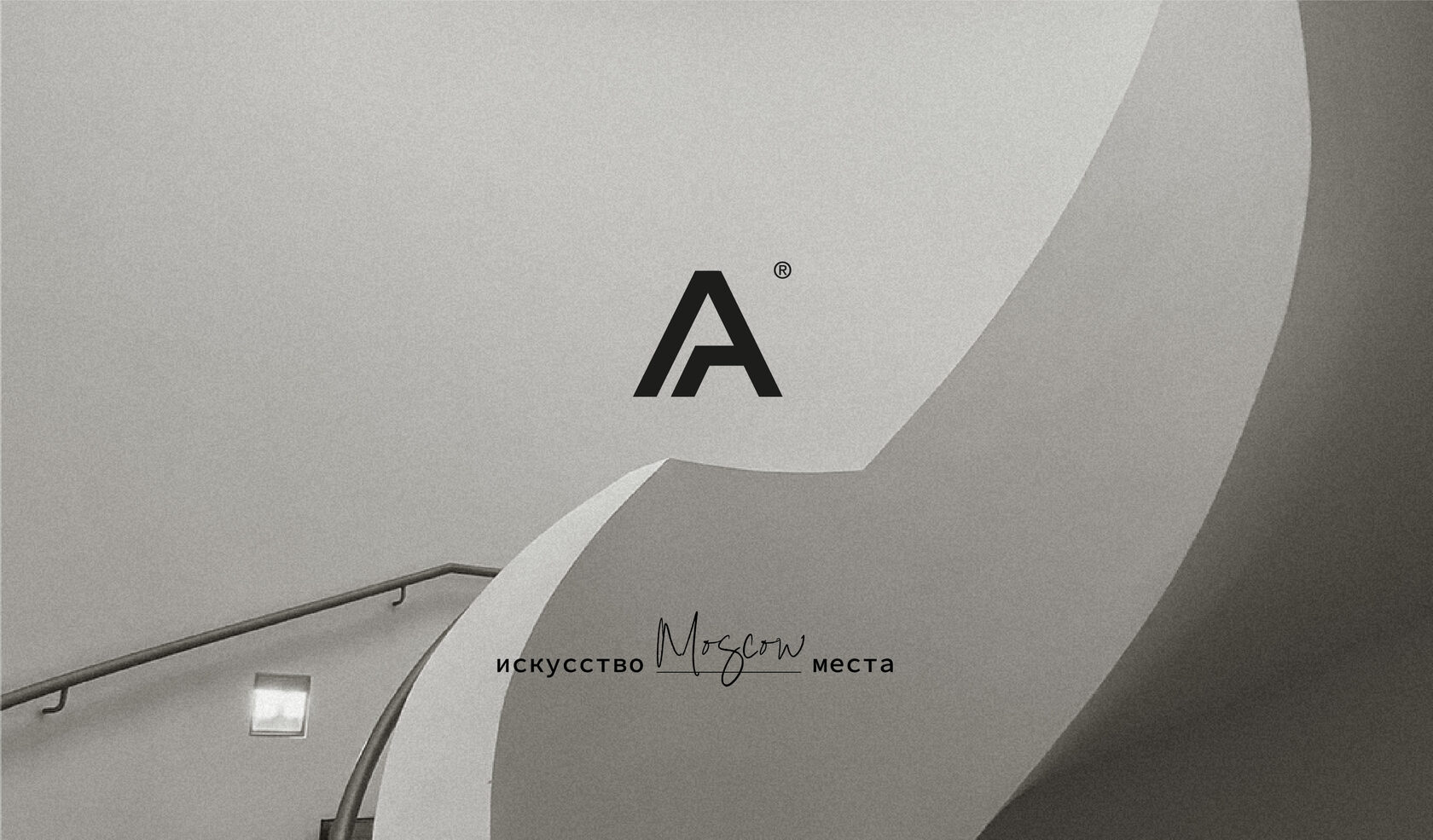
The sign part is an art object with different reading scenarios. It combines two A’s, but if you shift the angle of attention, the lines form a chair under the roof, a schematic image of a house.
When creating the descriptor, we have left the element of the centering line between the words visible. The technique demonstrates the idea that design cannot be random — it is a painstaking work that requires not only artistic vision but also deep professional knowledge.
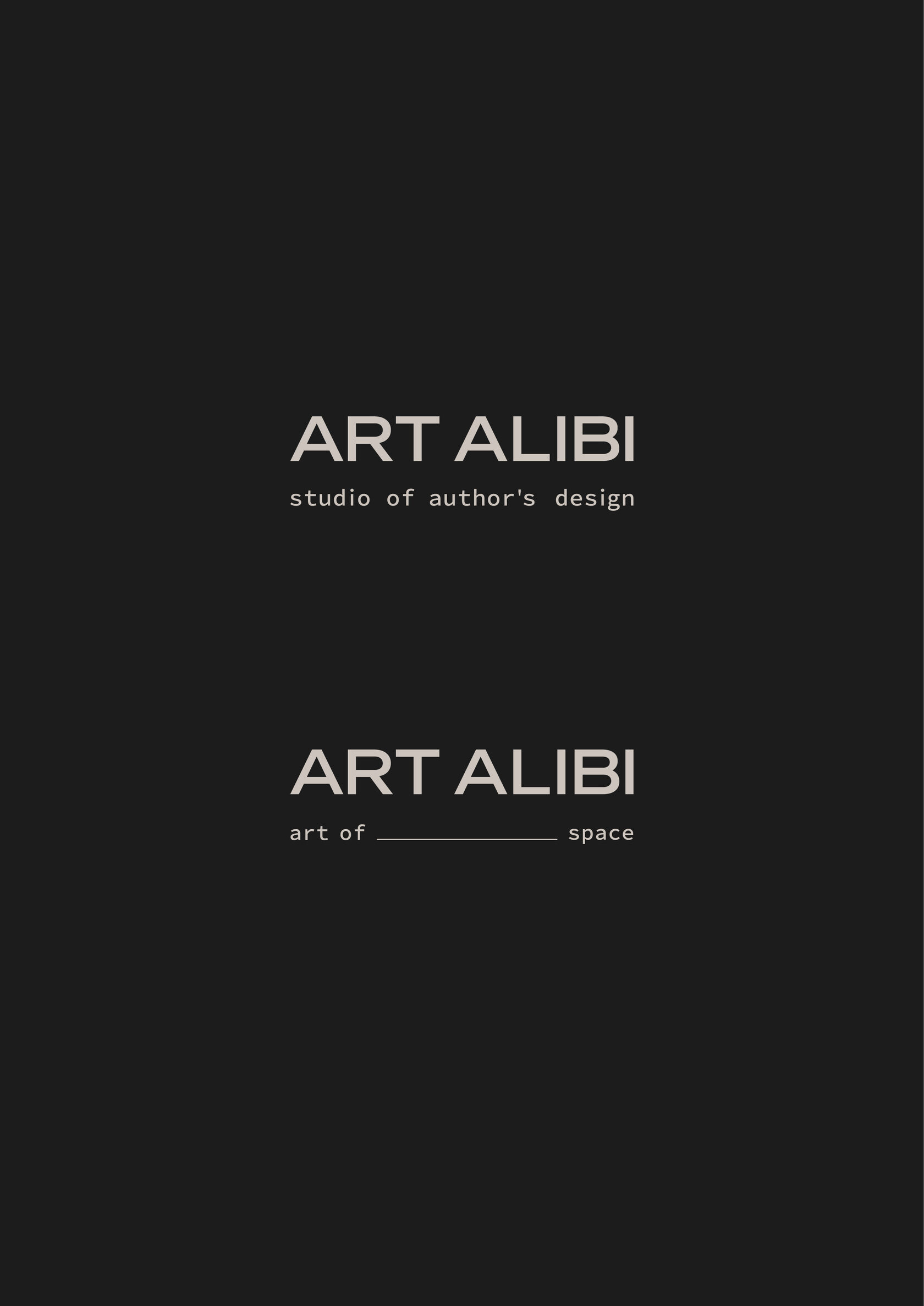
The descriptor expresses an important meaning for the company. Reflecting on its presentation, we saw a new reading where a dash between words could play a role: 'the art of THIS place'. It then becomes possible to insert the names of projects or cities, making each presentation addressable and more sincere.

The visual identity of the brand continues in the author’s illustrations.
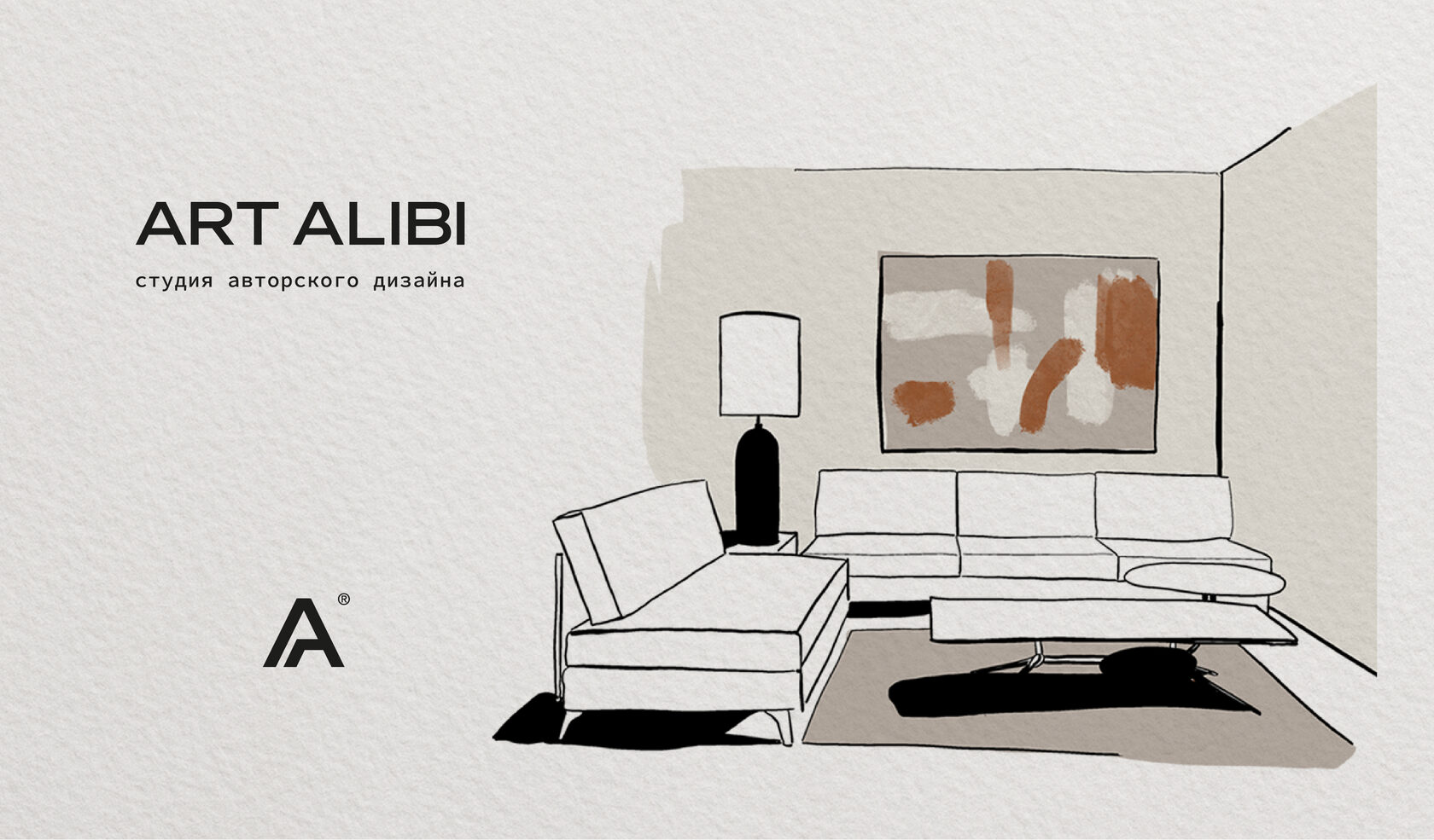
The images are hand drawn from the studio’s actual projects. As another intangible thread linking ART ALIBI design-projects with art.
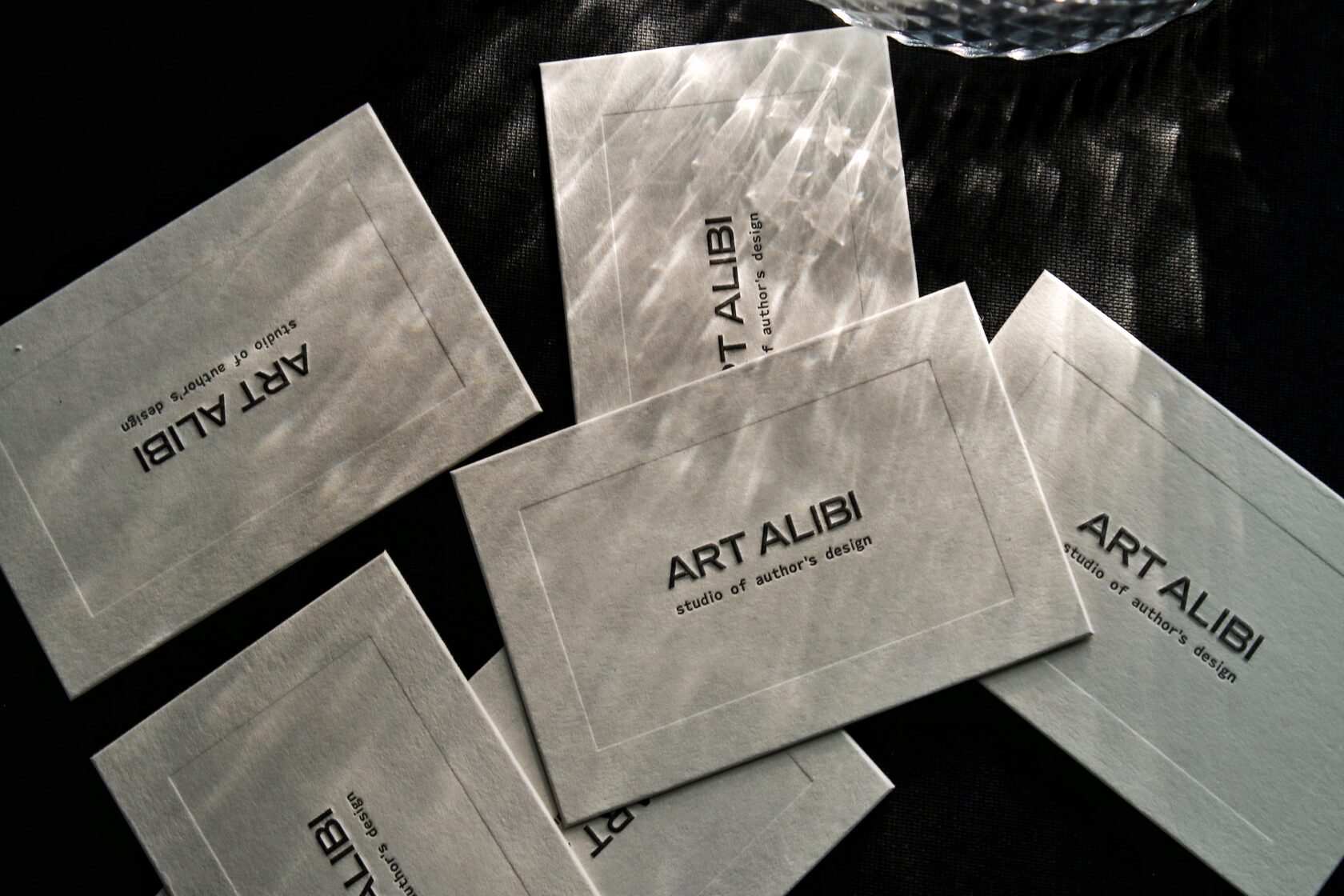
The founder of ART ALIBI admires the philosophy of Coco Chanel and associates the studio with her person. Printed in milky hues with contrasting black text as a tribute to the great fashion designer.
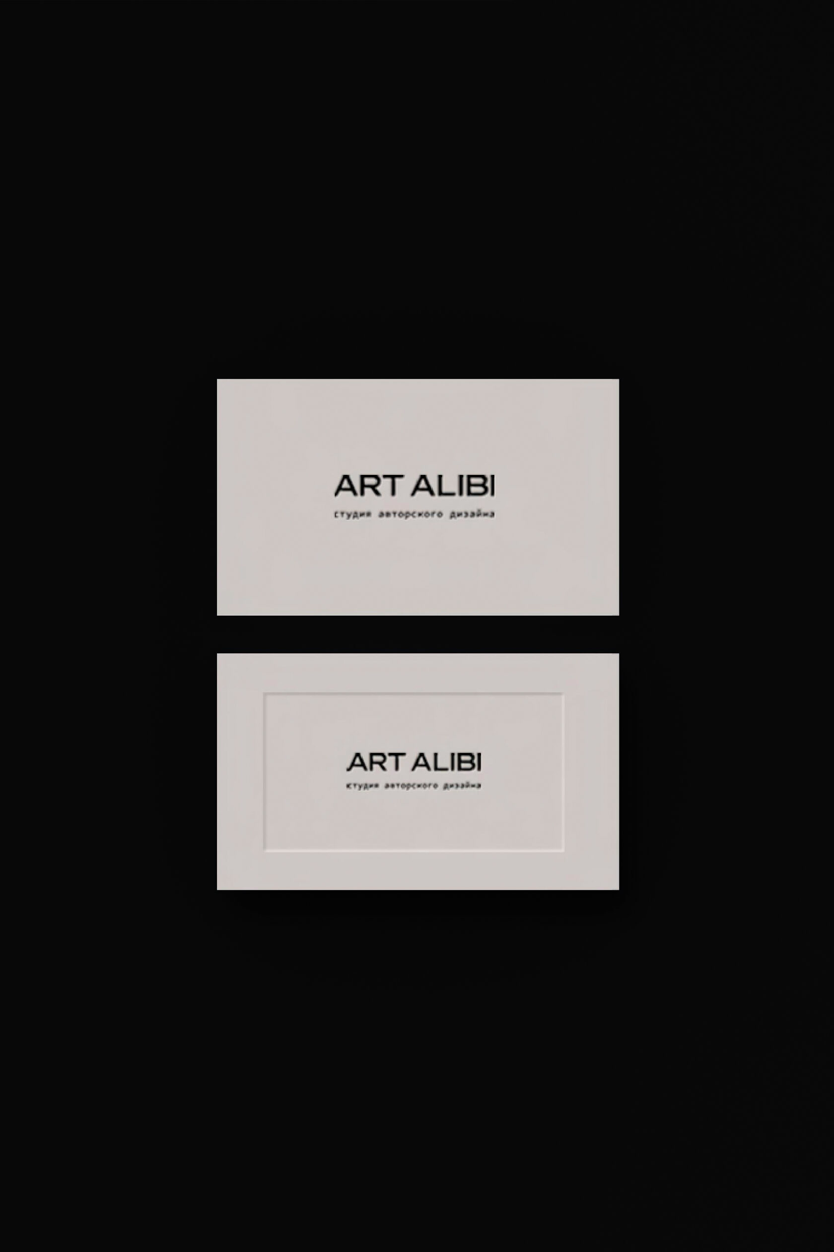
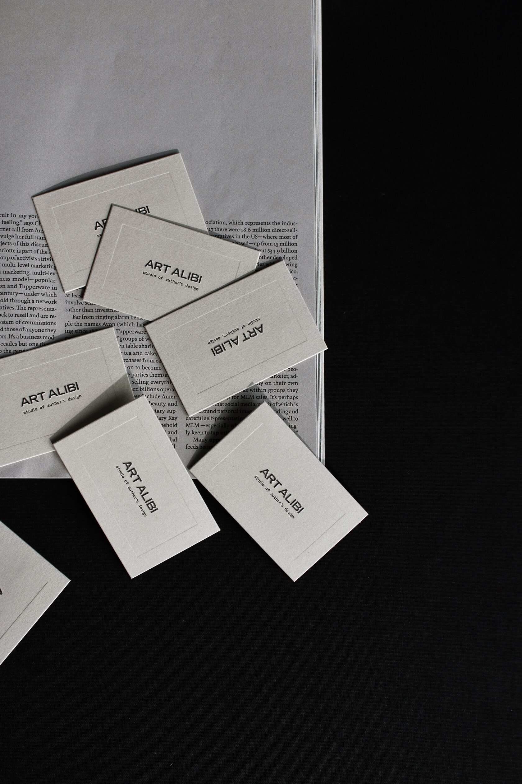
The main semantic line of the Art of Place brand platform is reflected in the visual image. We’ve taken the association with an art gallery as the basis for the brand’s graphics.
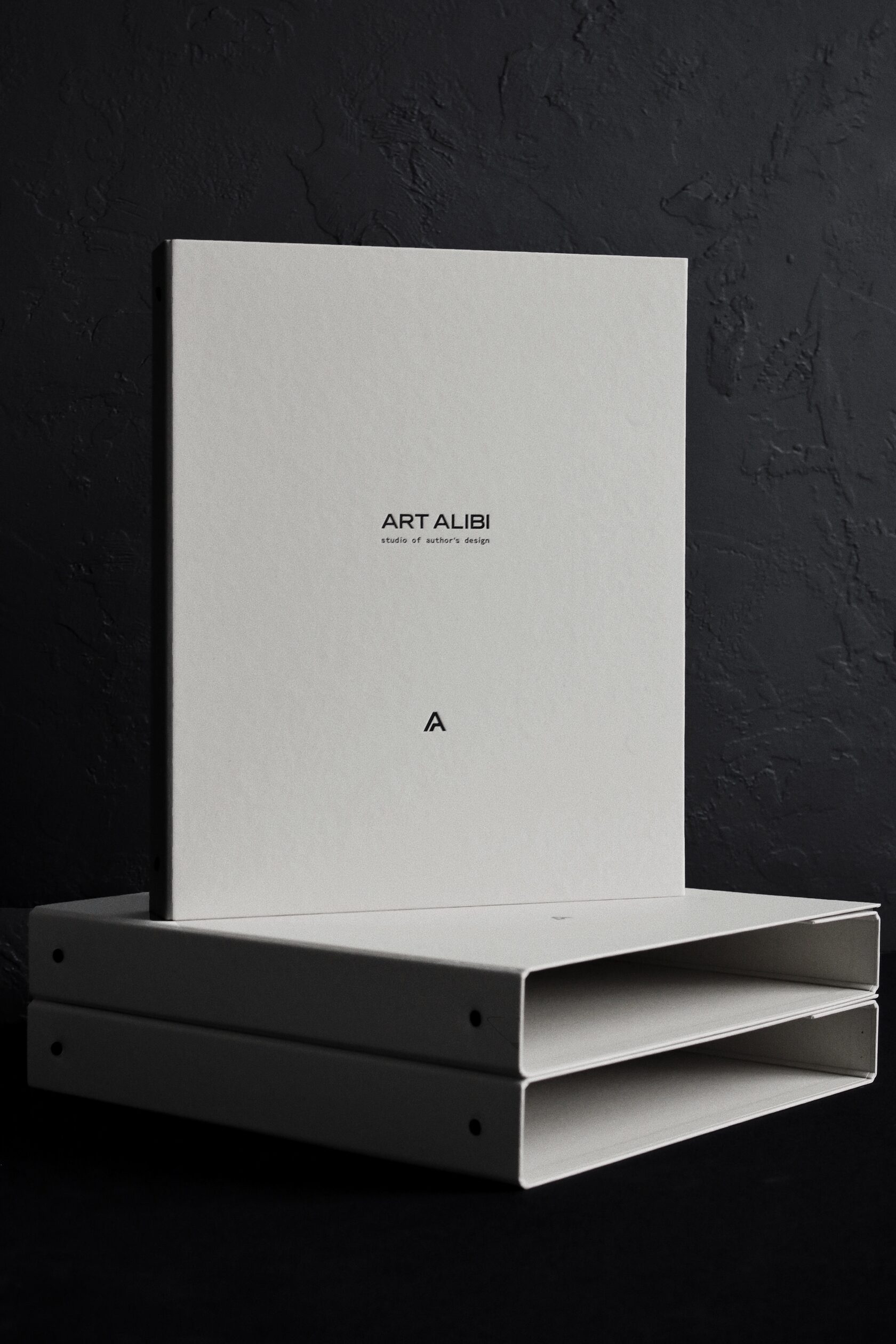
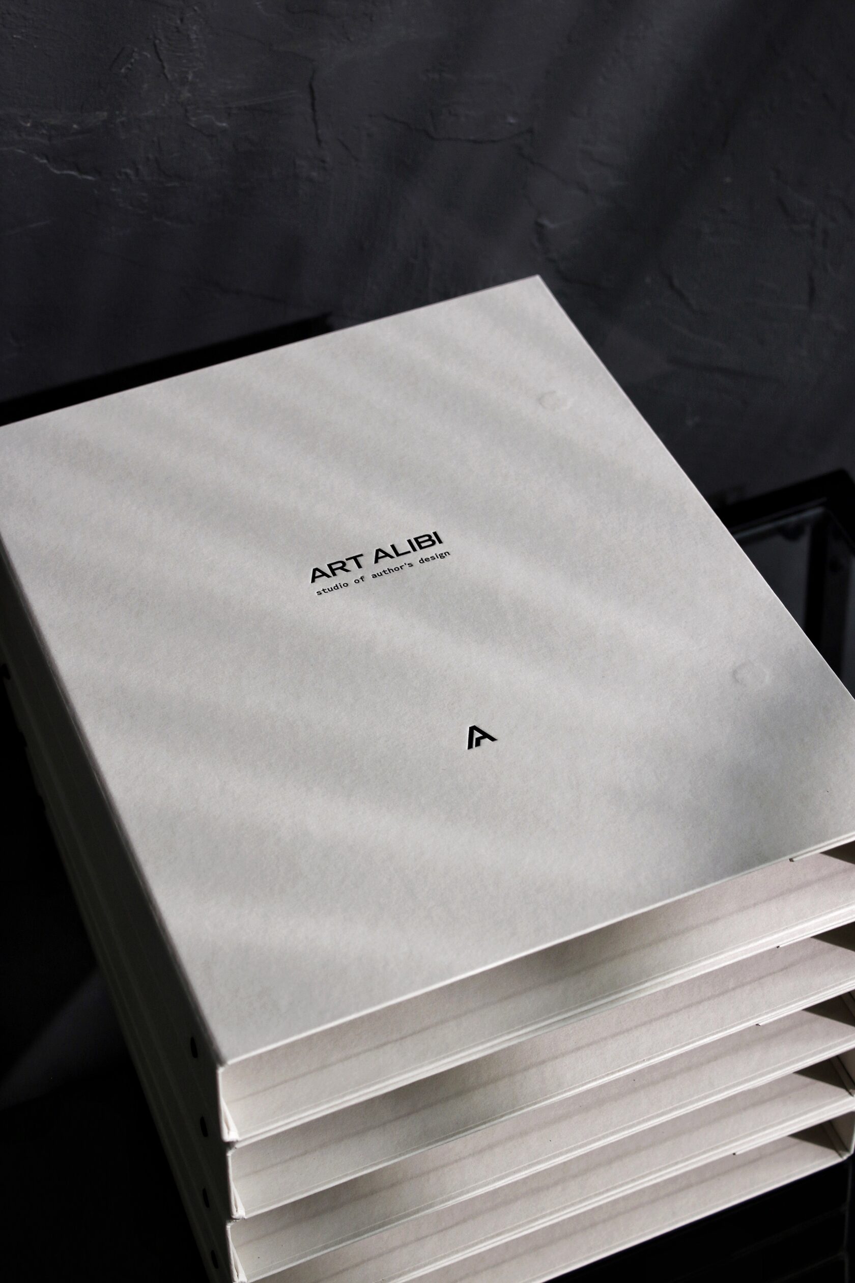
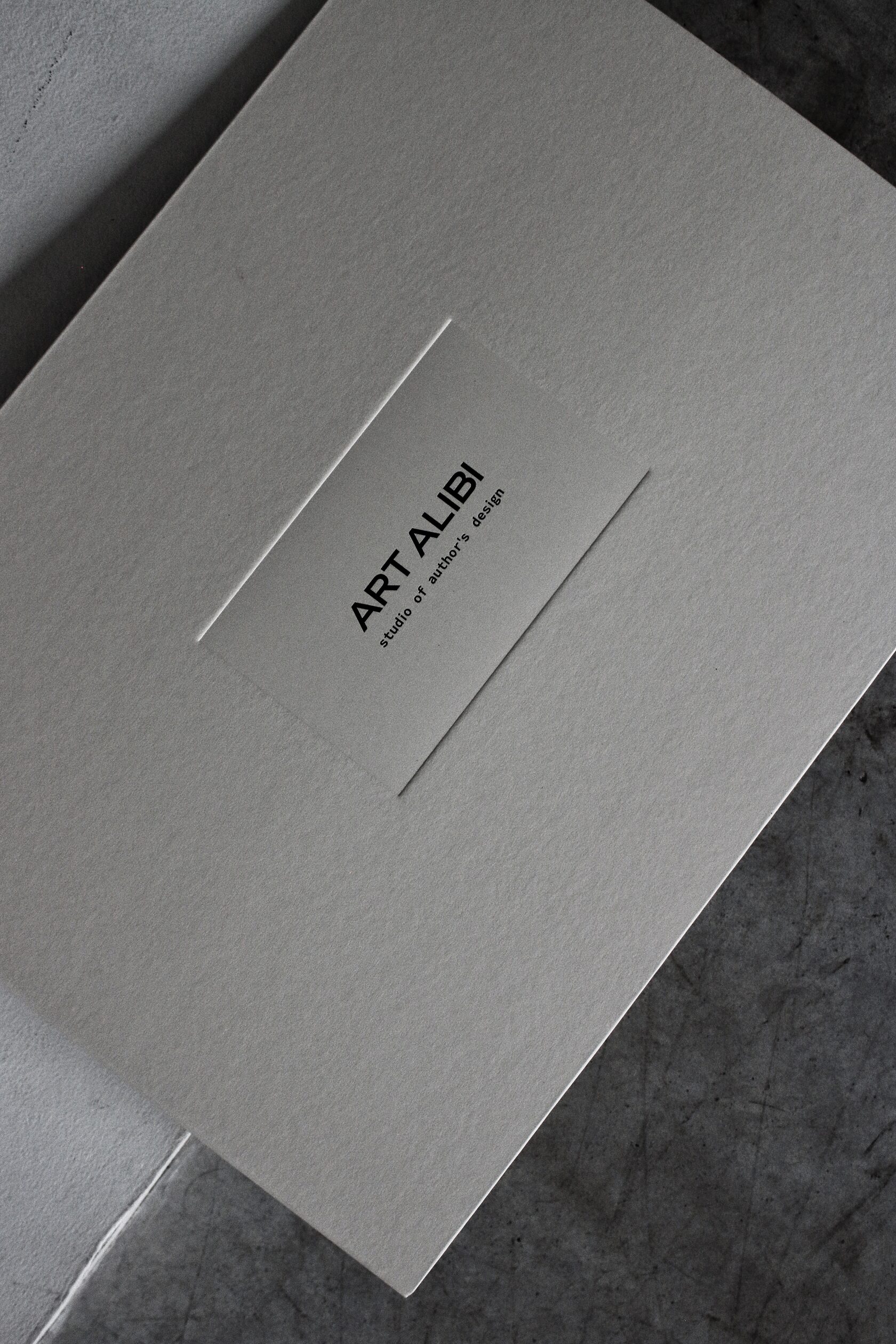
Elements of the corporate identity are reminiscent of framed paintings. This image is found on business cards and in albums for the project.

We did not use this technique on the specification folders. However, when the studio’s clients receive the entire set of documents, the visual image will finally take shape.
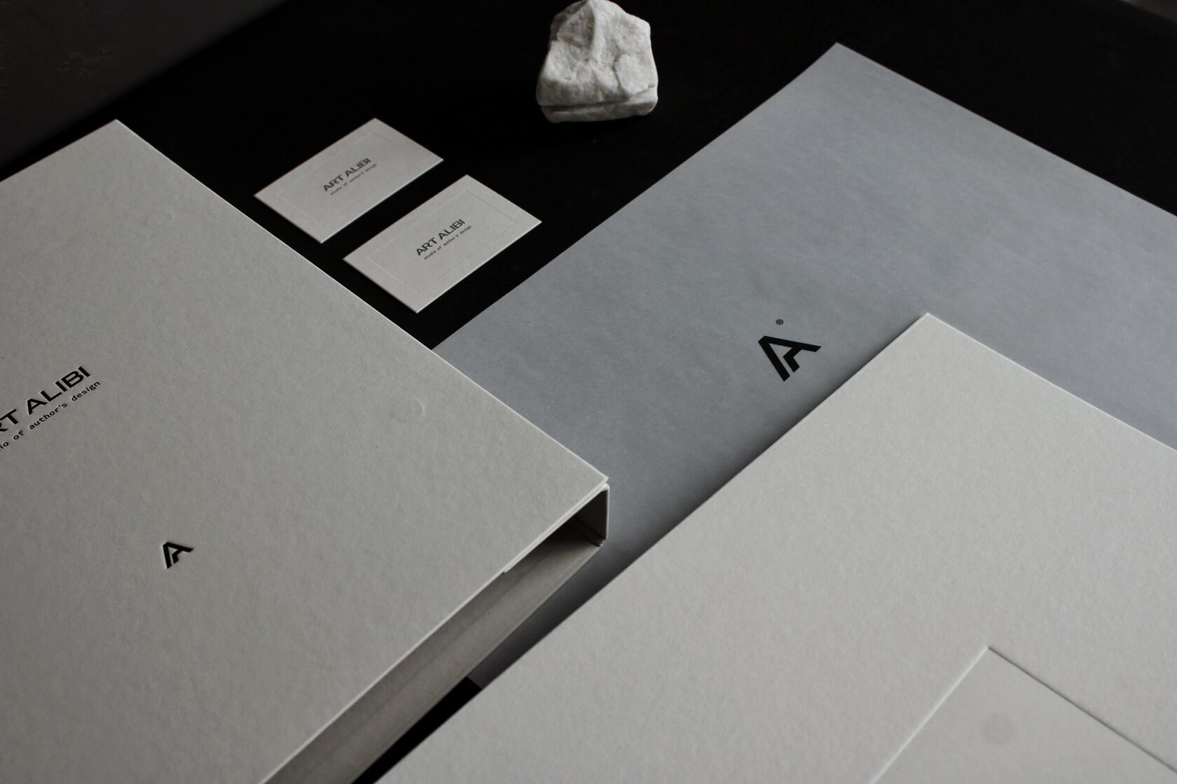
When clients open the project folder, they will see a branded tracing paper hand written name of the residential complex or their town. This page is like a veil that gives you time to enjoy the moment before viewing the visualizations of the future interior.
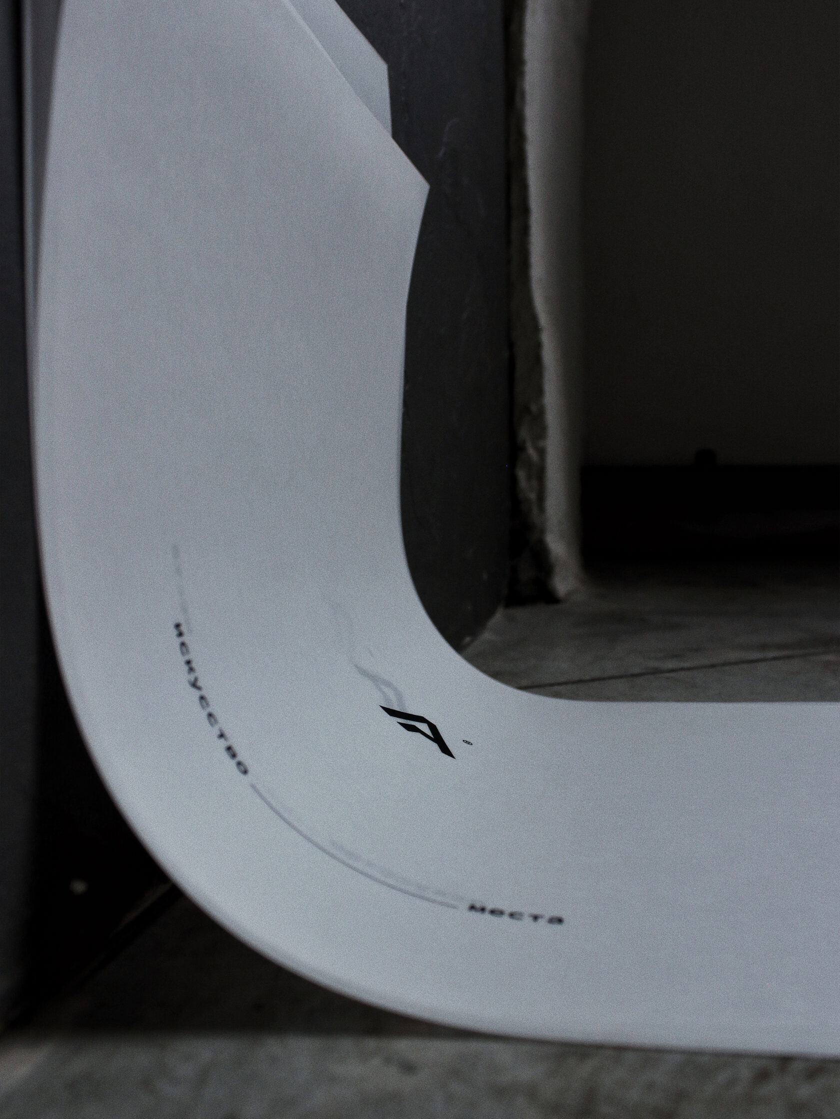
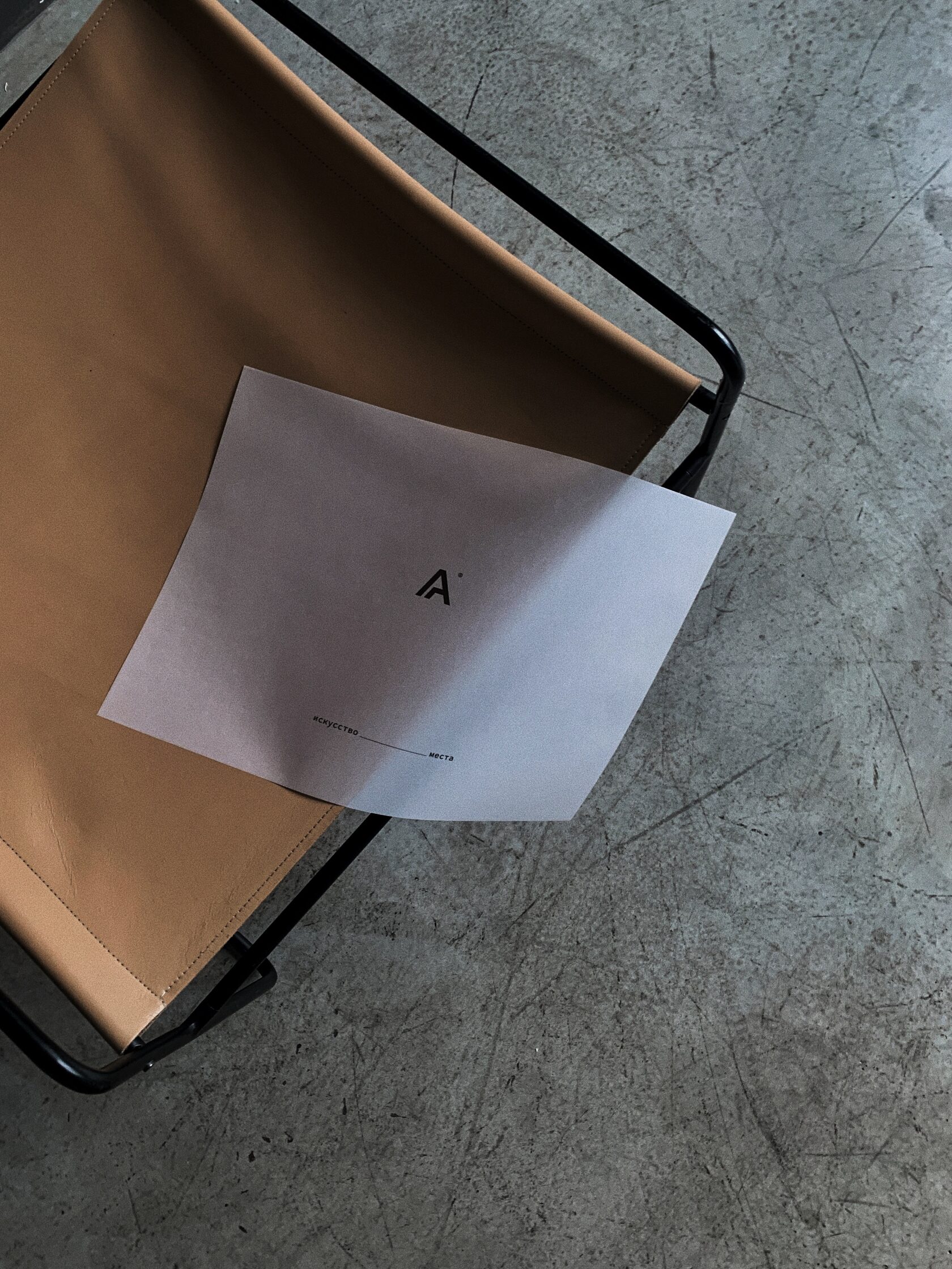
Frames become one of the iconic graphic elements that will always be associated with ART ALIBI studio. The technique can be used in branding posters and the design of company pages on the internet.
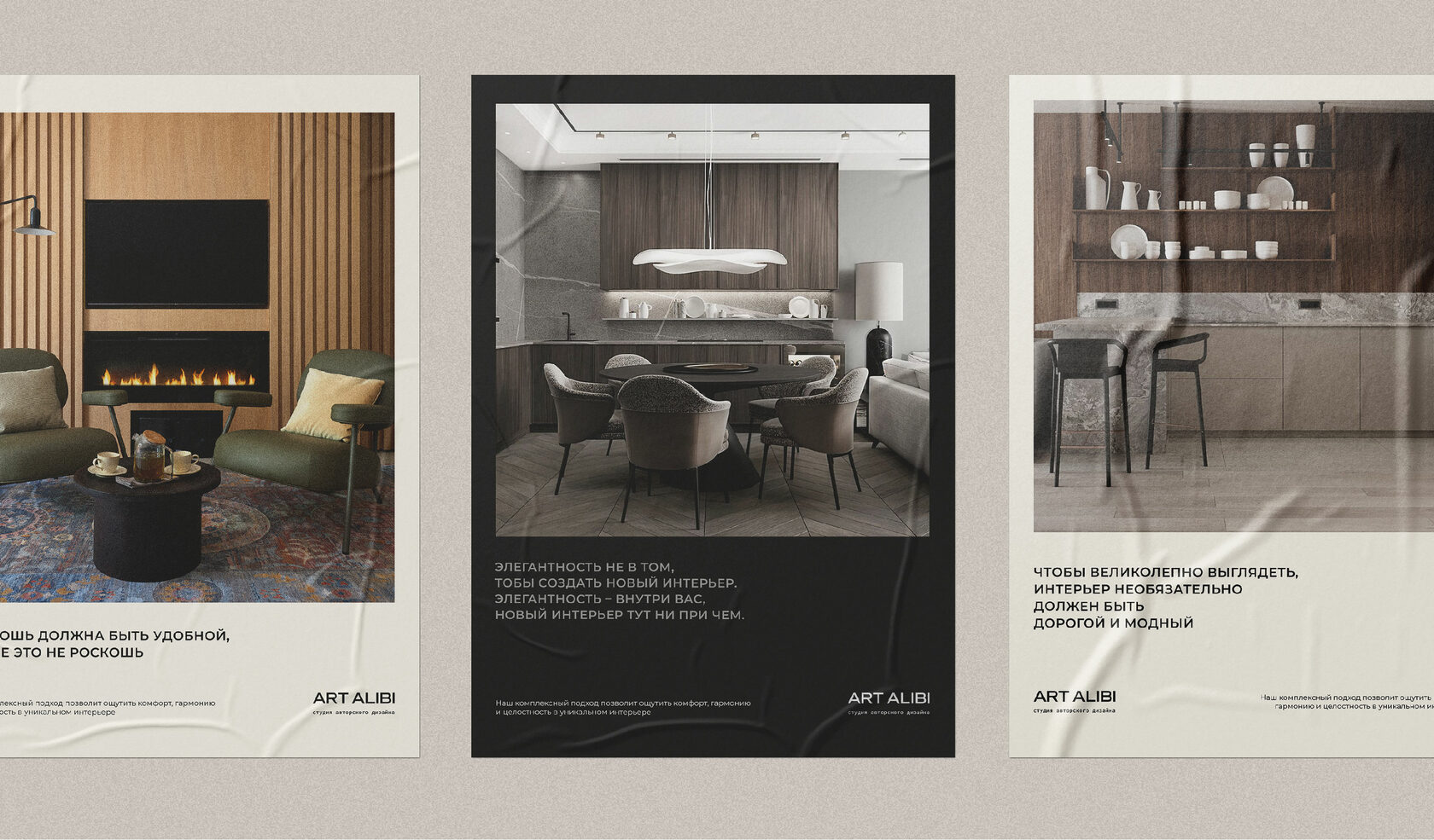
Visualisations with design examples have been created to help the studio team independently maintain the corporate identity in social media.
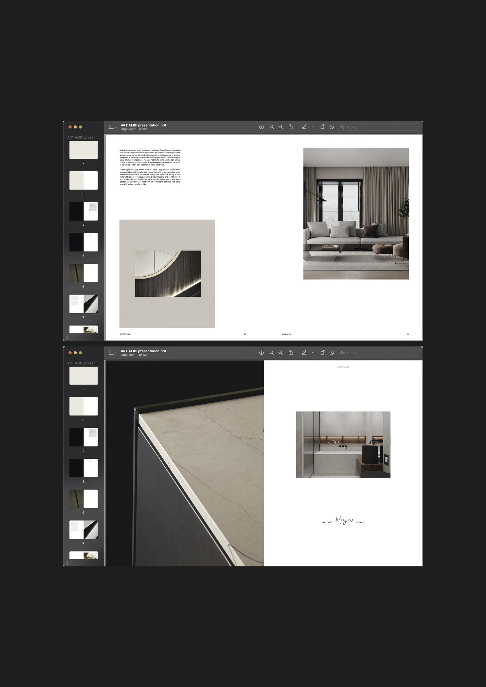

We are now working on a presentation of the company. It will be a big book to be sent to partners and future clients to present the studio’s philosophy and cases.
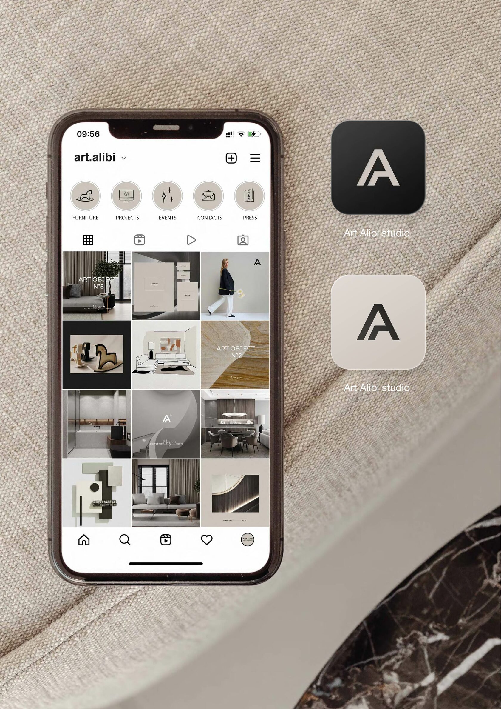
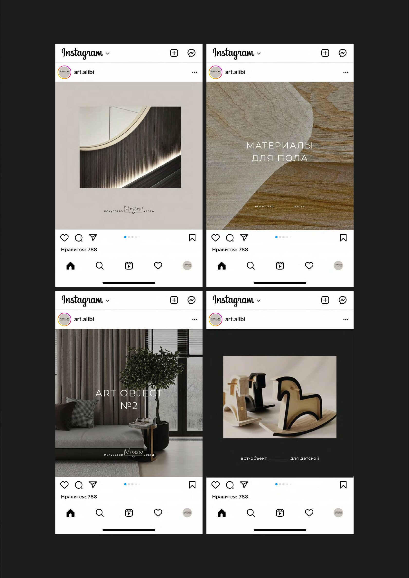
Flipping through the pages of the book on a mobile phone or on a big screen, it’s as if the reader is getting to know the creator of the brand in person.
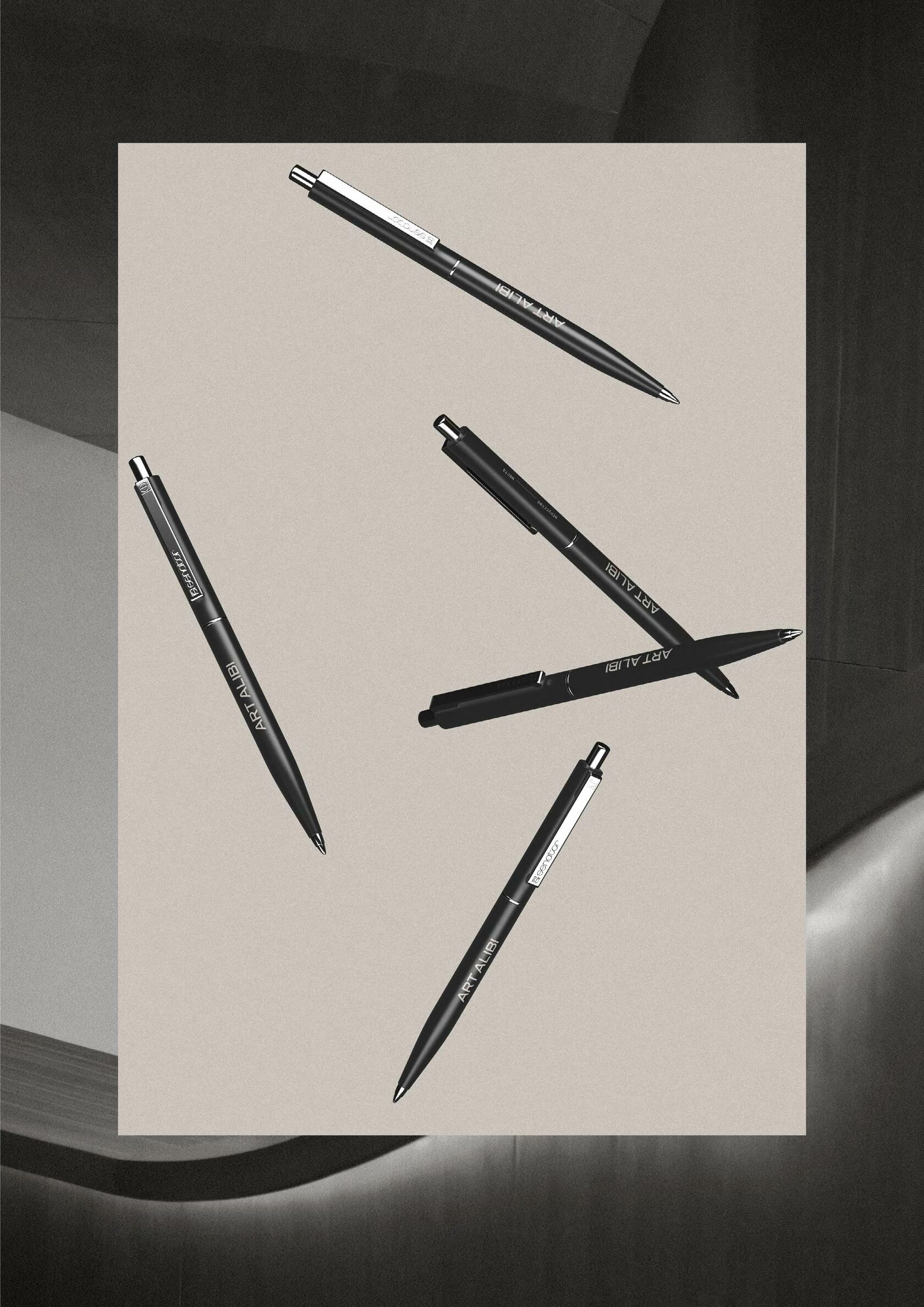
Brand merchandise is what brings a team together. To be a part of a great cause, to be proud of the results of your joint work and to declare to the world, "I'm part of this story!" Wear a hoodie on site outings or corporate weekends and feel the love ♥︎

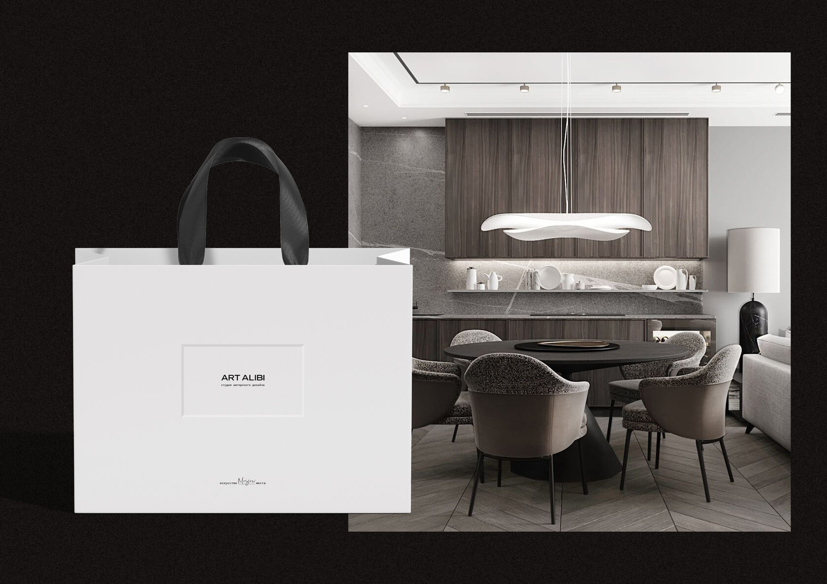
Art in everything from creating a design project to presenting it beautifully. A packet with reps ribbons and branding embossing on the frame for the most festive occasions.
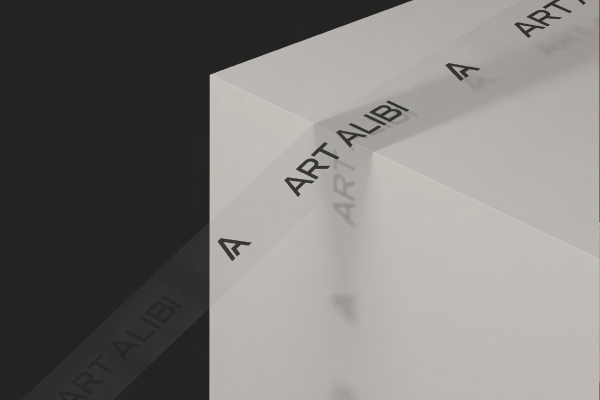
We have provided a branded ribbon for gift design. It will elegantly underline the design of the gift wrapping and will be a stylish addition to it.
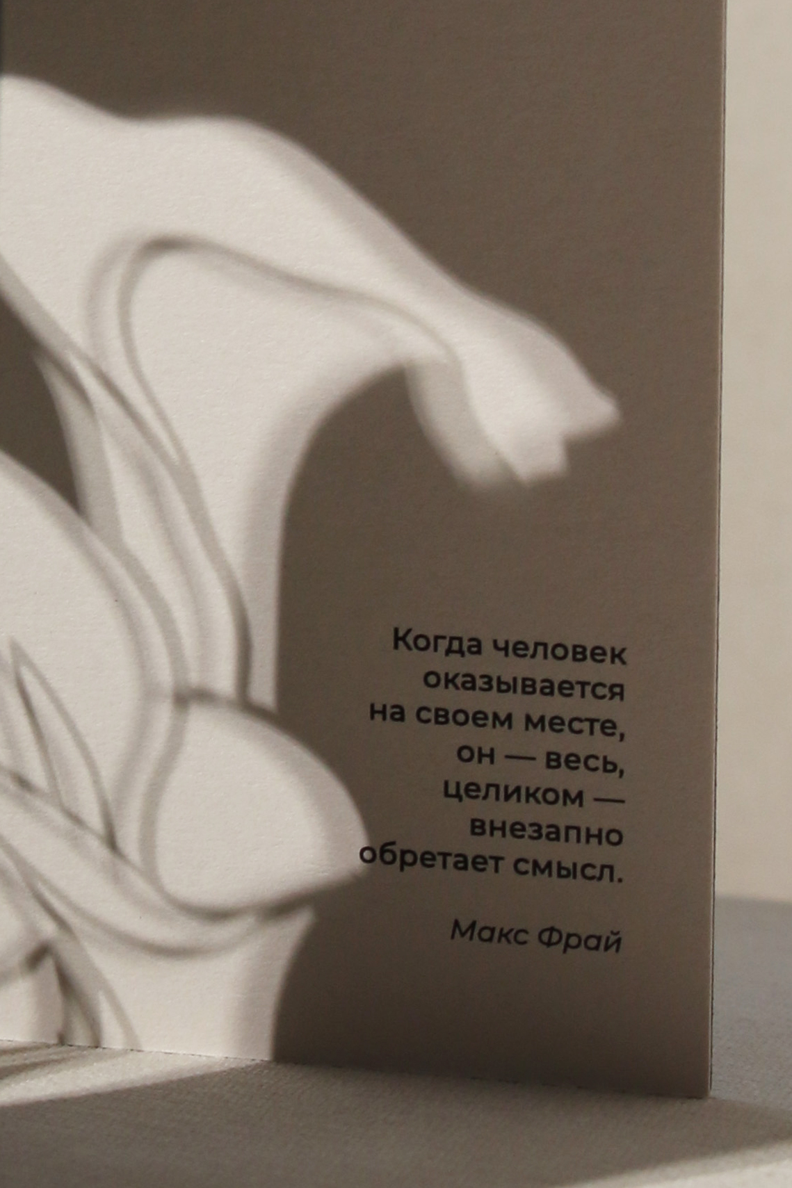
When a person finds himself in his place, he — all, entirely — suddenly acquires meaning.
Max Fry
Max Fry
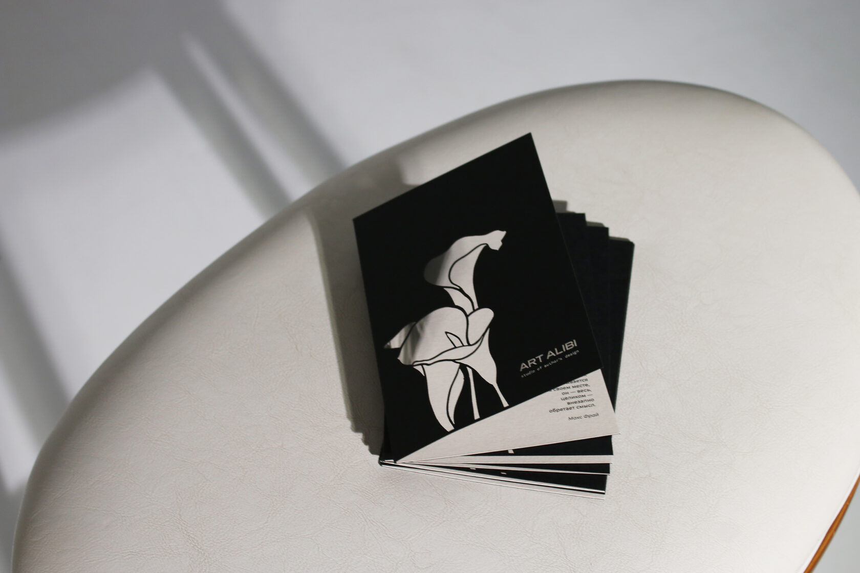
Client cards have a special meaning. When selecting the flowers for the card, we took the brand personality type "creative seeker" as a basis and turned to a professional florist for comments. Thus, we settled on flowers whose meanings and properties are consonant with the studio.
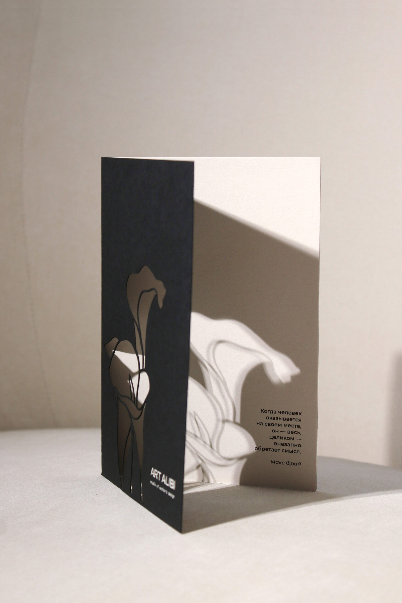
Olga’s choice was her favourite calla, a sophisticated, minimalist, pearl-coloured flower. A colour that unites branding and matches festive paraphernalia. The shape of the calla is reminiscent of the curved ladder that is the brand’s title image.
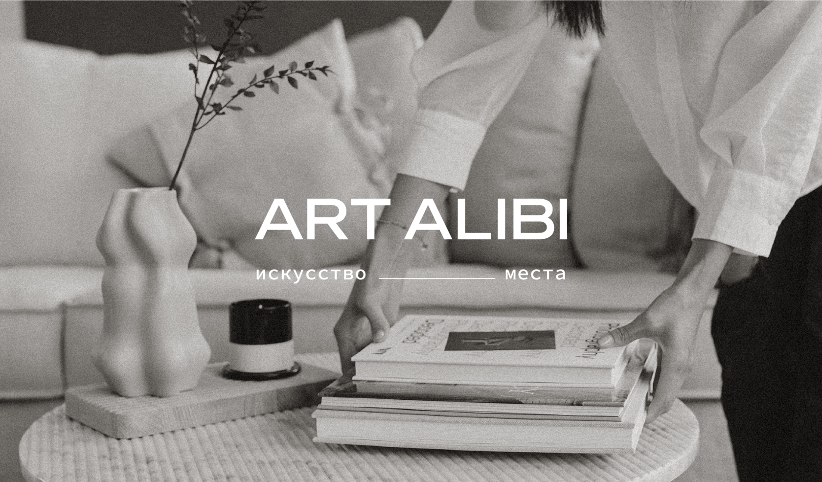
Creating an interior as an art object for those who care about expressing themselves through their home and feeling 'in their place'. In order for this to happen, it is necessary to build a trusting, sincere relationship with the clients. This is what ART ALIBI brand stands for and and its embodiment in the corporate style.


