


Branding case — SIMPLE INTERIORS


A new reality based on timeless values.
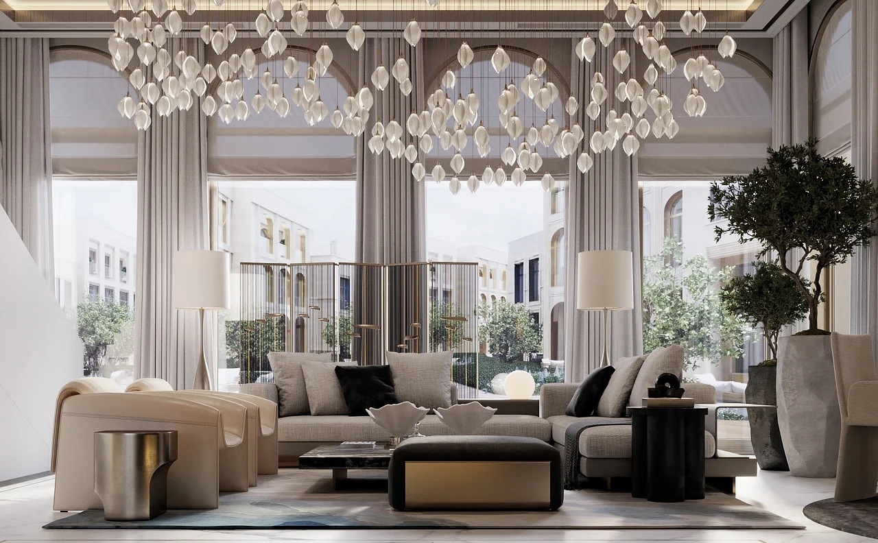
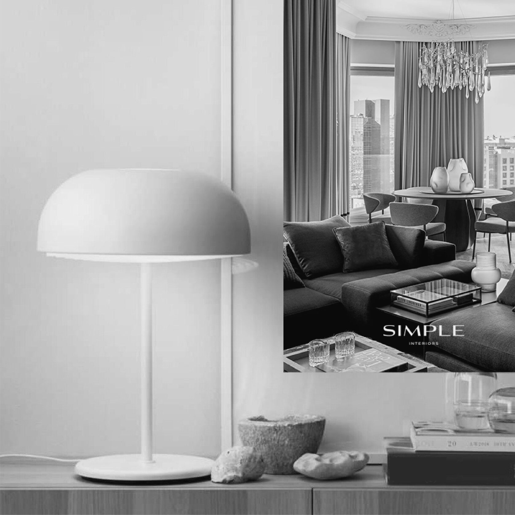
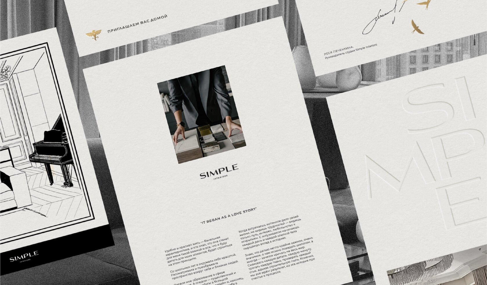
This is Simple Interiors and their gorgeous interiors for the most discerning, inspired clients from Russia, Europe, Cyprus, UAE, Miami. The founder of the bureau is the incredibly talented, free-spirited, determined and passionate Leesya Pechenkina. Simple’s creations have won prestigious awards and tickets for Lesya’s performances sell out within hours of the event being announced.
Our acquaintance began with the development of a new brief, followed by a presentation on the eve of one of the lectures. We created over a hundred slides together in just three days — sleepless and utterly drowning in a maddening, all-consuming creative process.
The magic happened and it was the start of our great friendship and extensive work — to create a new corporate identity, a multi-faceted identity and the most delightful website in the history of our office.
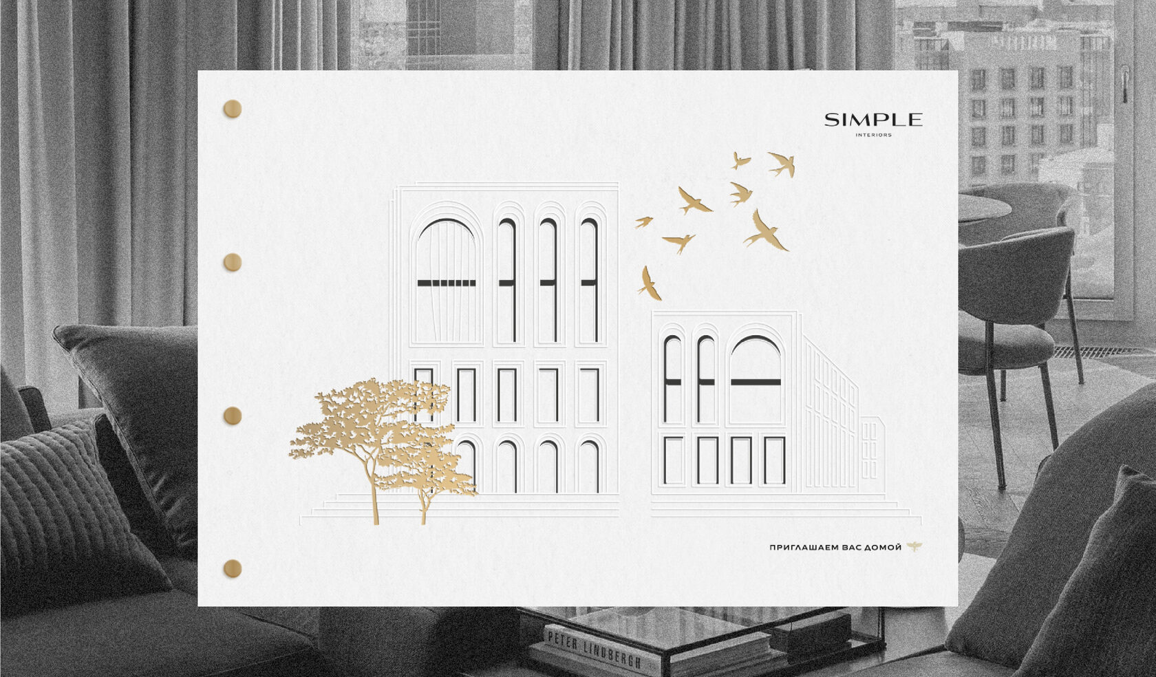
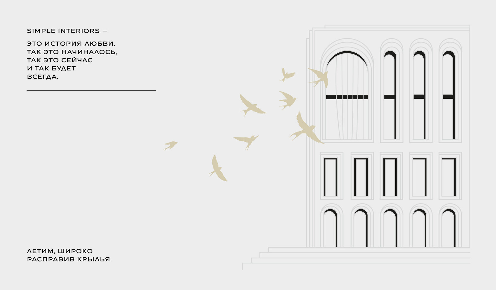
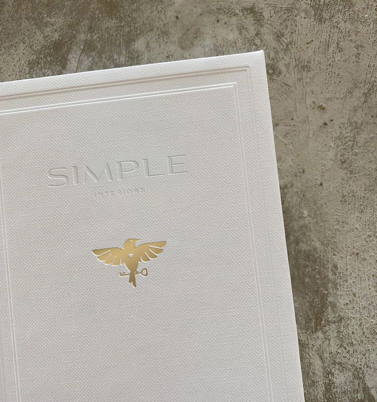
The world of Simple is flight. Passionate, exciting, above the sky, without borders or conventions. Birds are one of the iconic elements of branding.

The project at Caméo Moscow Villas is a particular pride of the bureau. The architecture of the complex in the style of Tuscan residences so inspired the Simple team that we took its idea as the basis for the corporate graphics.
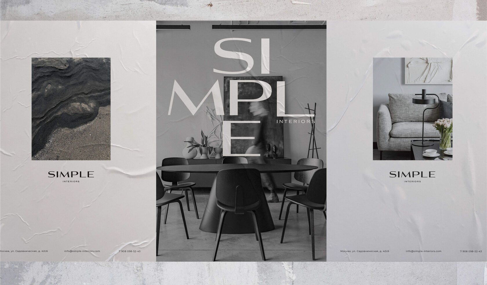
The logo is monumental and uncompromising, as if it has descended from the pages of world glossy magazines. A logo with lines and proportions which speak of the high taste of the office team. It is classical, minimalist and attentive to every detail.

A different reading of the logo and we see a new facet — trendy details, design experiences, boldness and an unconventional view of interiors. Contrasts, emotion, luxury of spaces — that’s Simple Interiors.
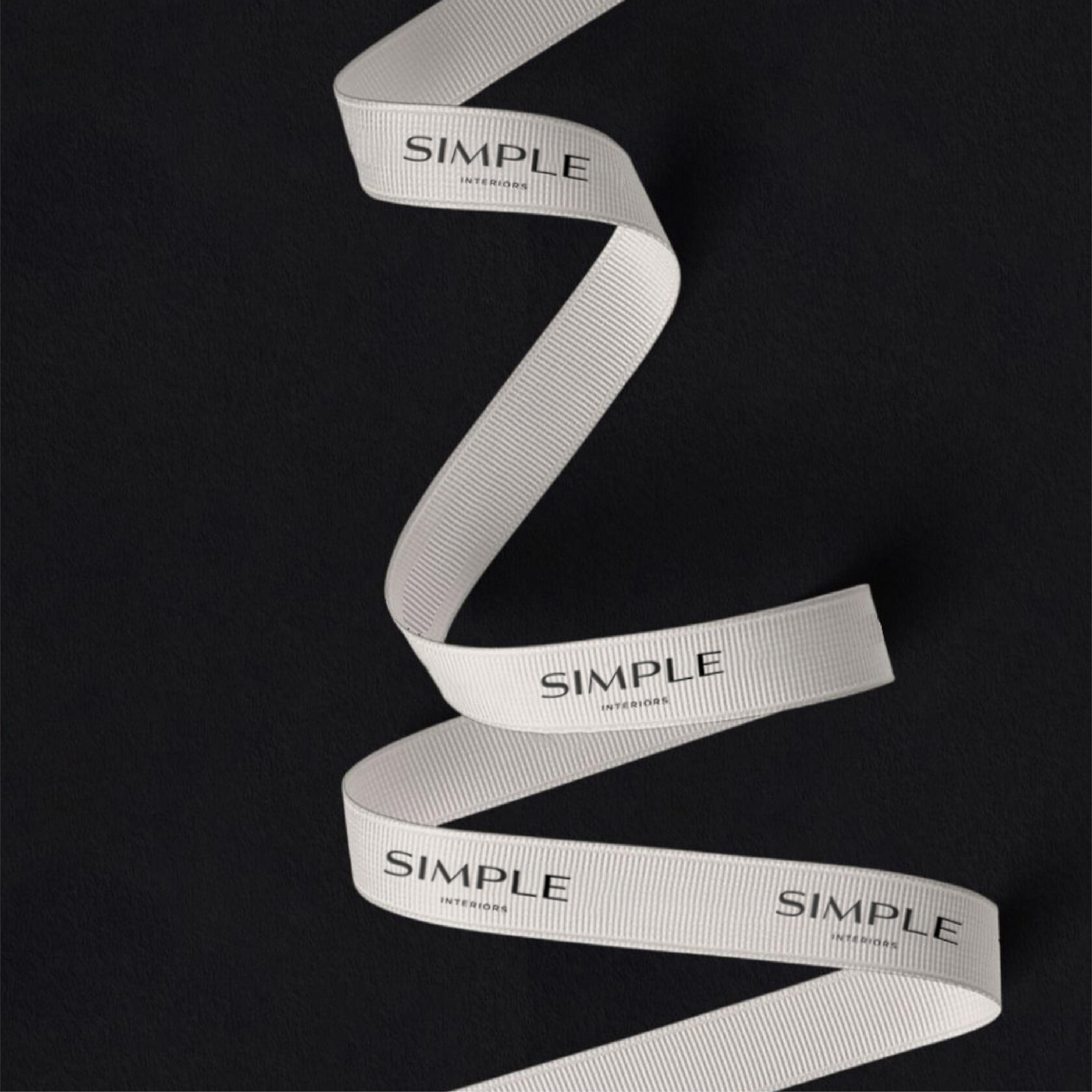
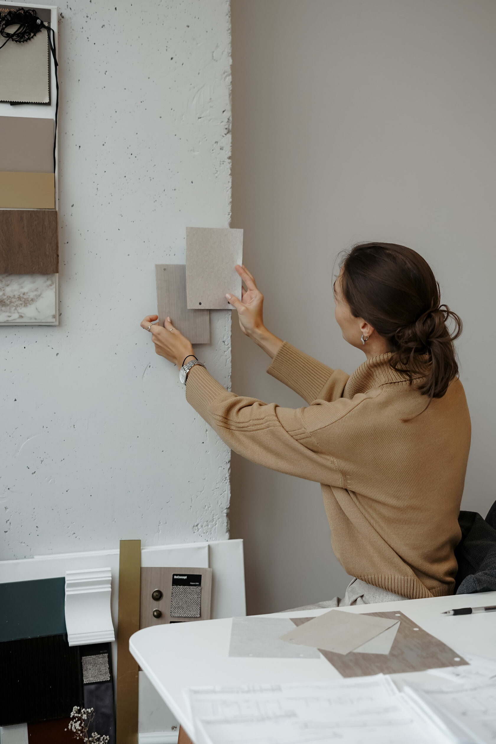
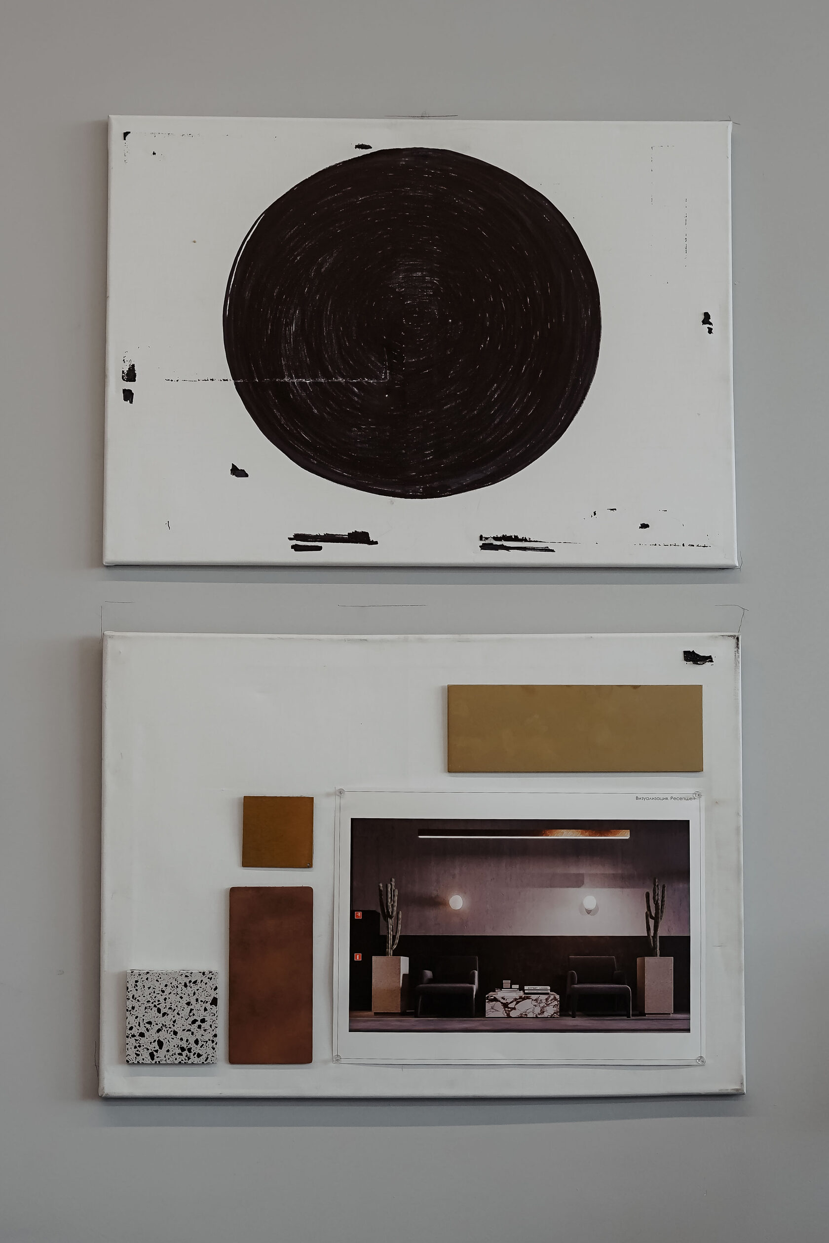
The clients of the bureau choose to enjoy life and surround themselves with beauty. The philosophy of pleasure from Simple Interiors is when you can give gifts for no reason, take care, and even lay out the favorite things of customers around the future home on 3D visualizations. Tying the finished project folder with a branded ribbon is like a compliment, like an aesthetic ritual.
The folder for the design project album deserves special attention. Thick cardboard, gold embossing and magnetic congreve. A work of art for Simple Interiors' incredible creations.
Bringing this idea to life was a real challenge for us and our partners. The format of the folder is considerably larger than the typographic clichés we have worked with before. The first test samples did not meet expectations — we had to rework the production technology. Tried again and again until we found the perfect recipe.
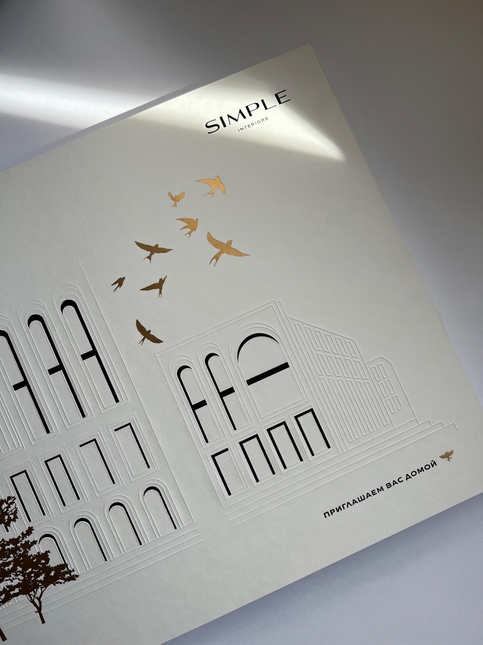
We have been working on the cover for the project’s album for about half a year, and we know for sure that there is no equivalent in Russia in the field of interior design.

A black document folder — like a tuxedo. Champagne, black tie, signing a contract. A celebration that marks the beginning of a big story.
The process is like art. Every detail finds its place and becomes part of a beautiful space.
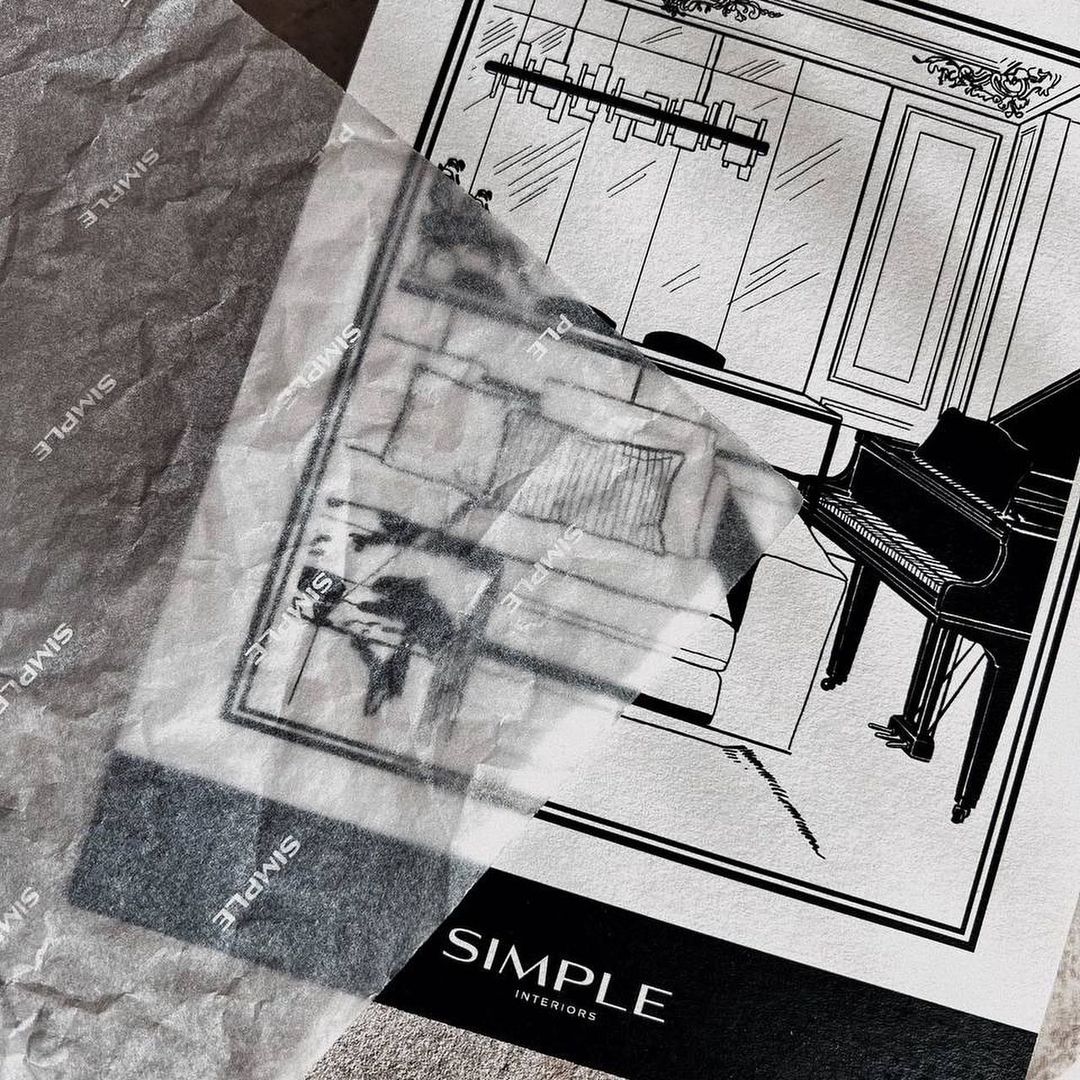
The bureau’s signature postcards. We drew stunning angles of Simple’s interiors to create company branded cards that can be signed at any time to attach to a bouquet or to complement a gift for clients and partners.
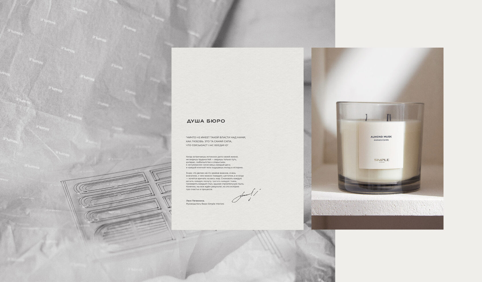
"When you meet the true cause of your life, you don’t see difficulties — you only see a path, an interest, a curiosity for discovery. With enthusiasm you start each day and with every cell of your body you feel your contribution to the story."
Lesya Pechenkina, founder of Simple Interiors
Lesya Pechenkina, founder of Simple Interiors
Light candles, pour a glass of Prosecco, put on some music and dance barefoot on a soft carpet! Or perhaps right on the paving stones? In 2020, the first series of exclusive candles for the home was the start of the bureau’s new direction, Simple Home.
The pajama line was a sensual extension of Simple interiors — in hues and impeccable fabrics. Clothes for home and relaxed going out are imbued with Lesya’s philosophy, her sense of life.
Simple Home pajamas are synonymous with inspiration and beauty. To take responsibility for the feeling of happiness, femininity and energy inside yourself.
Meet a courier in the morning, unpack a luxurious box and immediately put on a suit of flowing fabric. It will be the beginning of a new life.

Acting from the feeling of flying is one of the principles of Simple Interiors, symbolized by the golden bird.
From the first meeting with the client to the final realization of the interior takes more than a year. During this time, a relationship of trust and warmth is built. We have created a series of birthday cards to congratulate the clients of Simple Interiors on their birthdays.
When Simple Interiors celebrates its birthday — everyone celebrates! An animation for the bureau’s account. It’s got picture-associations, dynamics and life!
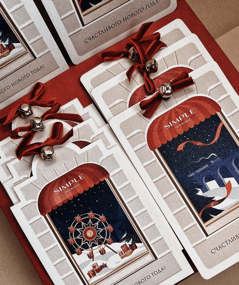
The execution of the New Year cards is a bit of a departure from the traditional style of Simple Interiors. We’ve added colour and allowed ourselves the liberty of fairytale themes. Supplementing the design are velvet ribbons in a perfect shade of scarlet, and real bells, which pleasantly ring when handed over. The tie-in to the brand’s philosophy is magic and an unbelievable love of the festive atmosphere.

Simple Interiors is all about energy. It is a passion that overwhelms us with its wave of new ideas.
Simple Interiors is freedom. It is the opportunity to create and create the best we can.
Simple Interiors is freedom. It is the opportunity to create and create the best we can.