Branding case — MISIA


MISIA DEVELOPMENT’s core business is creating premium real estate, from finishing luxury apartments to building high-teck apartment buildings. We met the company’s founders Roman Kuzin and Viktoria Matviychuk when they were just planning to enter the capital’s market. Impressive changes necessitated a new name and a corporate identity to make a strong name for ourselves in the most demanding region of the country.
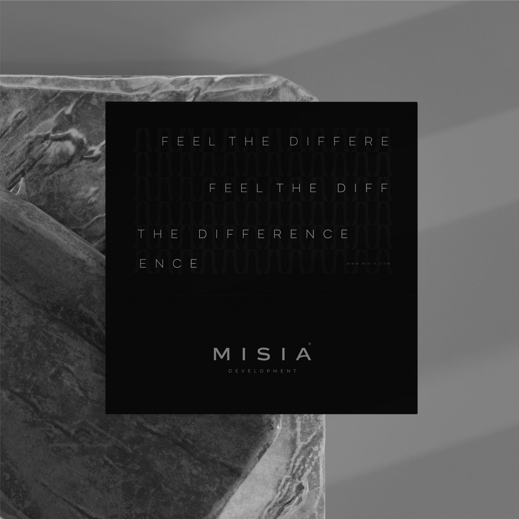
With the approval of our clients, we allowed ourselves to rethink the usual understanding of the corporate identity of construction companies and create something completely different. A new age phenomenon that sheds superfluous pathos and becomes maneuverable on bends. "Real estate ahead of its time" is a slogan that explains it all.
With the approval of our clients, we allowed ourselves to rethink the usual understanding of the corporate identity of construction companies and create something completely different. A new age phenomenon that sheds superfluous pathos and becomes maneuverable on bends. "Real estate ahead of its time" is a slogan that explains it all.
When developing naming, we turned to several semantic areas. We studied cosmic bodies and generated neologisms — at morning jogs, work meetings and family dinners. It was necessary to capture the intangible. To feel the power in the sound. "MISIA DEVELOPMENT" was the final one. Roman and Victoria felt it, and after some deliberation approved it.
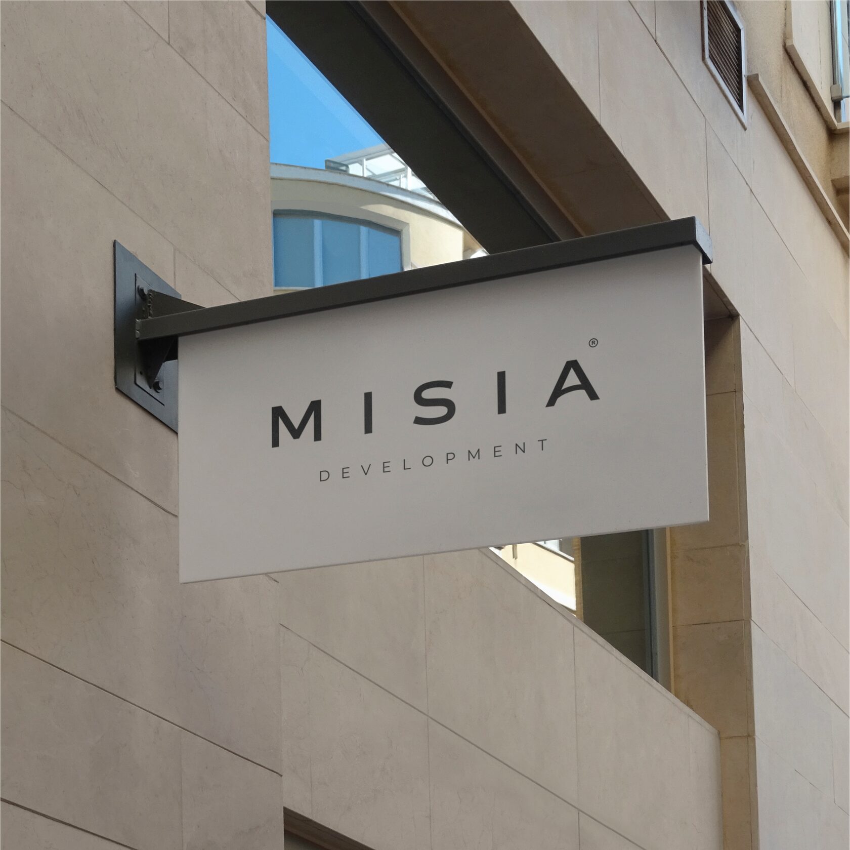

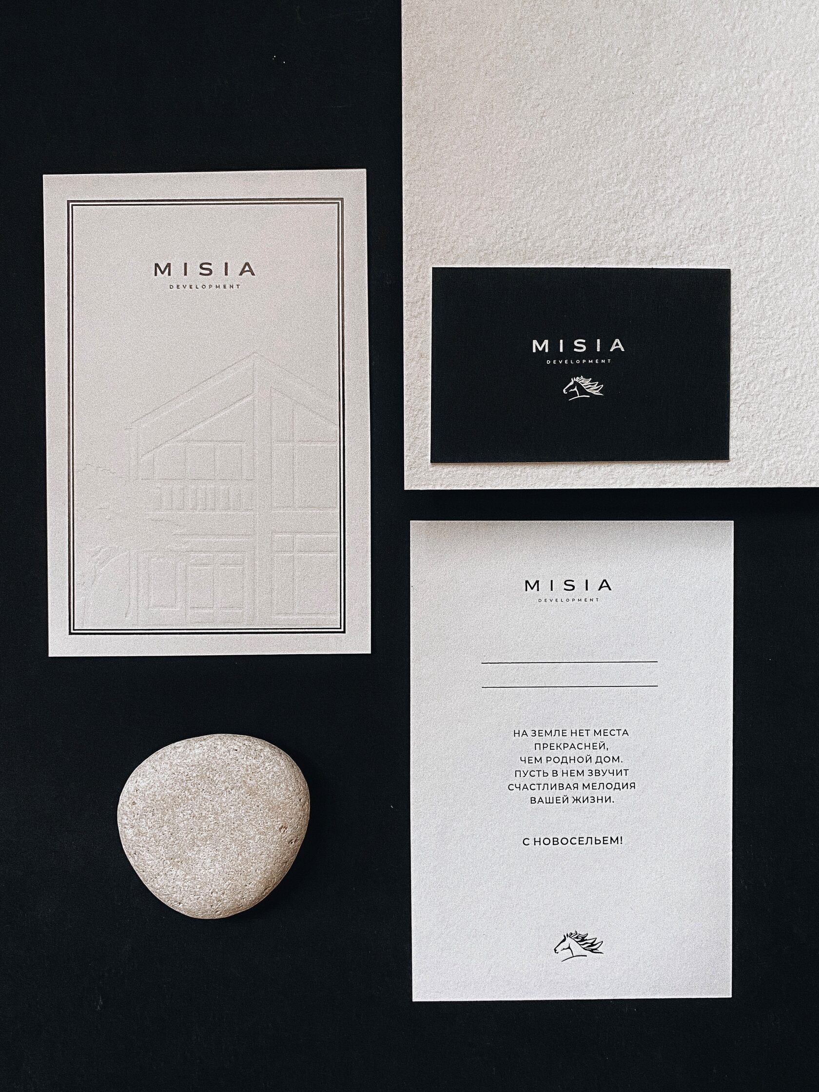
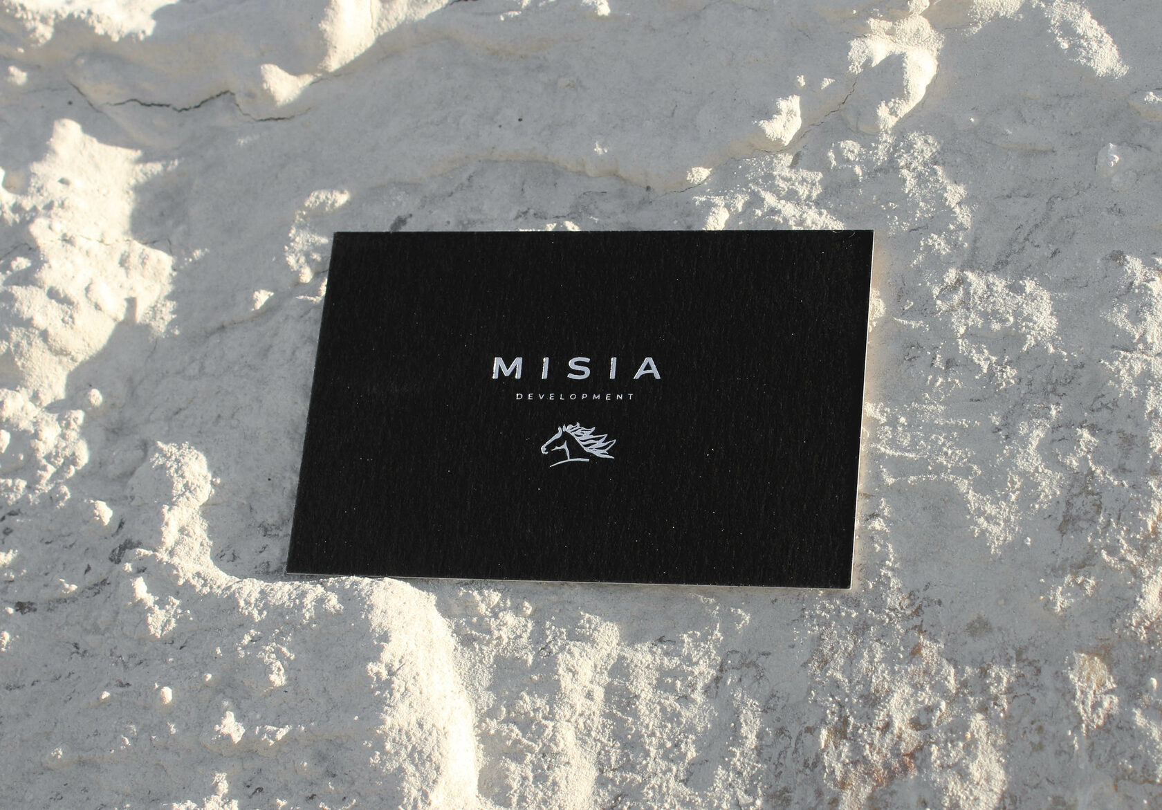
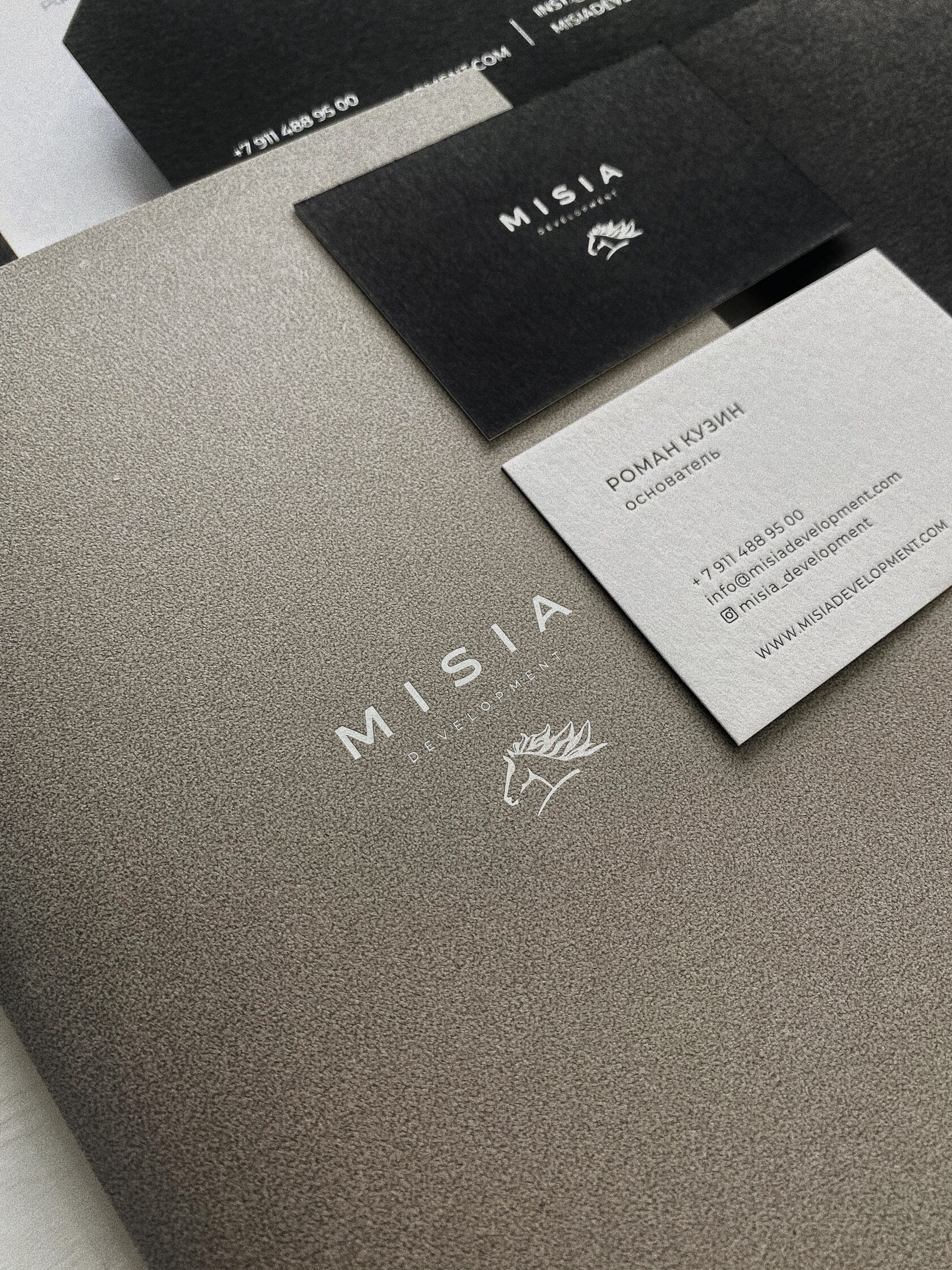
On the logo a horse rushing to the goal is a metaphor that reflects the principles of "MISIA DEVELOPMENT": reliability, intelligence and undeniable beauty. In this image, life, speed and strength are qualities that are unconsciously read and lie at the heart of the impression.
The visual rhythm is set by the dynamic rung in the letter 'A' and the decisive final touch at the iconic part. Harmonious, like the space created in "MISIA DEVELOPMENT".

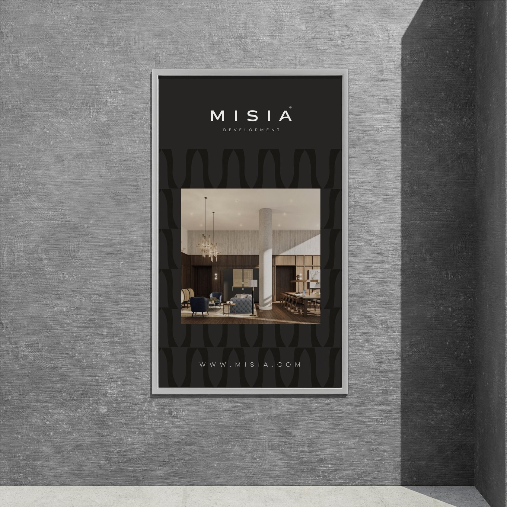
One of the company’s main goals is to show customers the aesthetics of renovation. Even beyond the construction site. Providing a high level of service, care and attention.
The inspiration for the iconic part of the logo was an art object in one of the hotels in Dubai, where Anna Fortuna was when we conceptualised the logo. The horse is fast and powerful, rushing to the left. The image is from Arabian culture, where from right to left is forward movement. We did not change this direction to commemorate the history of the logo.
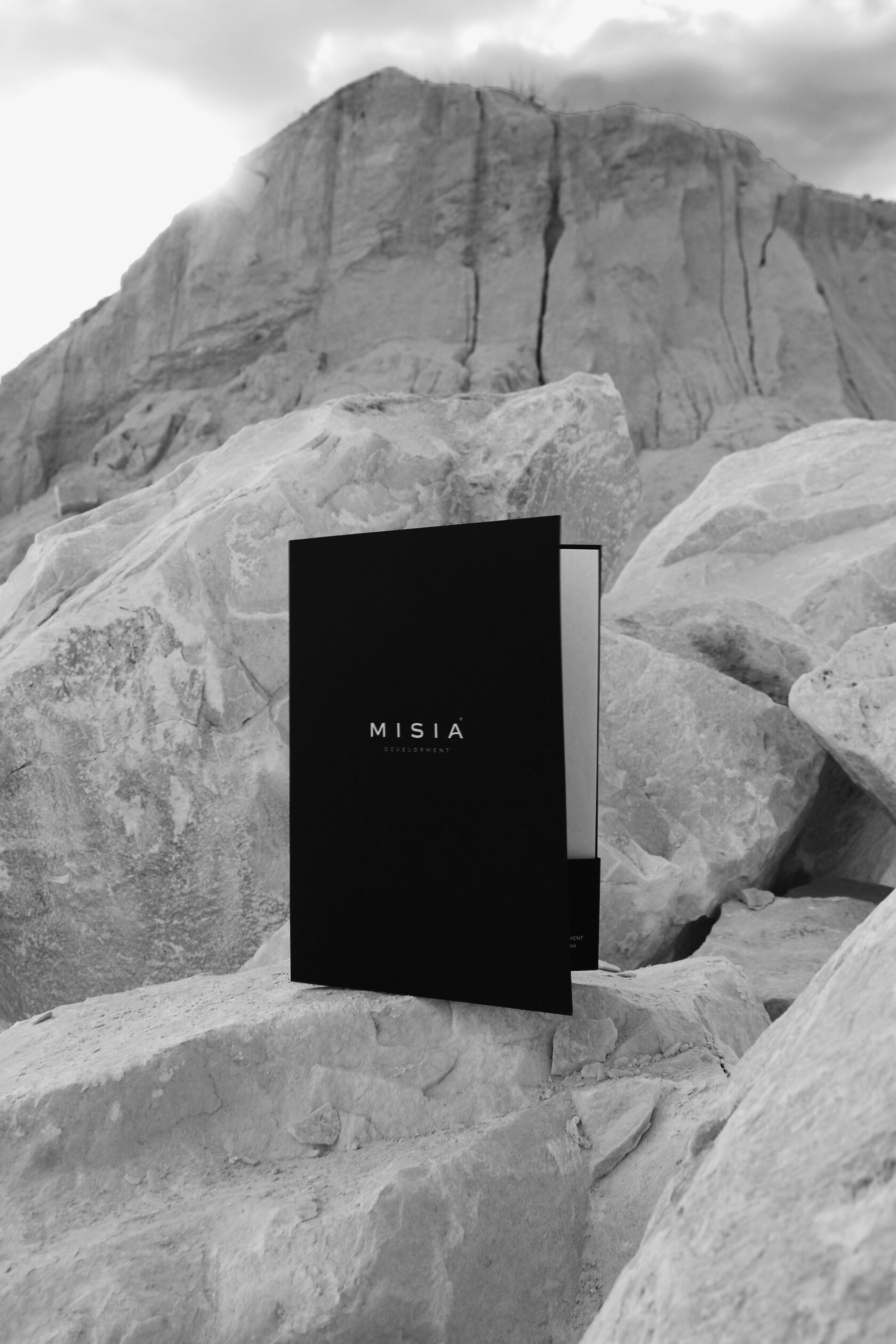
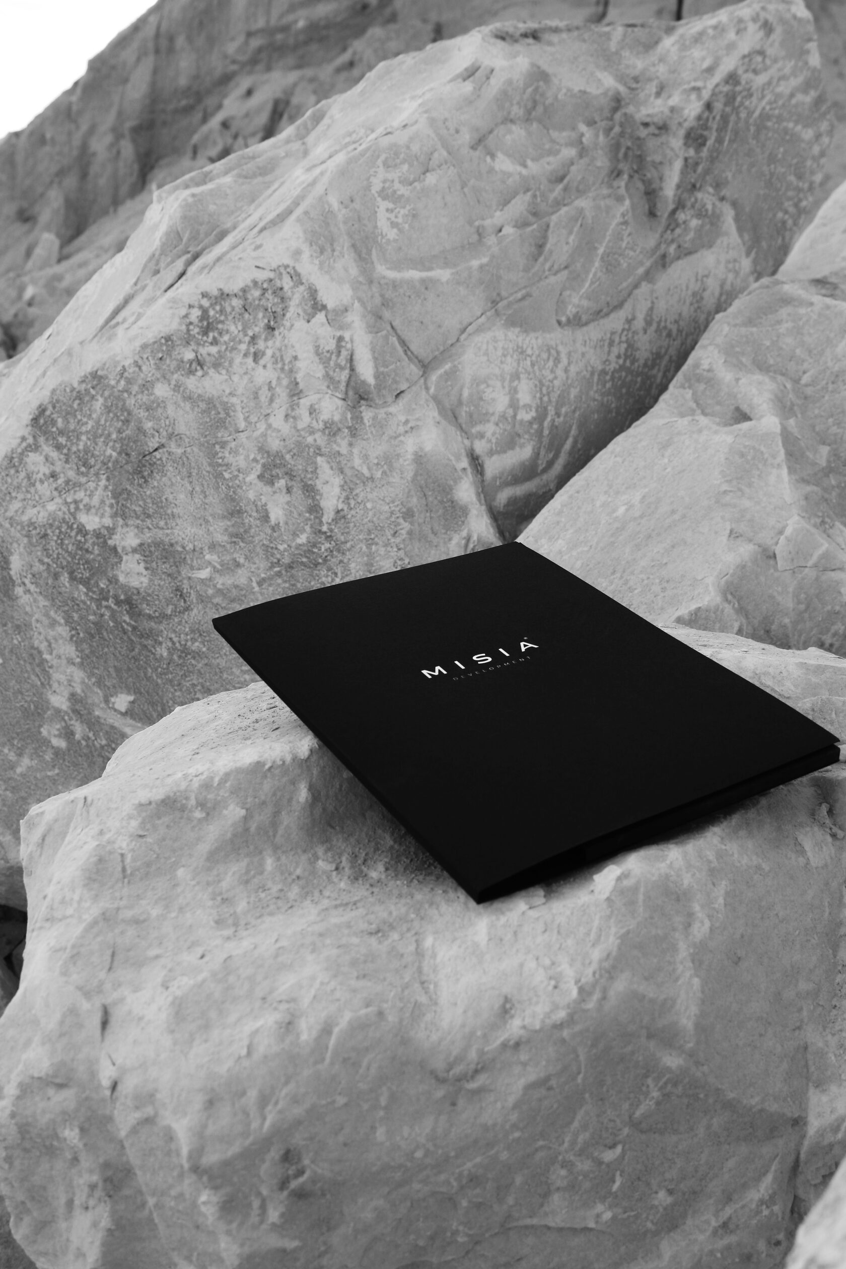
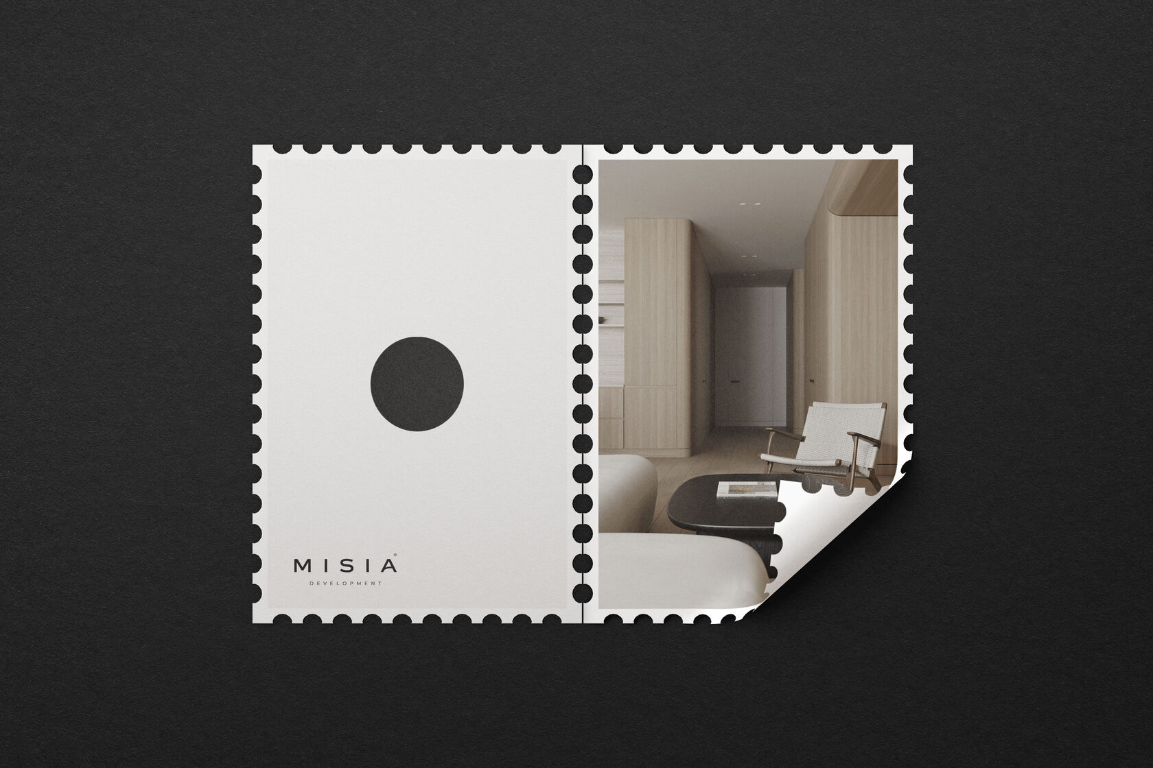
With an emphasis on quality and longevity, "MISIA DEVELOPMENT" provides customers with durable real estate that will keep them happy for years to come. For a company with this message, we created a corporate identity that is elegant, status-oriented and credible.
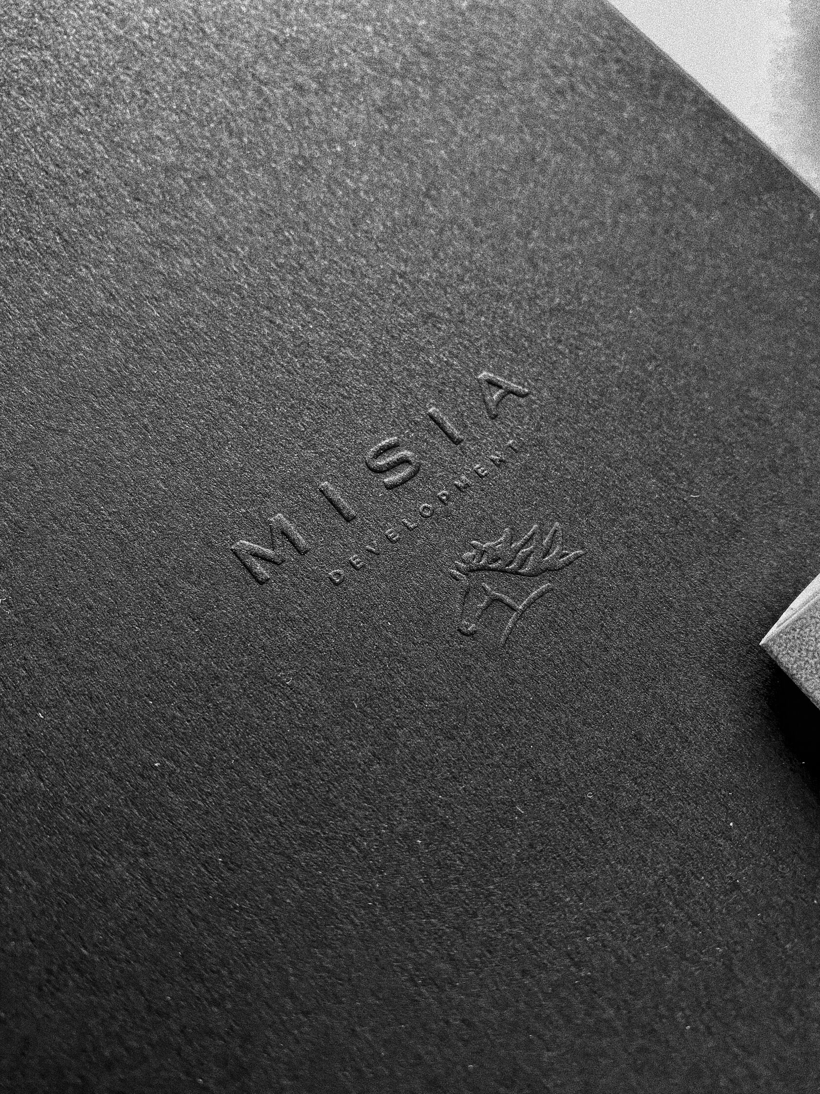

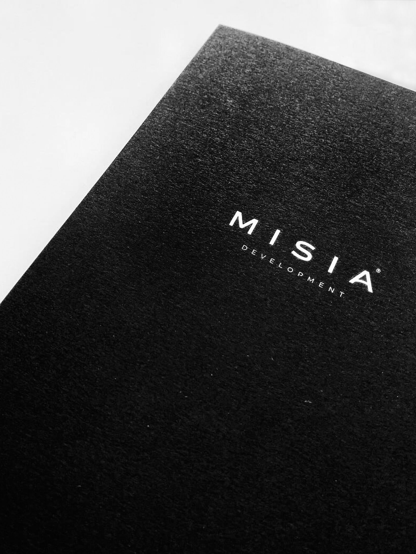
Elegant black colour with a voluminous logo. Details are what distinguish professionals and true aesthetes.

The "MISIA DEVELOPMENT" team takes responsibility to make renovation an enjoyable lifestyle, freeing its clients from complex tasks and leaving them to enjoy the process and the result.

When signing a contract, you can always complement the happy moment with a nice gift — a branded notebook and an elegant pen.

Corporate identity gives the company a new round of development. This applies to customers, who have a first impression of the brand, as well as to business owners and employees, who proudly and happily present themselves in the market.

Branded uniforms as the basis of discipline and order. A branded polo-shirt is an important detail that partners and clients are sure to note when they visit a building site.


When designing author’s New Year’s cards, we hand-painted the facade of a real house created by "MISIA DEVELOPMENT".


With special attention we approach the writing of congratulatory texts. First of all, inspired by the true values of our customers and their sincere desire to delight partners and customers.
A corporate identity whose meaning extends beyond the construction of real estate. It is much more — a desire for a new reality, for a new comfort and standard of living!