Branding case — Marmel


Magnetic, enigmatic and filled of history, The Marmel Home project. Here, the soul of magnificent buildings is intertwined with the embodiment of the author’s interiors. A deep, impressive and sensual corporate identity for Margarita Melnikova’s interior design studio.
The work began with naming and continued with the development of a logo, branded graphics and graphic elements which fleshed out the stylistic narrative of the character of the studio’s interiors.
The work began with naming and continued with the development of a logo, branded graphics and graphic elements which fleshed out the stylistic narrative of the character of the studio’s interiors.
An expressive nym is made up of the first syllables of the founder’s first and surname: MARMEL — the embodiment of Margarita Melnikova’s creative side of life. Try saying The Marmel Home out loud. Can you feel the energy and intrigue? Like the title of a book, on the pages of which lie the stories of the most beautiful houses.
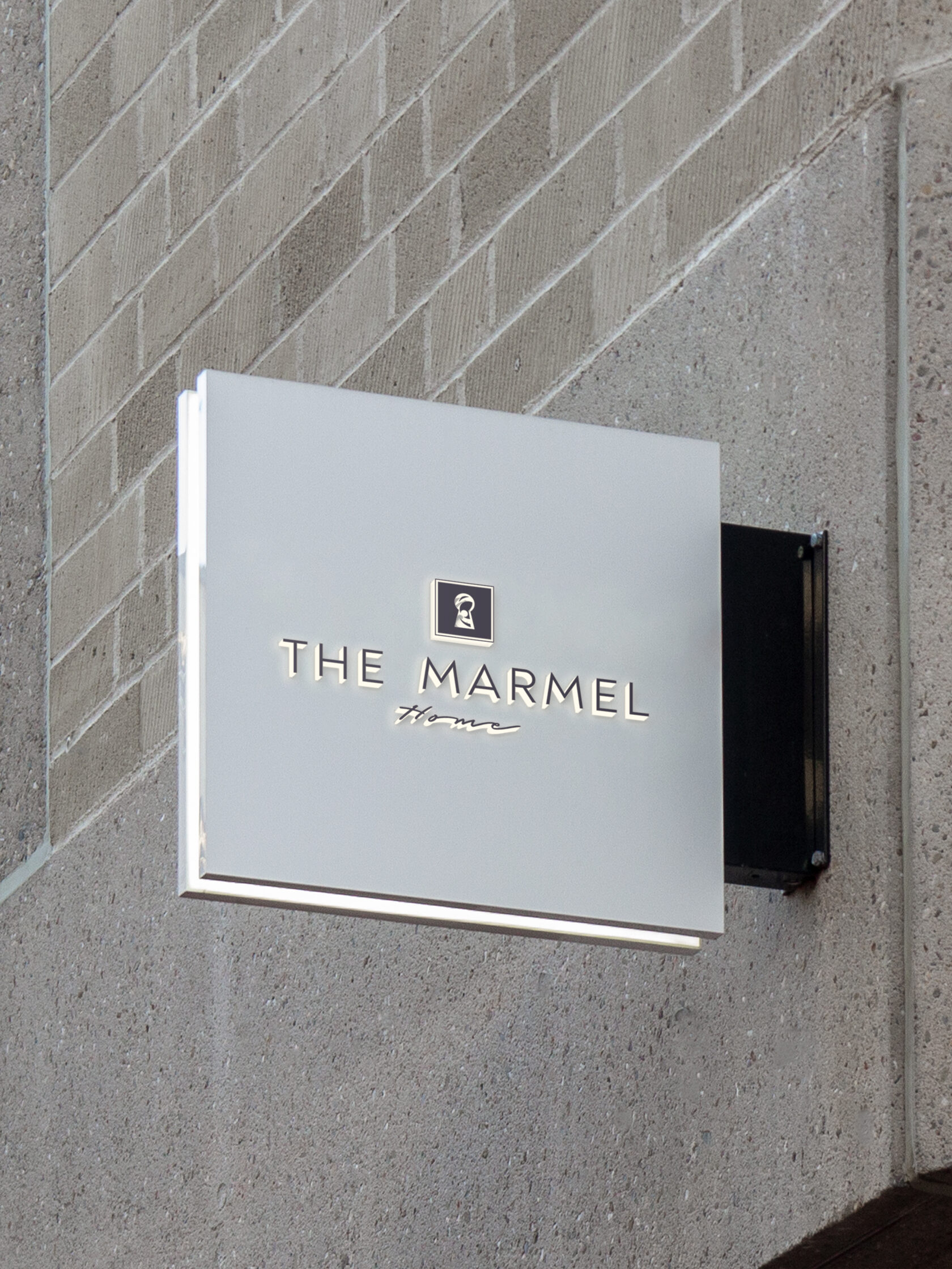
A concise logo with clear contours, softened by a wave of descriptors. The rhythm continues in the combination of straight, geometric and soft lines in the iconic part of the logo. This is the keyhole of the house, behind which is the incredible, magnetic world of interiors.
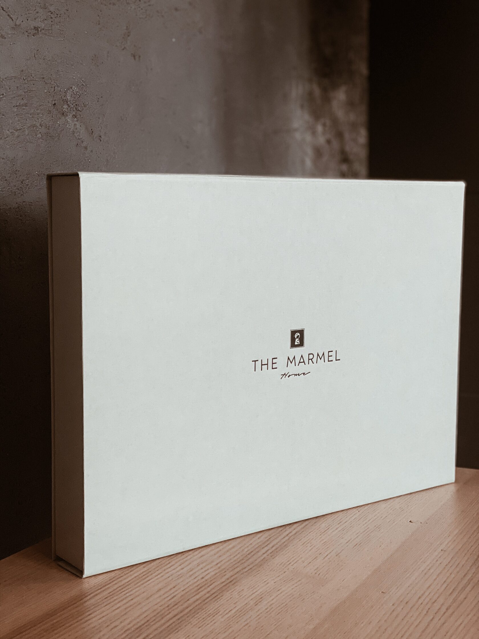
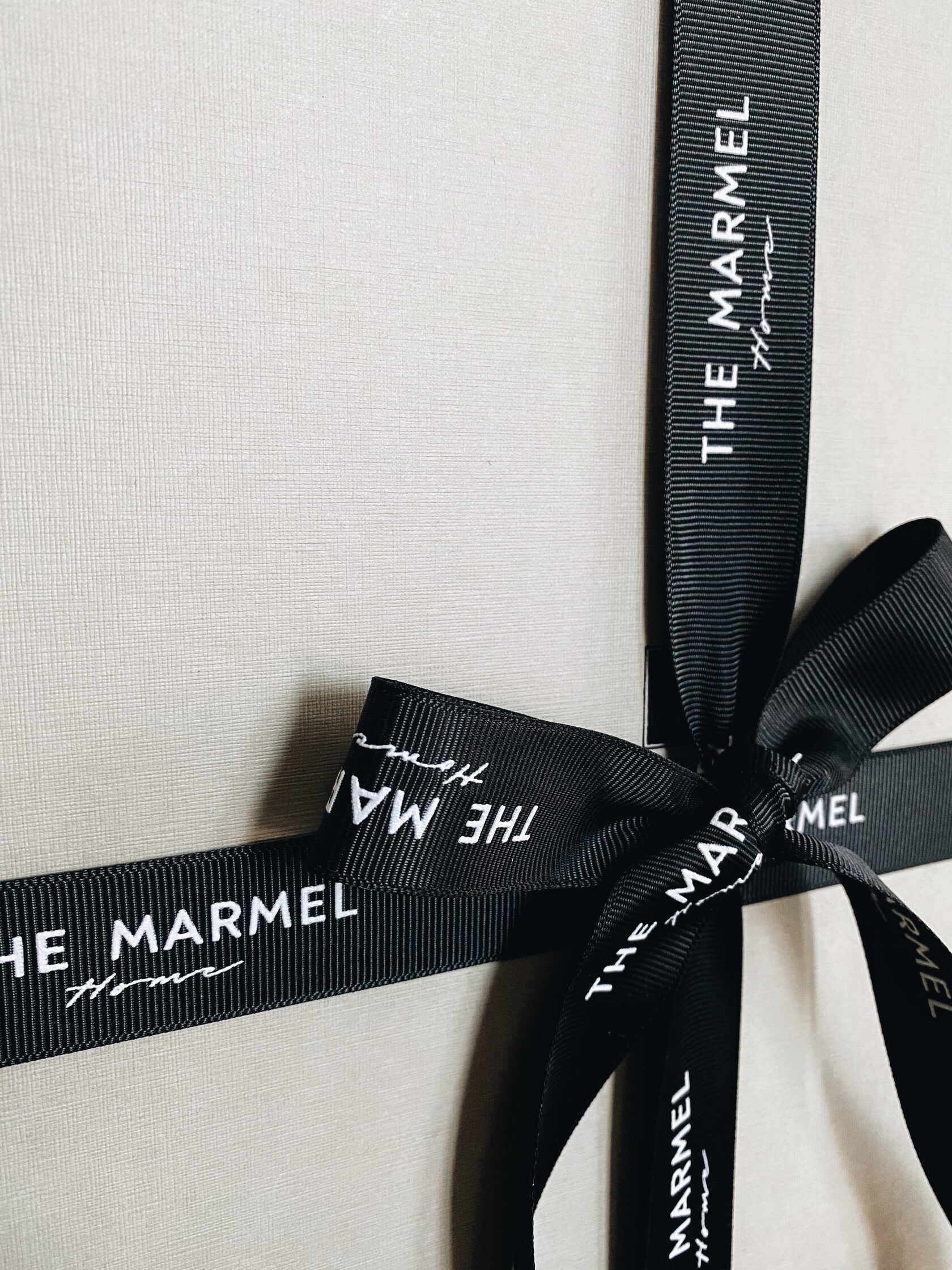
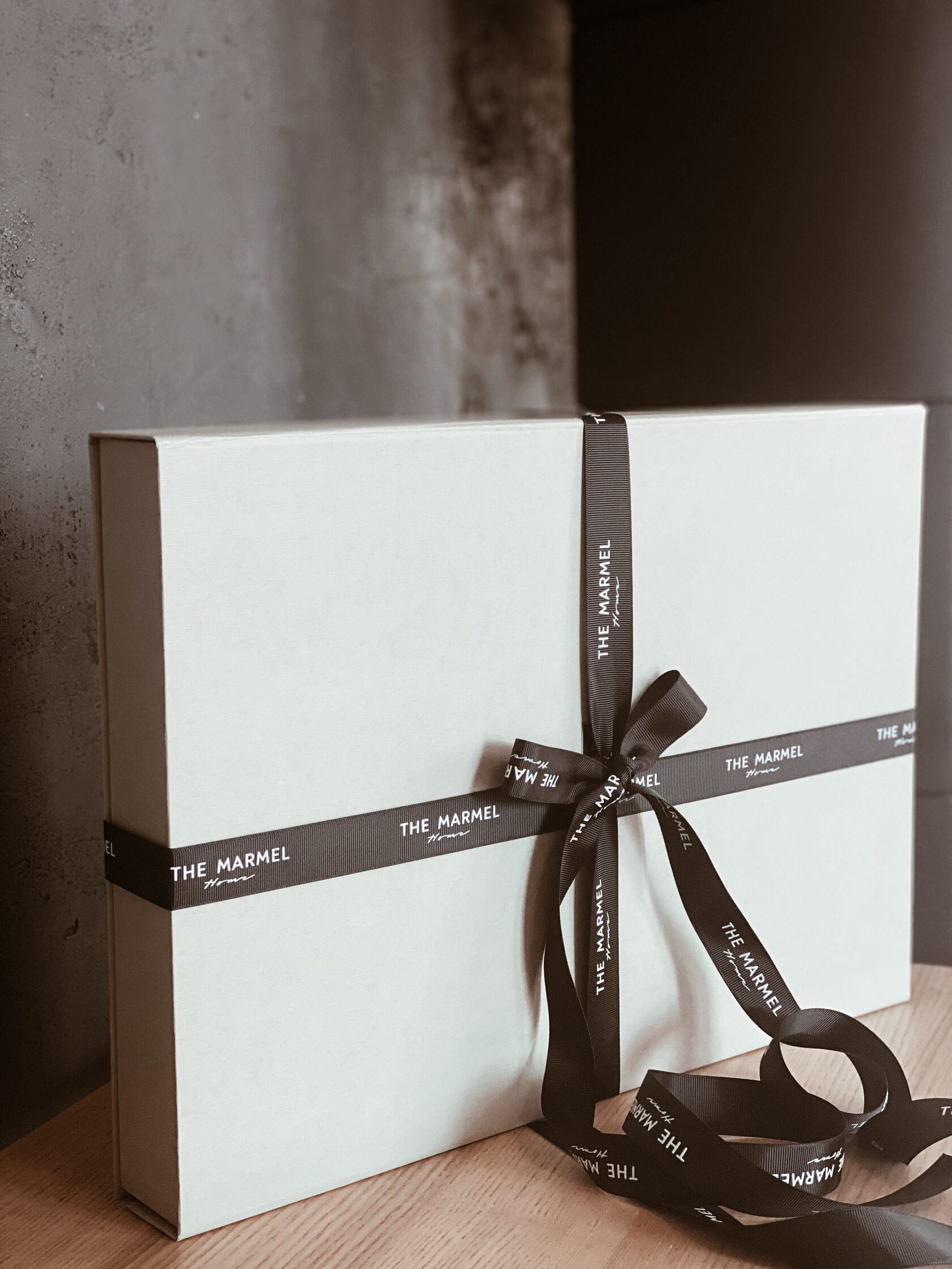
The light-colour boxes for packaging of design-projects are made of thick textured cardboard and decorated with a black flowing ribbon with the company logo. The logo on the lid of the box is embossed with black foil. The impressive look matches the contents — an album with a superb design project.
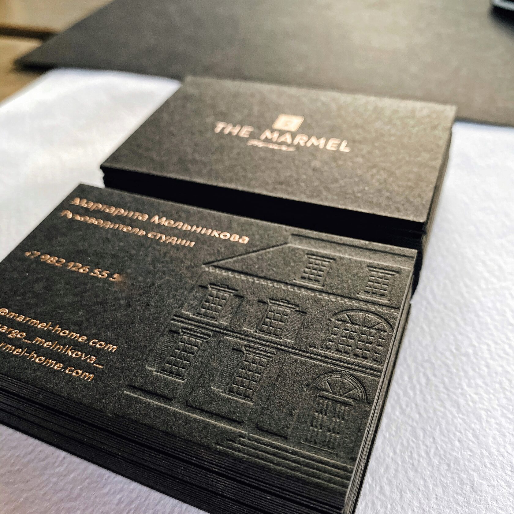
We hand-drawn the house as the brand graphic for the project, which is fully or partially used on the brand identity media. A house of carefree living, where there is a dip in champagne, an aperitif on the terrace, a dinner in good company, and dancing at dawn.
In front of us is the entrance to the real Centre of Attraction. Each of them has their own, according to their soul.
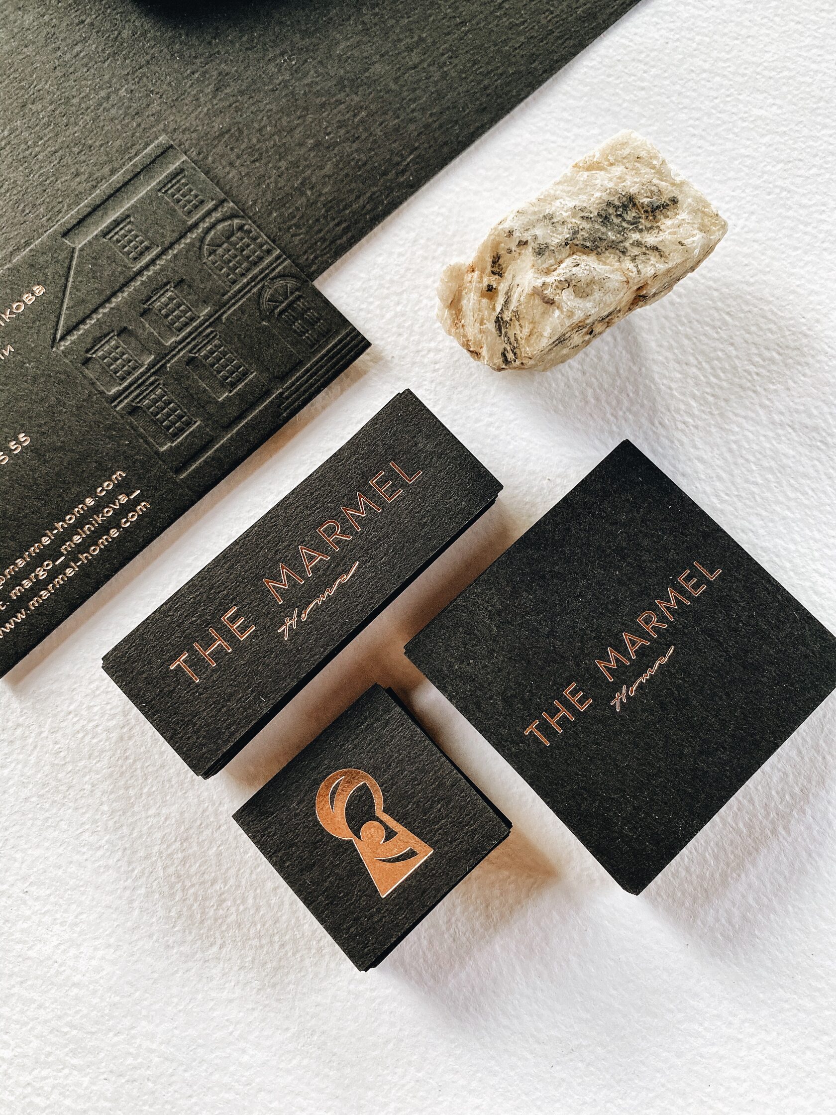
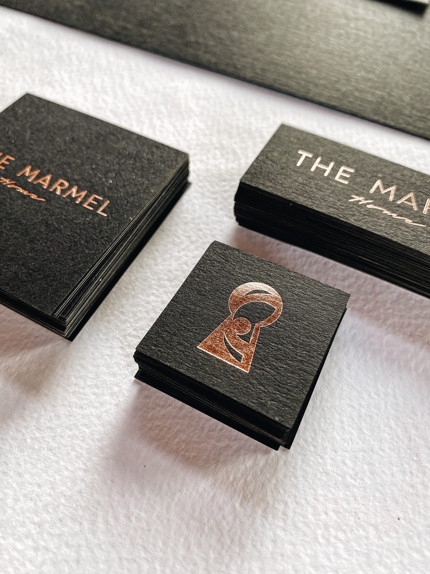
The designer’s black textured cardboard was the basis for all the printed elements of the brand identity. The lettering and symbols on the company cards and stickers are embossed with copper foil and the blint embossing embossing perfectly reproduces the texture of the Marmel House.
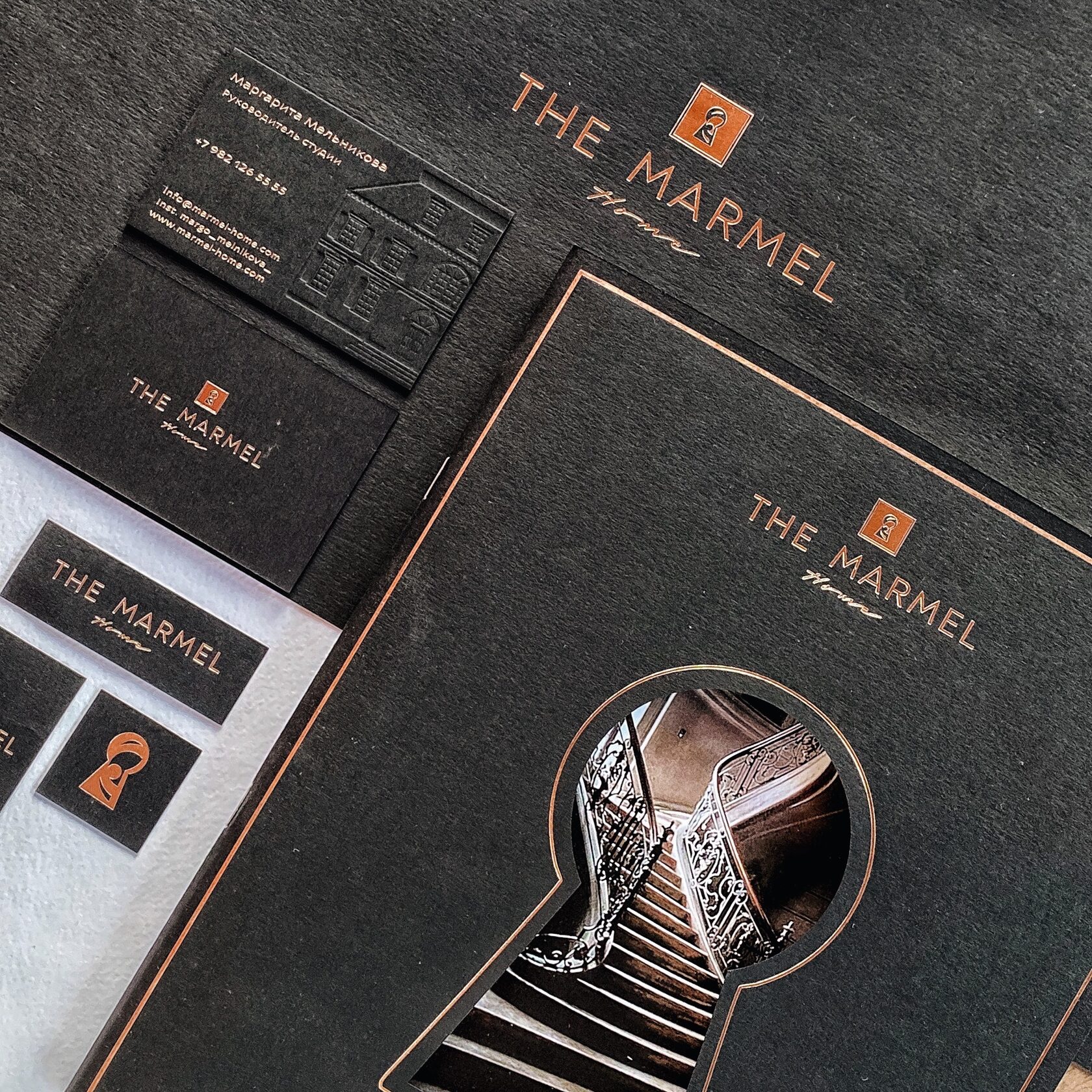
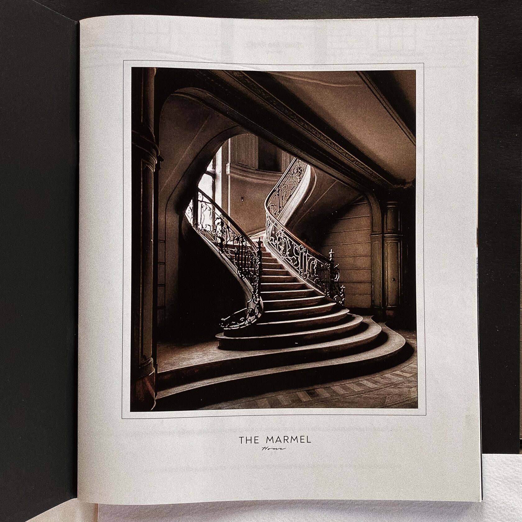
The cover of the brief is made of textured matte paper. There is a keyhole cut out in the centre, through which we enter the magical interior of Marmel. When the cover is closed, you can only see a part of the staircase’s curve, but when you open it, an attractive path upwards, towards wish fulfilment, appears before us.
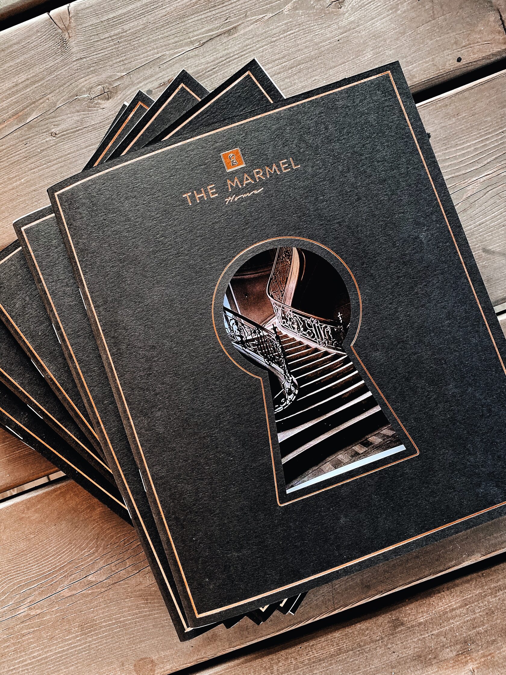
Every element reflects the company’s style. A unique design, lovingly crafted for The Marmel Home.
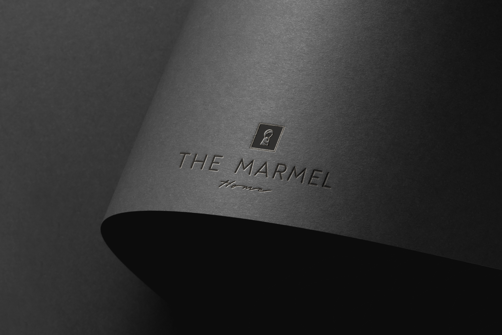
The colour palette of the identity elements is noble black and warm white, with accents of copper or rose gold texture. Graceful conciseness, sensual luxury and a drop of magic.
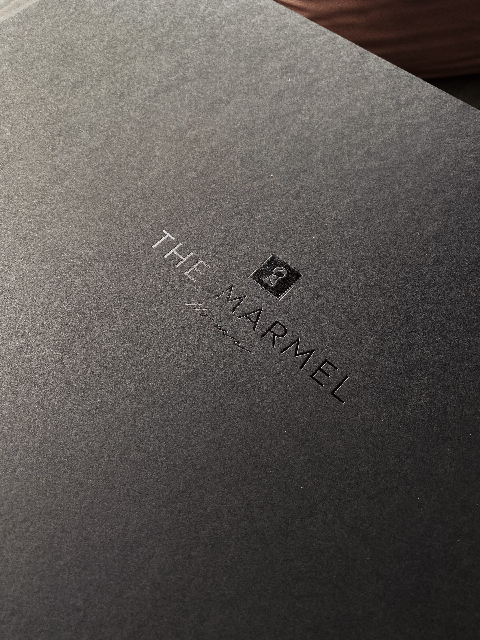
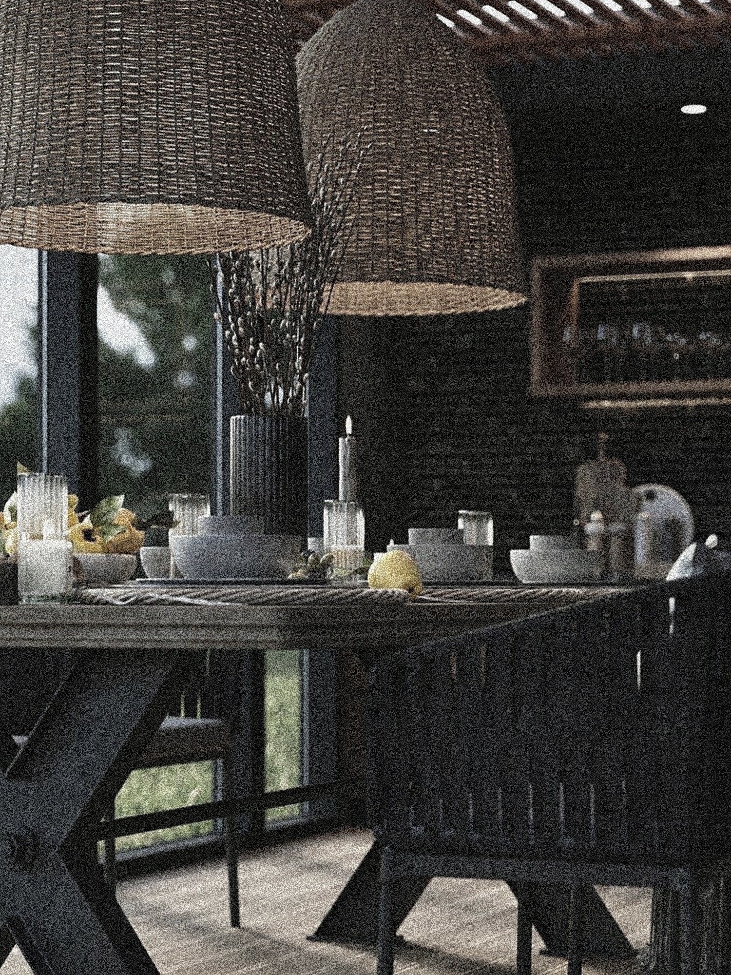
The art of attraction, dream catchers and eternal dreamers — the home of Marmel, where everyone will find what they’ve been looking for.


