


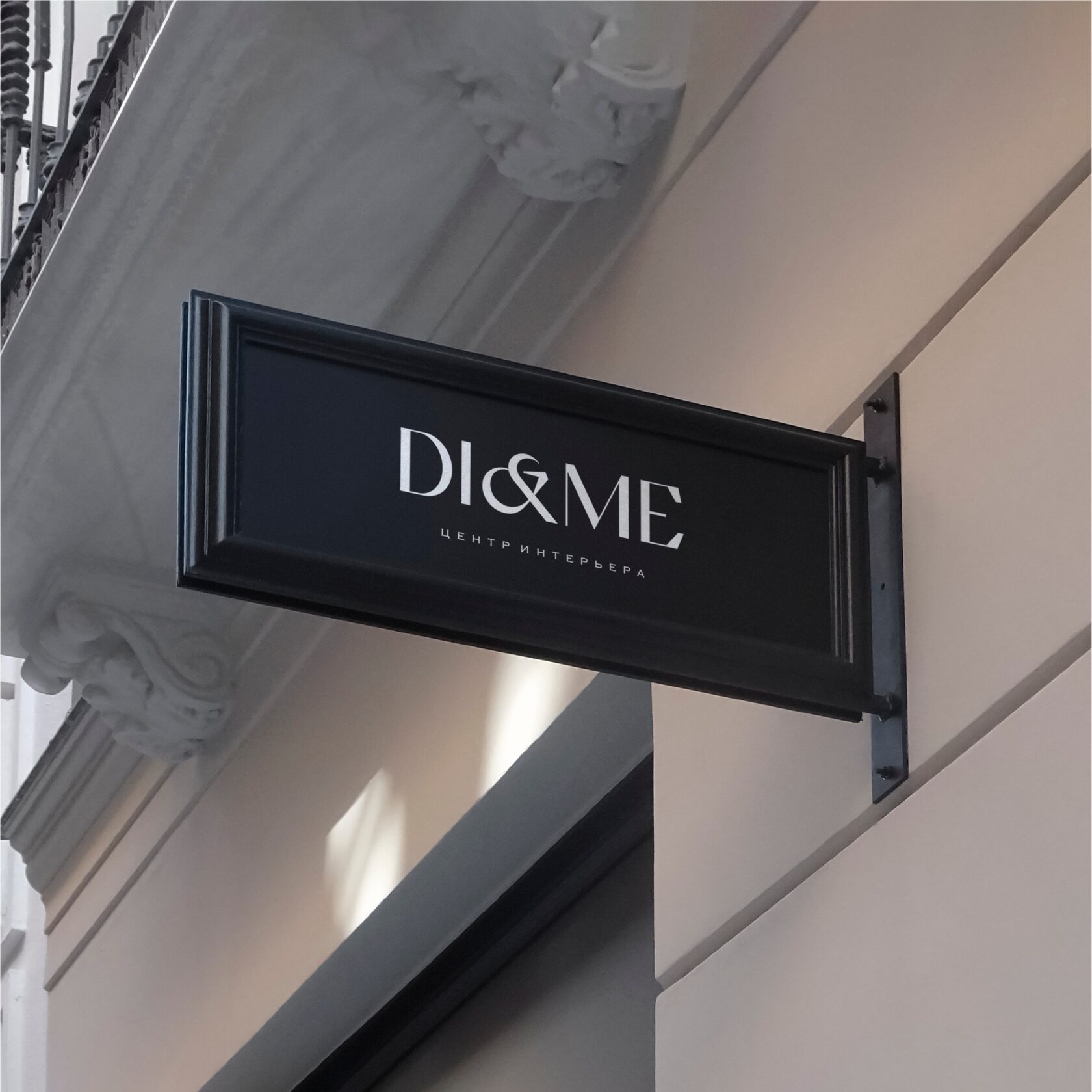
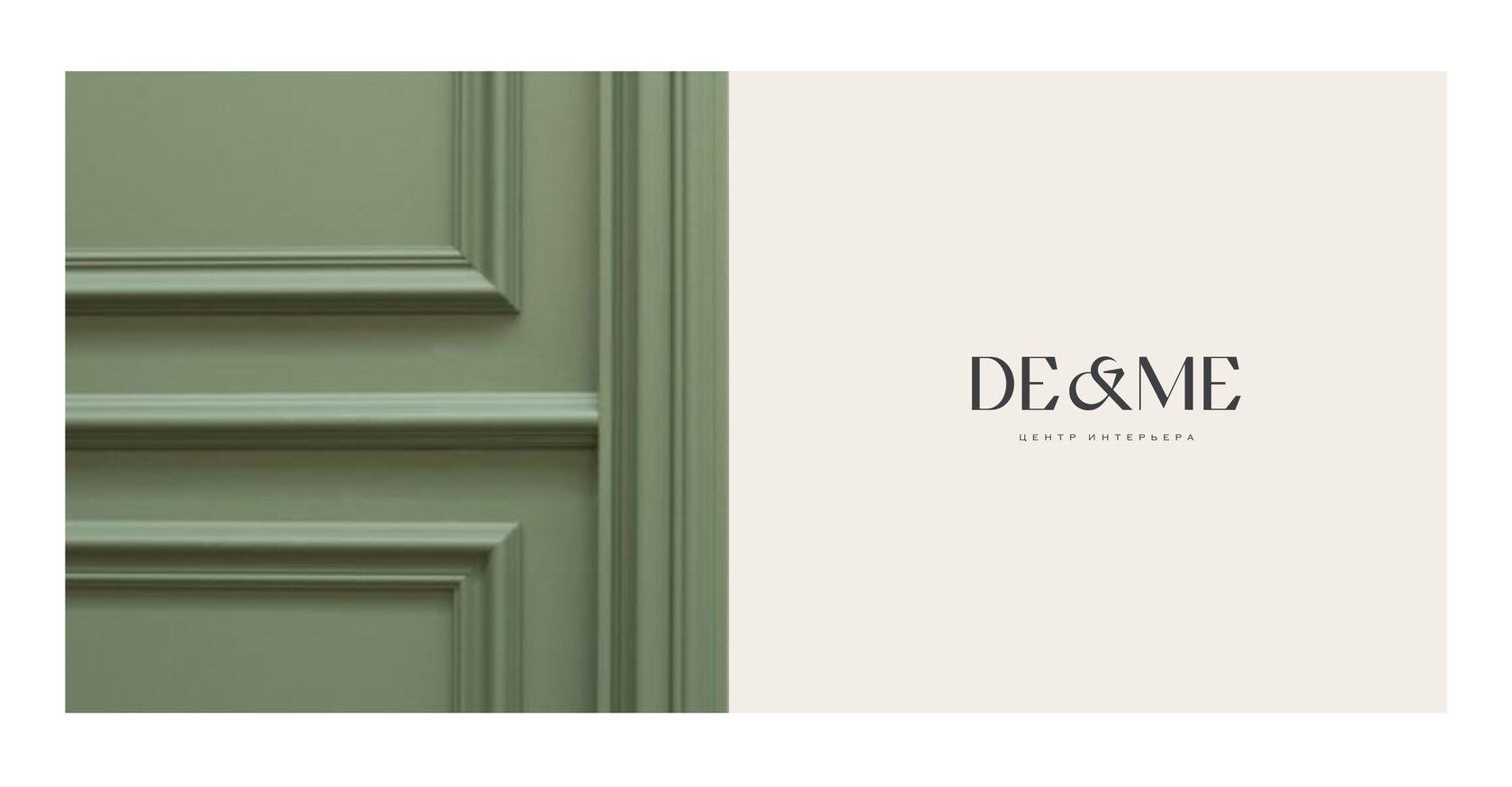
Branding case — DI&ME
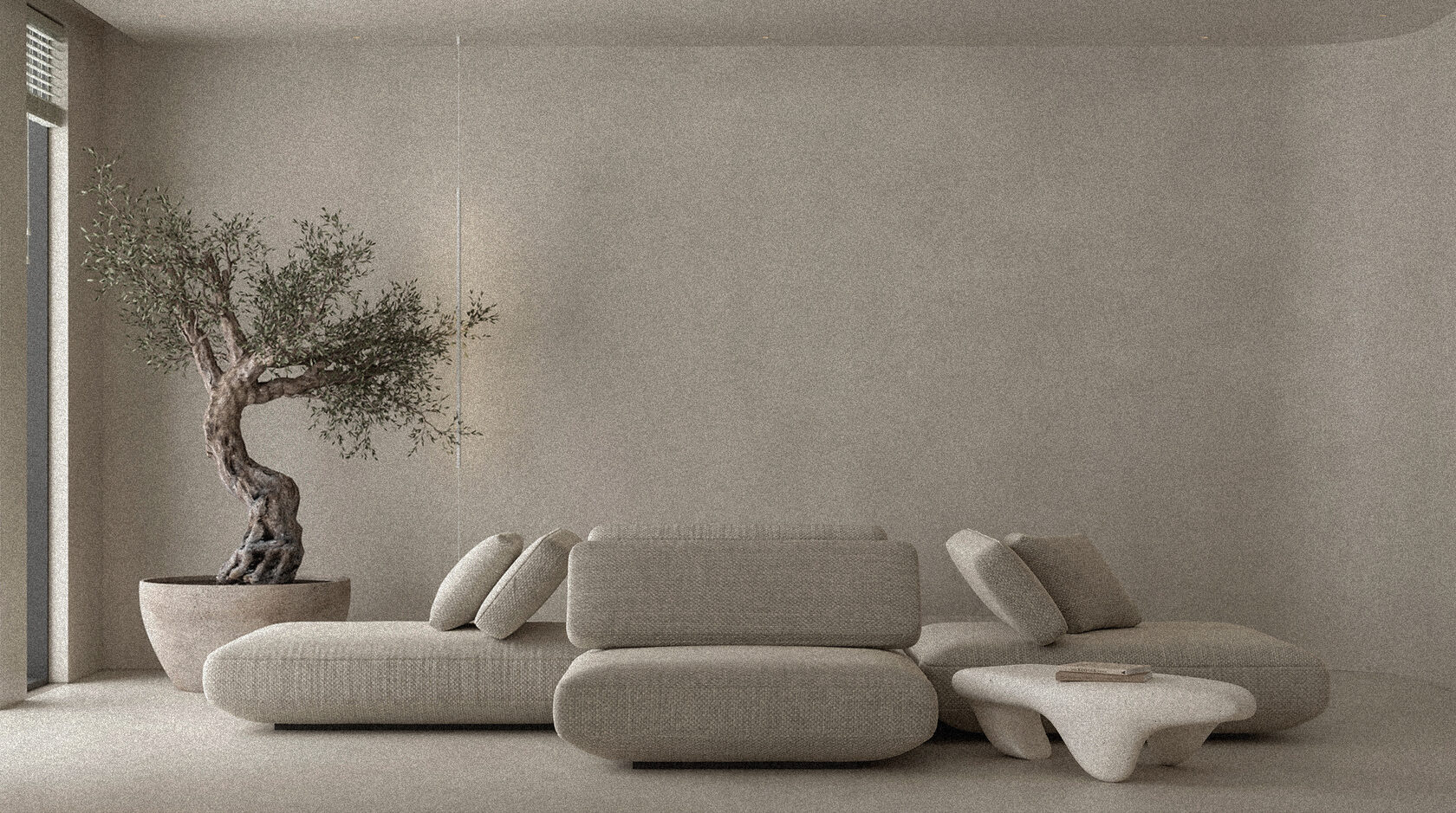

At the centre "DI&ME", filling an interior becomes a fascinating game, a meditation, an aesthetic pleasure. For 15 years, the company has been helping designers at the completion and realisation stage throughout Russia, as well as in the UAE and America. The founders of the centre approached us with the inspirational challenge of creating a new and unique visual identity for the company which would correspond to the world level.
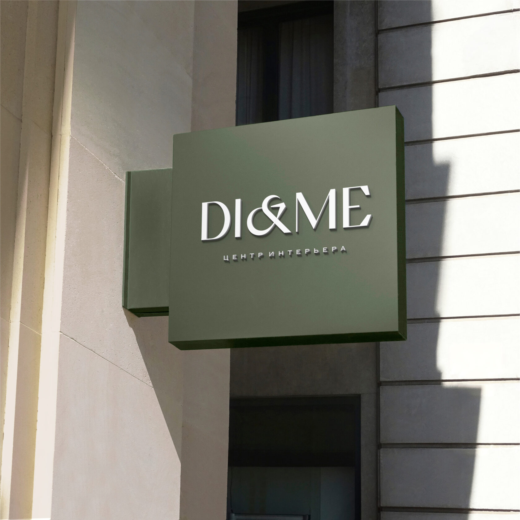
The "DI&ME" Interior Centre audience is professional designers. People with an incredible sense of style. When they first come into contact with a brand, it is important for them to feel aesthetic identity with it. We have developed a corporate identity, stunning graphics and a brand presentation for the company, after seeing it, the most dizzying contracts go to their signatures.
The "DI&ME" Interior Centre audience is professional designers. People with an incredible sense of style. When they first come into contact with a brand, it is important for them to feel aesthetic identity with it. We have developed a corporate identity, stunning graphics and a brand presentation for the company, after seeing it, the most dizzying contracts go to their signatures.
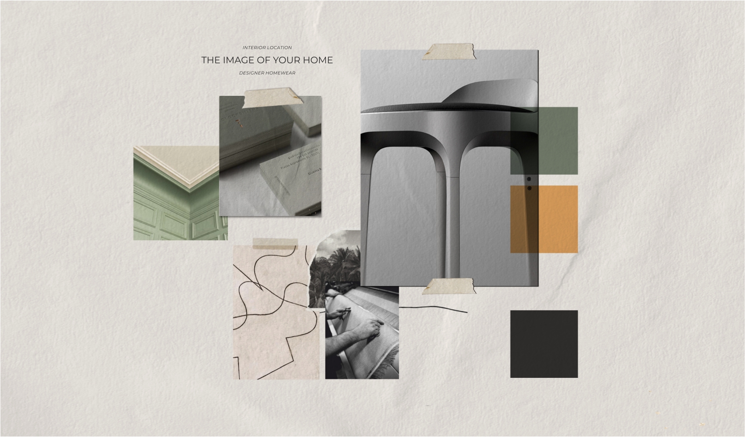
The corporate identity is based on the use of elegant fonts and noble colour combinations. At the same time, it does not read as exclusively premium and appeals equally to customers in the mid- and high-end price segments. Rather, it unites customers by underlying professional values.
Calm, deep colours combined with basic shades convey the reliability of the company’s stated intentions. The complex and multifaceted picking process is built like a high-precision mechanism here. With the guarantee of excellent service.
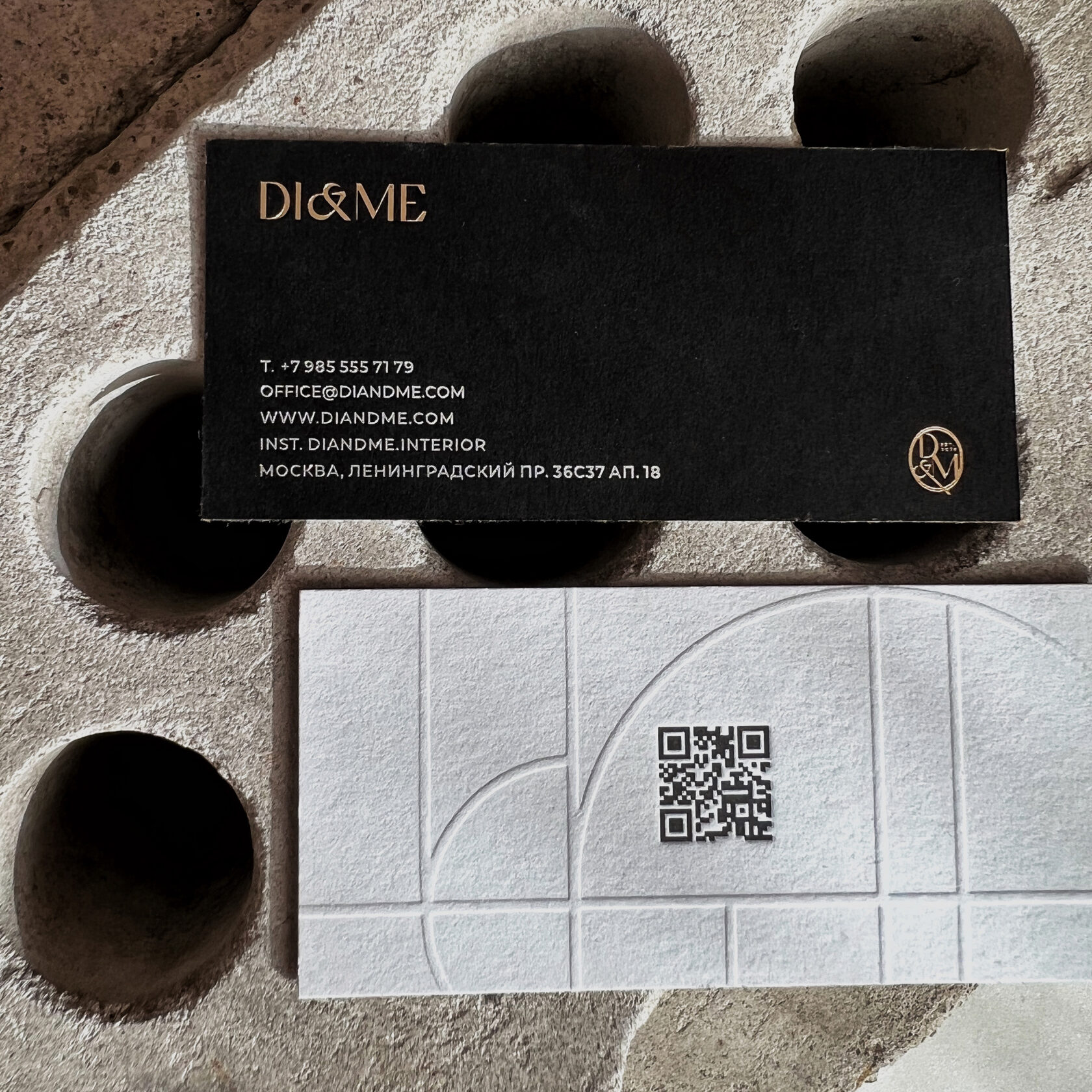
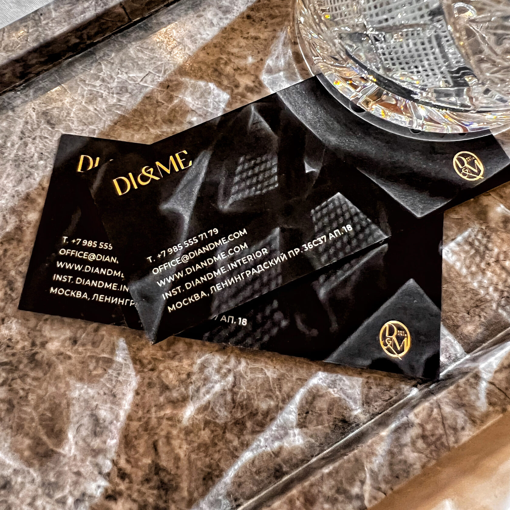
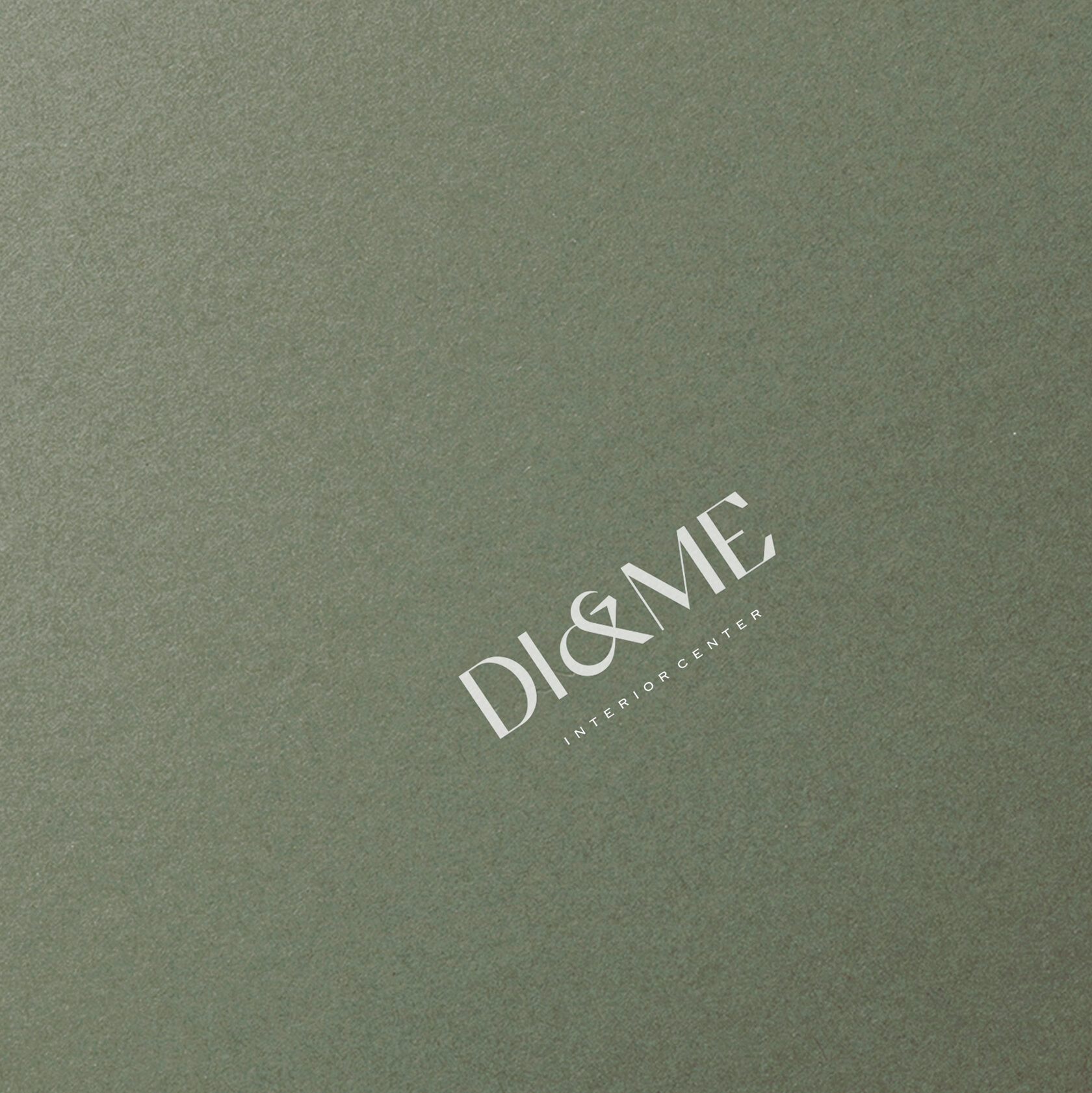
The polygraphy of the brand is made in the technique of volumetric embossing — convex. The velvety surface of the matte paper and the relief give a tactile pleasure. On the reverse side of the business card there is a QR code for easy access to the official website.
In creating branding, the human feelings comes to the fore that a person receives. Lines and proportions, depth of detailing, non-trivial shades, an emotional message — it is through the details that customers and partners intuitively choose the company with which they will work together to create magnificent homes for themselves or their customers.
When we create a logo, we already see many options for its implementation. Thinking bigger, coming up with scenarios that will be a pleasant surprise is so easy when we feel your love for our life’s work!
Who better to tell the story of a business than its creator? Probably only a book that has been co-developed with the brand owner. Making an impression is also realistic on the go, in the hustle and bustle of the working day — with an intelligent touch via email.
The finished book can be designed in two formats — a desktop version, which is easy to view on a large screen, and a mobile version. If desired, the document can be printed by a print house and given as a gift at business meetings and professional exhibitions.
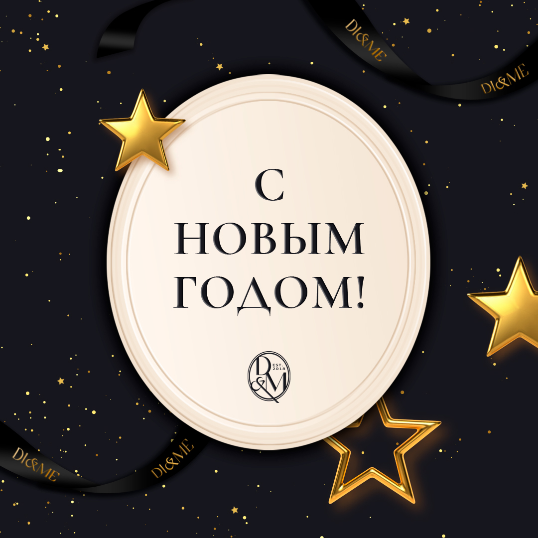
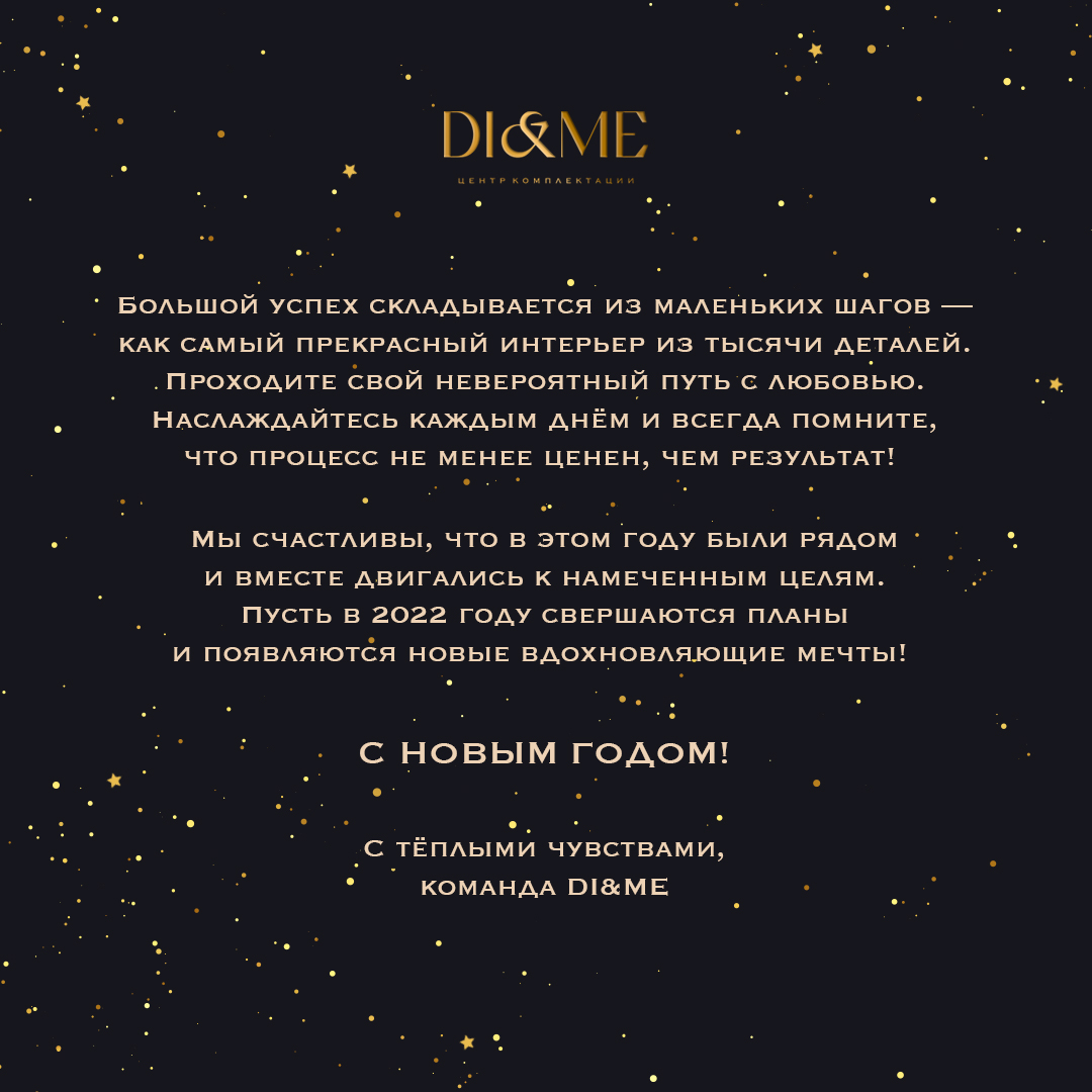
When clients live and work all over the world, it is not always possible to wish them happy holidays in person. But you can send a branded postcard via messenger. A nice sign of attention that makes the relationship warm and trustworthy.
We are exploring the field of interior design with interest. The DI&ME brand identity is definitely a new facet of one of our favourite trends. The logo will greet the centre’s clients across the ocean, on the other side of the world. What were we thinking when we heard this amazing news? — We put our heart and soul into the corporate identity! How could it be otherwise?

