Branding case — Nuovo Interiors


New home — the centre of your universe
The inspiration for the creation of the NUOVO logo was the fantastically beautiful natural phenomenon "Kiss of the Two Seas". It is an energetically powerful place in Rodos, where two such different seas merge: the calm Mediterranean Sea and the Aegean Sea covered in waves.
We turned to this association because the studio, which Vera Vedernikova had just founded for that moment, is located in Sochi. A city that is associated with big water, the noise of the surf and picturesque views.
Back then, in 2019, Vera was putting her heart and soul into the formation of the studio, and in our minds, the company’s corporate identity was beginning to take shape. Starting with naming and continuing with logo design, graphics, the first implemented identity and the website.
Did we know that our cooperation will develop into years of fruitful cooperation? No. Did we believe in NUOVO’s success? Yes. Absolutely! With all our hearts!
Developing the website was NUOVO’s first major challenge in structuring the company’s information. We created texts and worked out the visual and technical component of the website thoroughly.

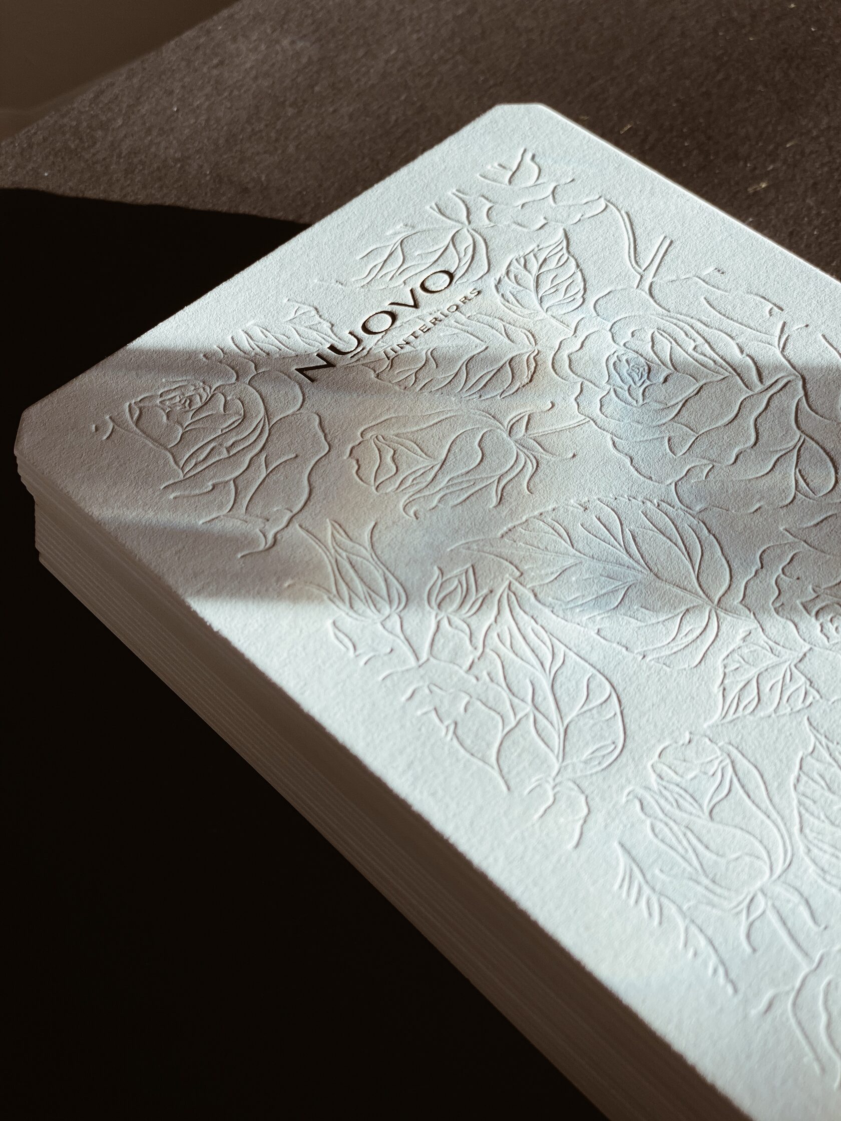
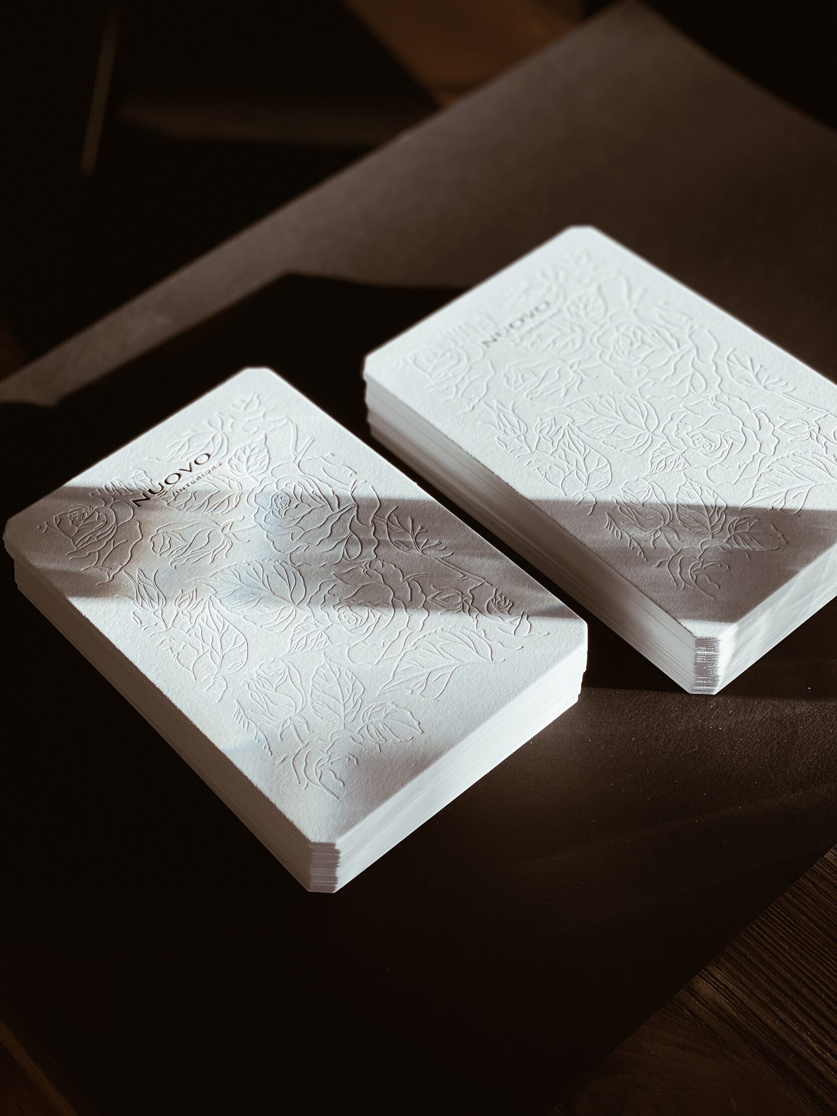
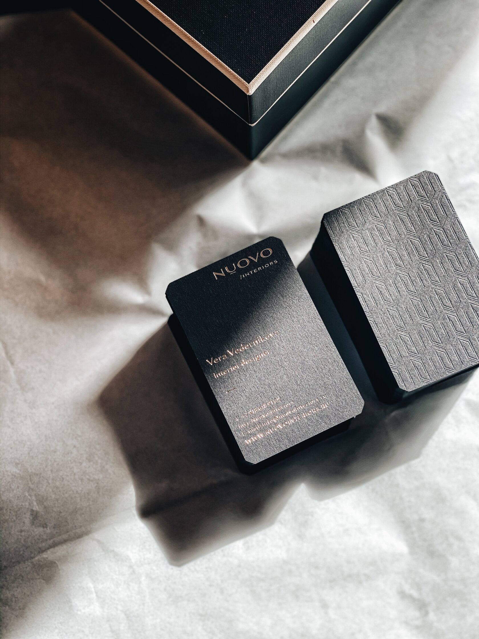
Cards for clients that emphasize the excellent taste of NUOVO specialists and demonstrate their attitude towards clients. Tactile face and warm handwritten words on the back. Gratitude for trust as a ritual that elevates the relationship between the client and the performer to a new level of mutual understanding.
The image of the company acquires its features with each new element of the identity.
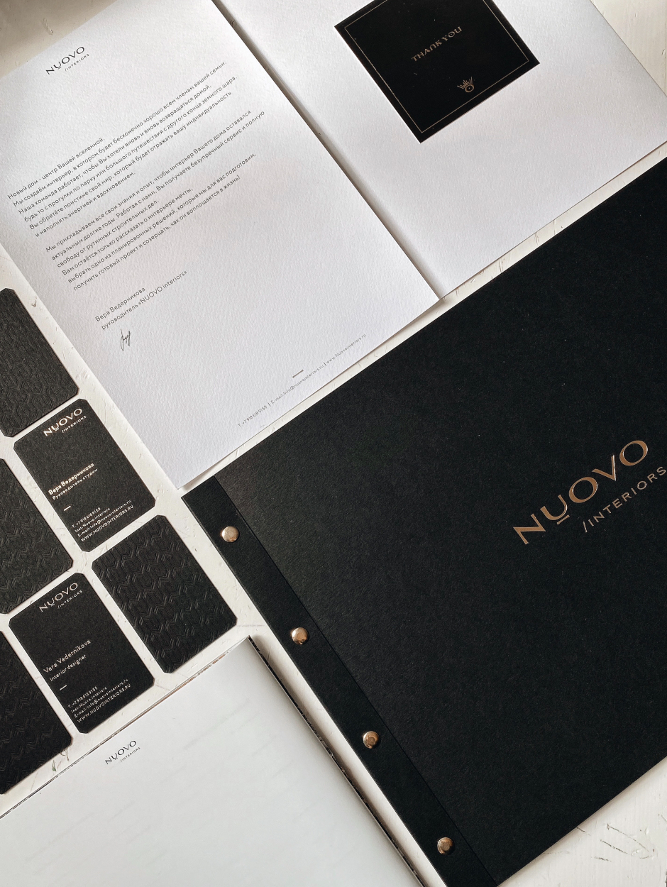
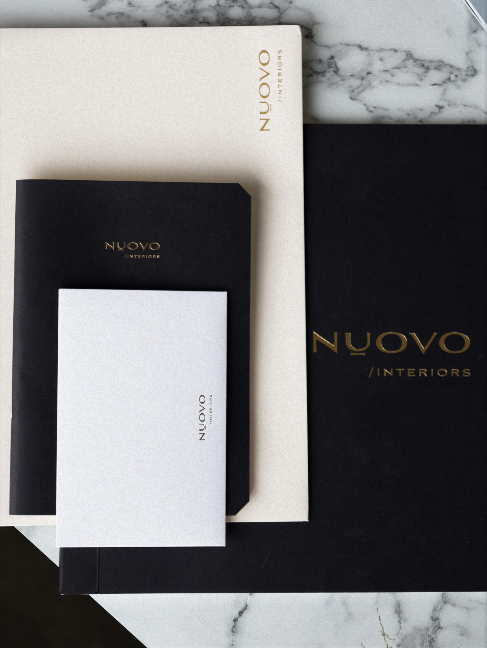
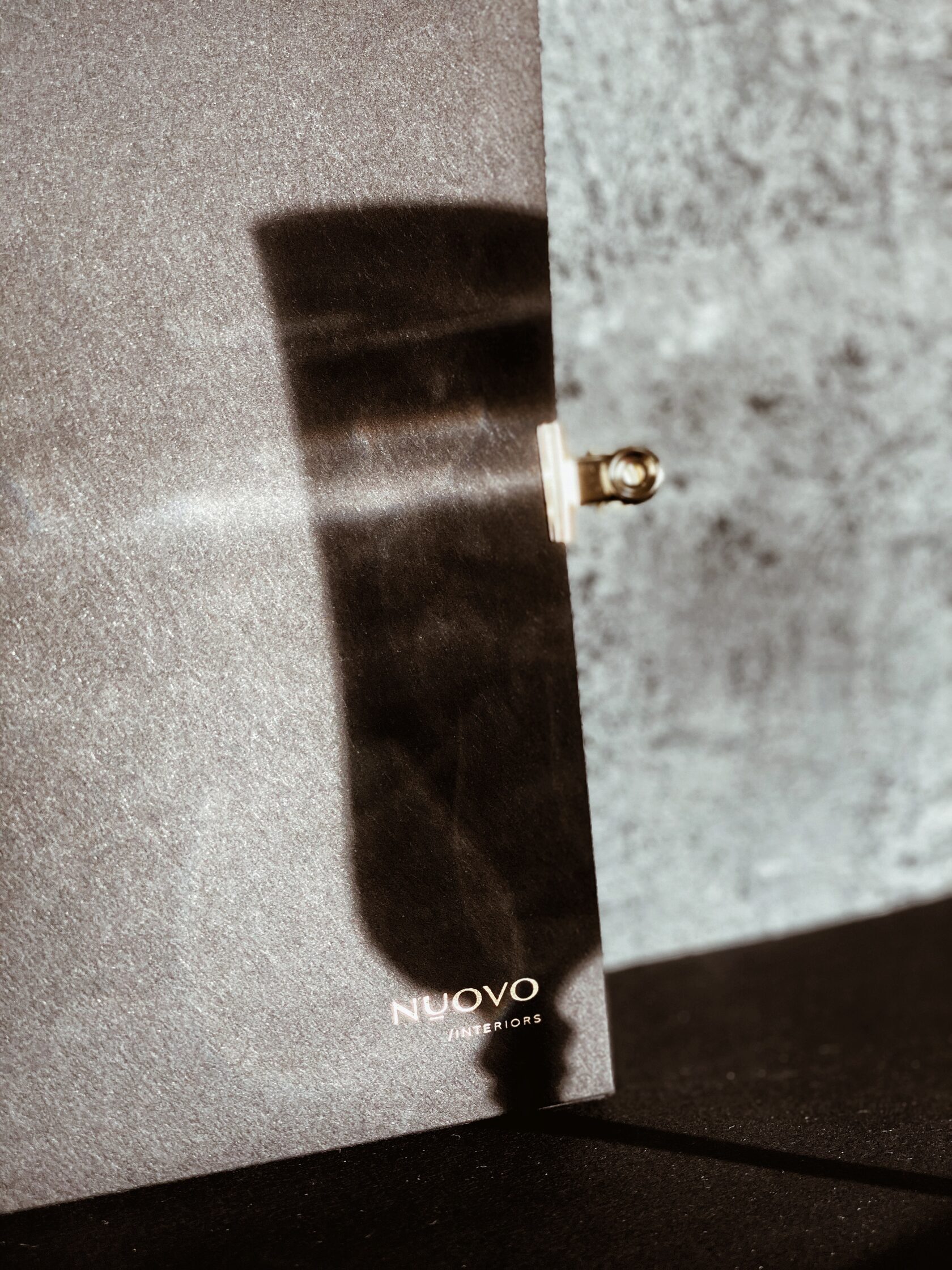
Branded folders with the studio founder’s message, gift notebooks, and project presentation albums give clients a sense of reliability for the company to which they have entrusted their home.
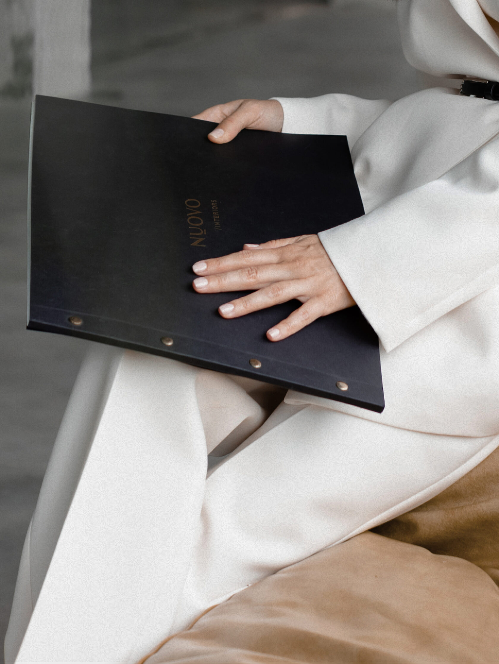
We send the polygraphy to a client after we have checked its excellent quality: fold lines, tightness of casting, tightness of fixing of connecting elements. If we notice even the smallest deviation from standards, we reissue the print run.
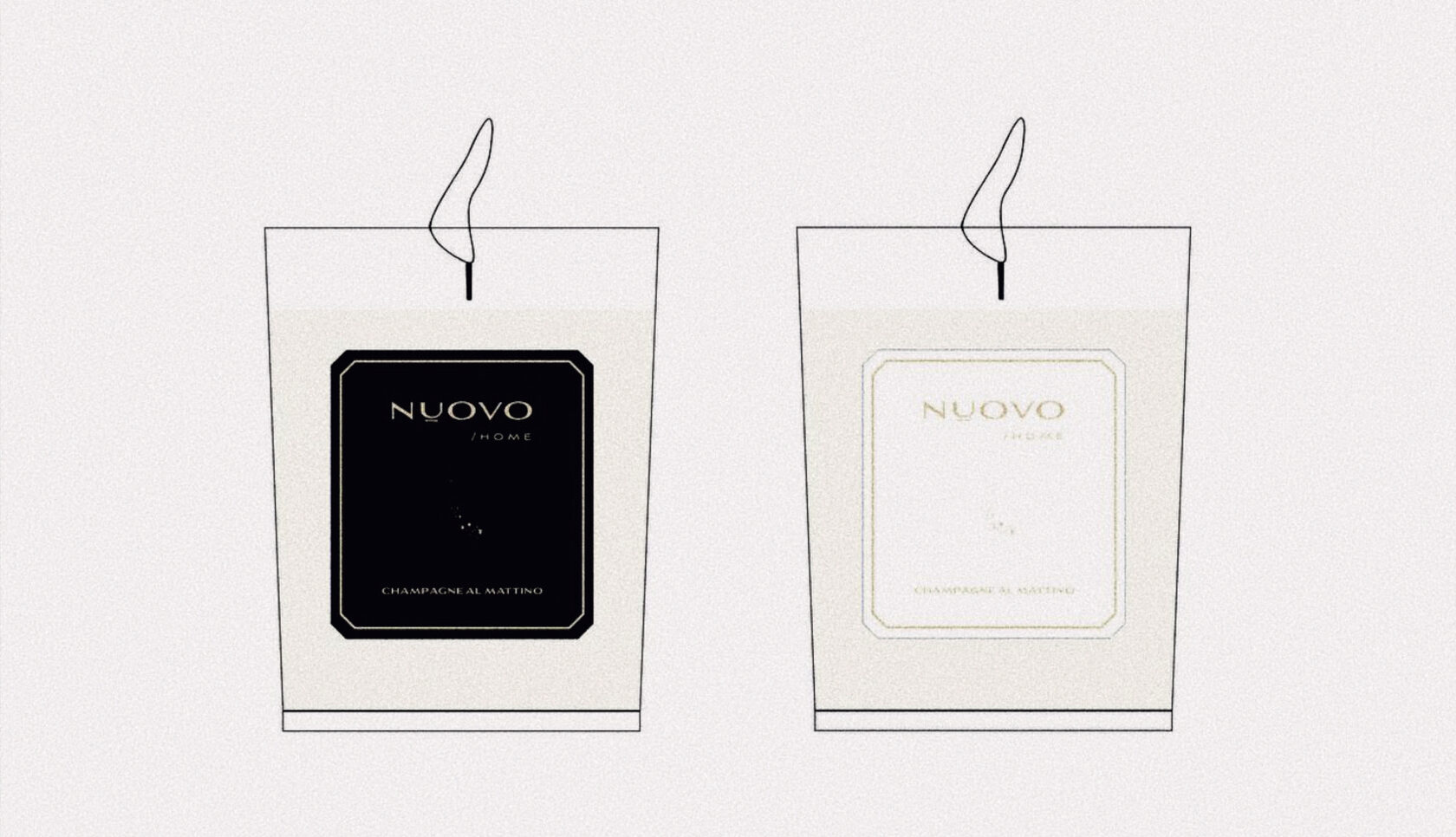
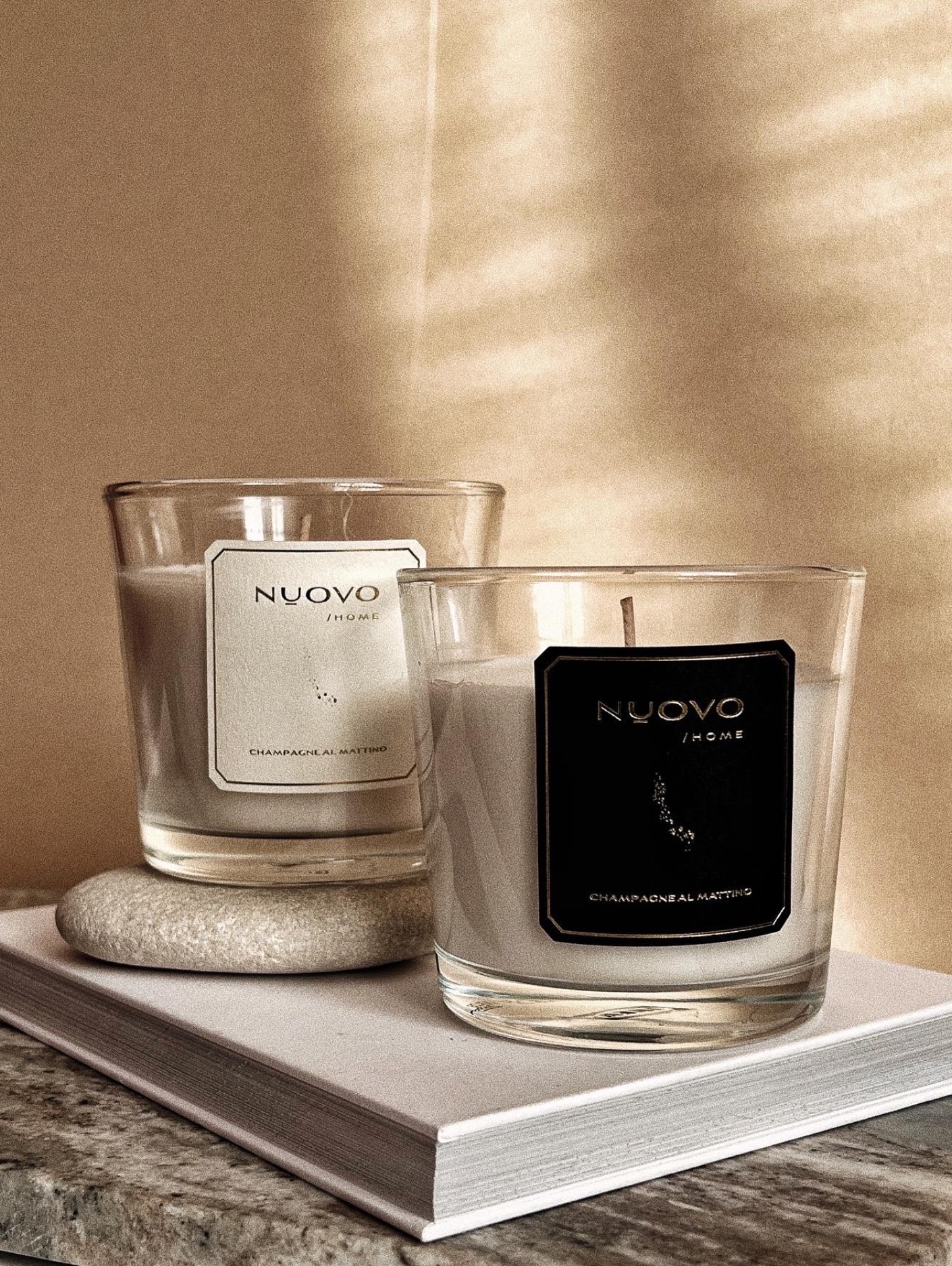
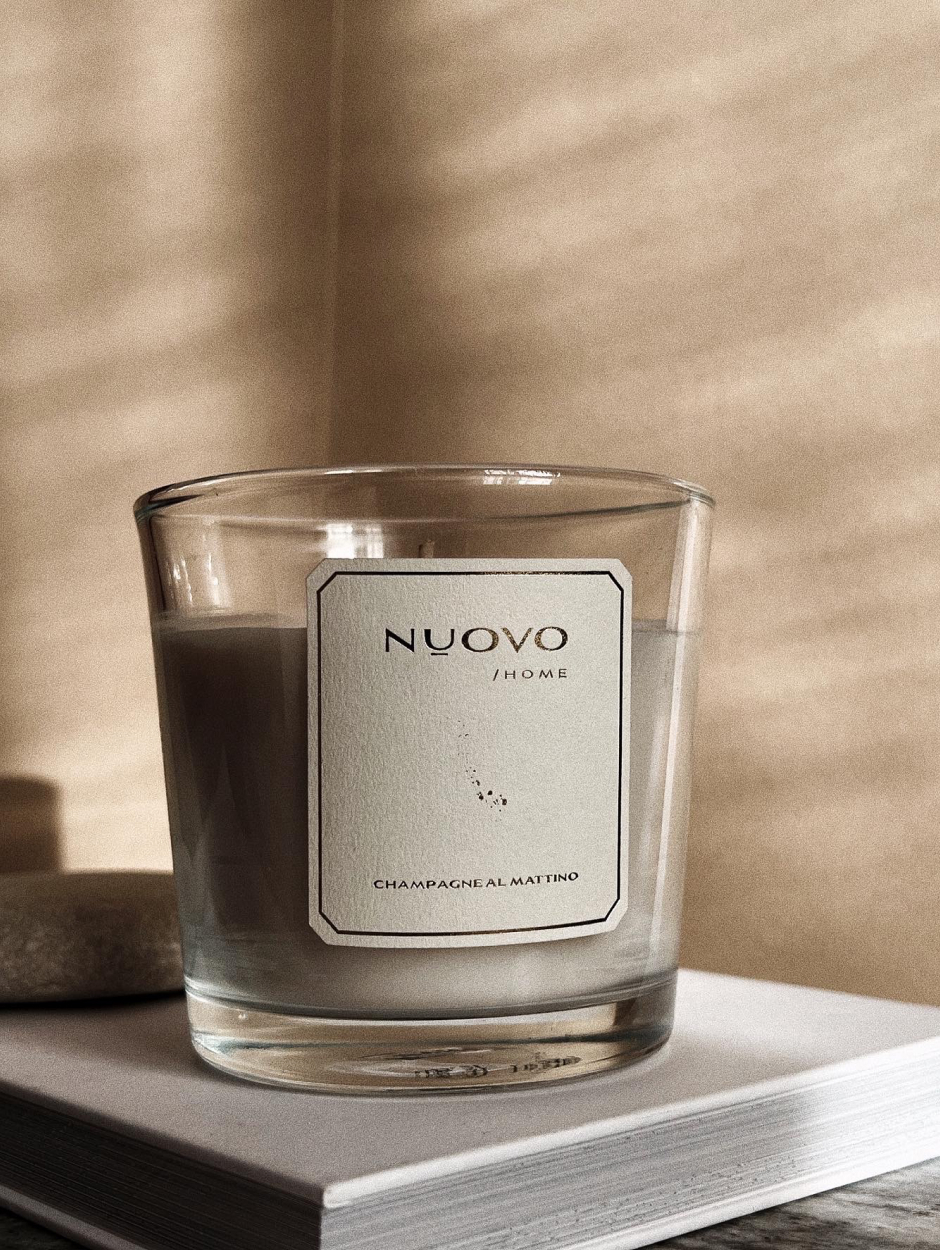
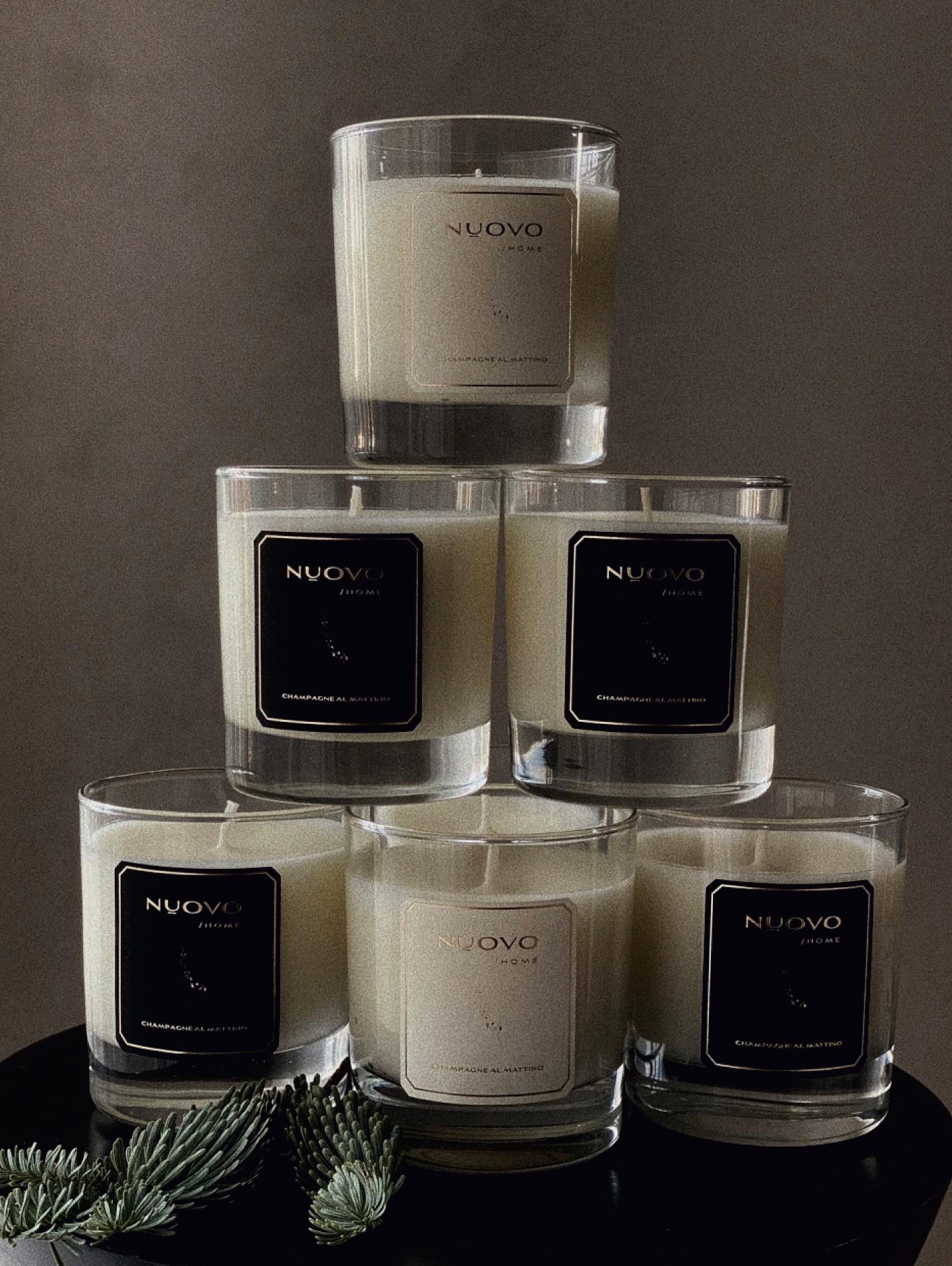
In 2021, the company opened a new business line- " NUOVO HOME". A couple of weeks before the new year, Vera wrote that she dreamed of creating branded candles. A few days later we agreed on a name and sketches for the labels. Over the Christmas holidays, clients have already contemplated the fire of "Champagne al Mattino".
You fulfil the dreams of your favourite customers and we are always there to help you do it with gusto.
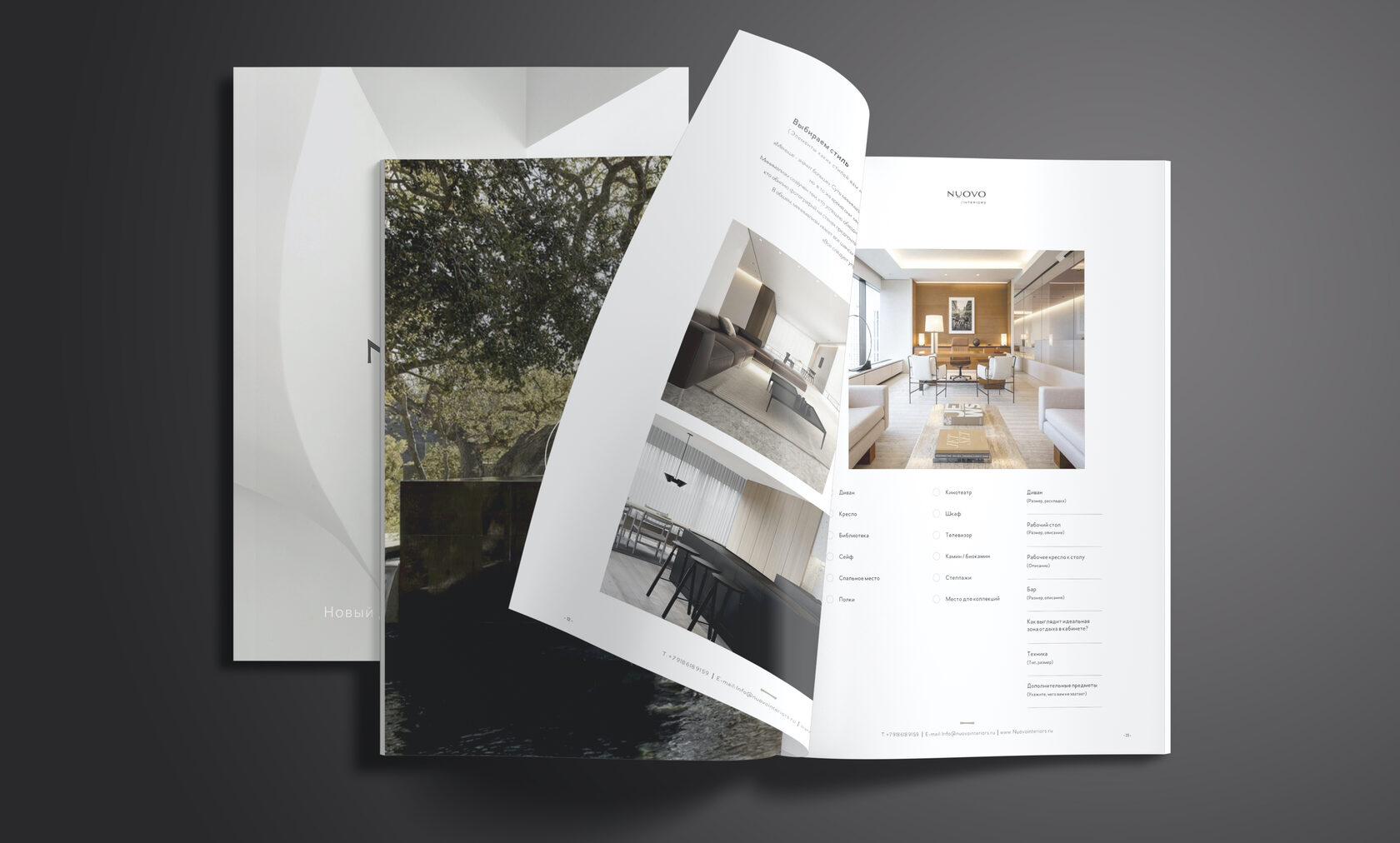
Make every touch special. For a NUOVO client, the brief is designed as a glossy magazine. High-quality illustrations help customers immerse themselves in the experience and dream of a future home that will soon become a reality.
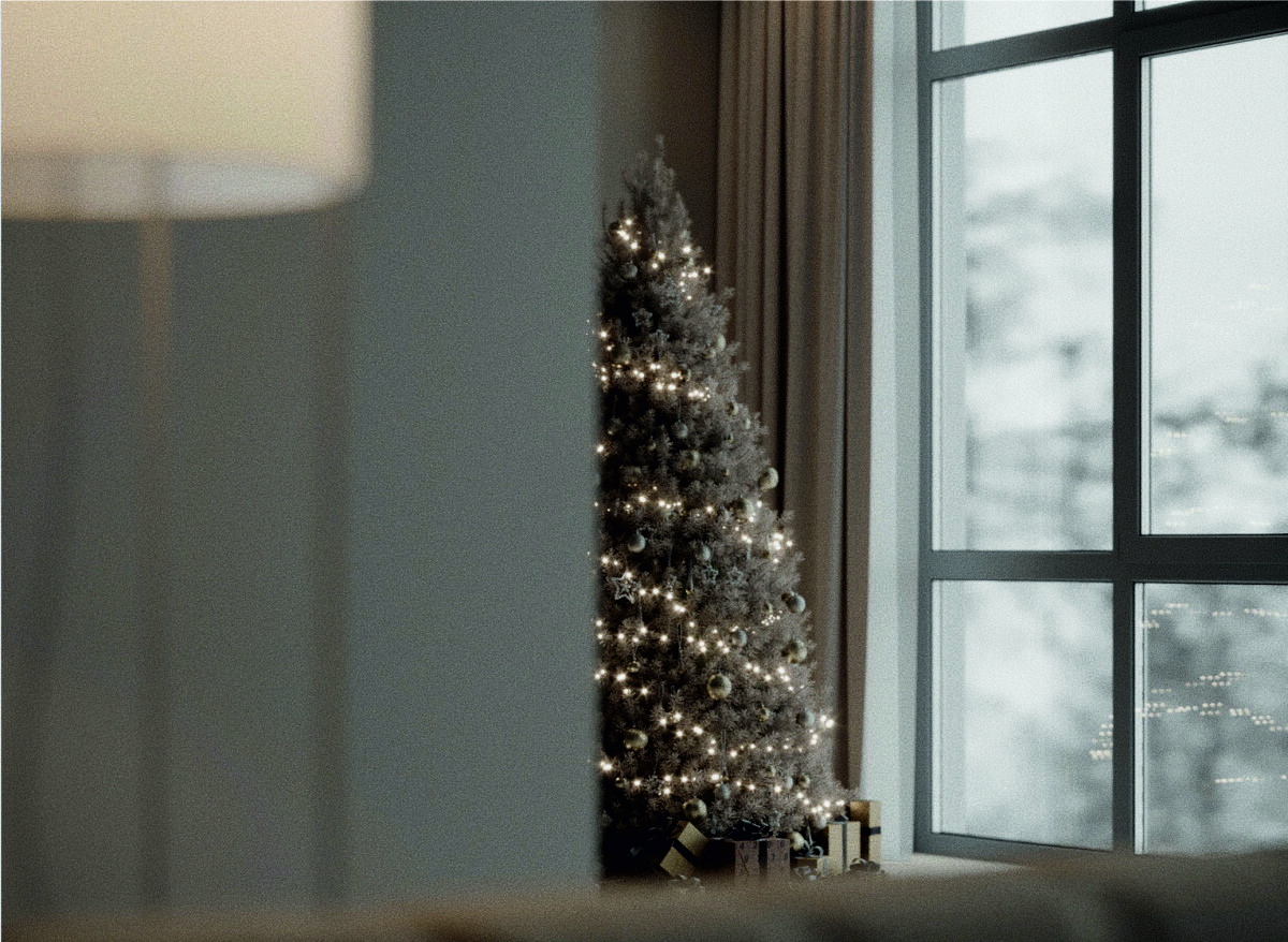
We turn everyday life into a holiday. And we fill holidays with the most incredible atmosphere.
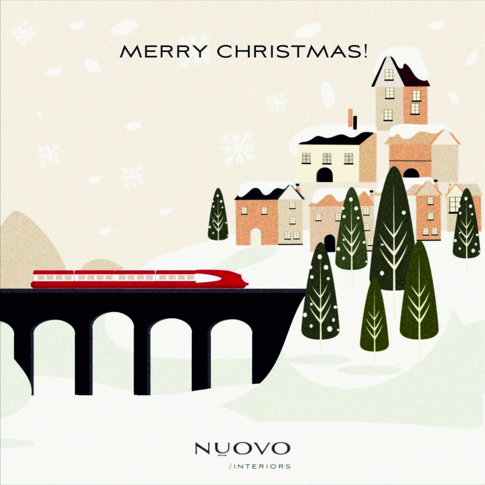
Minimalistic postcards made of thick velvety cardboard the colour of the first snow — large snowflakes, so long-awaited and outlandish for Sochi residents.
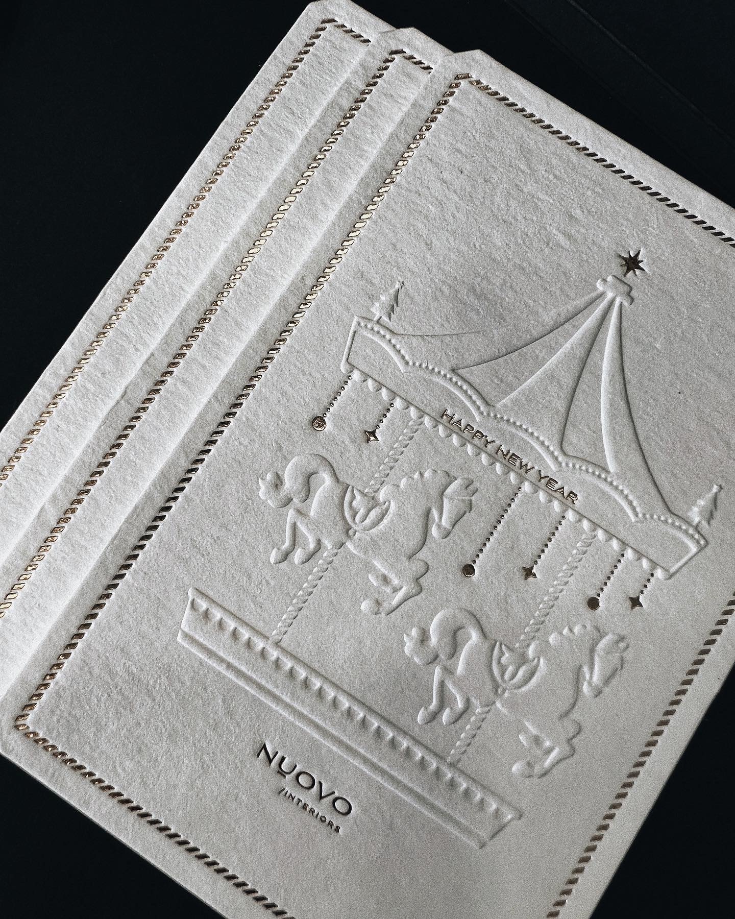
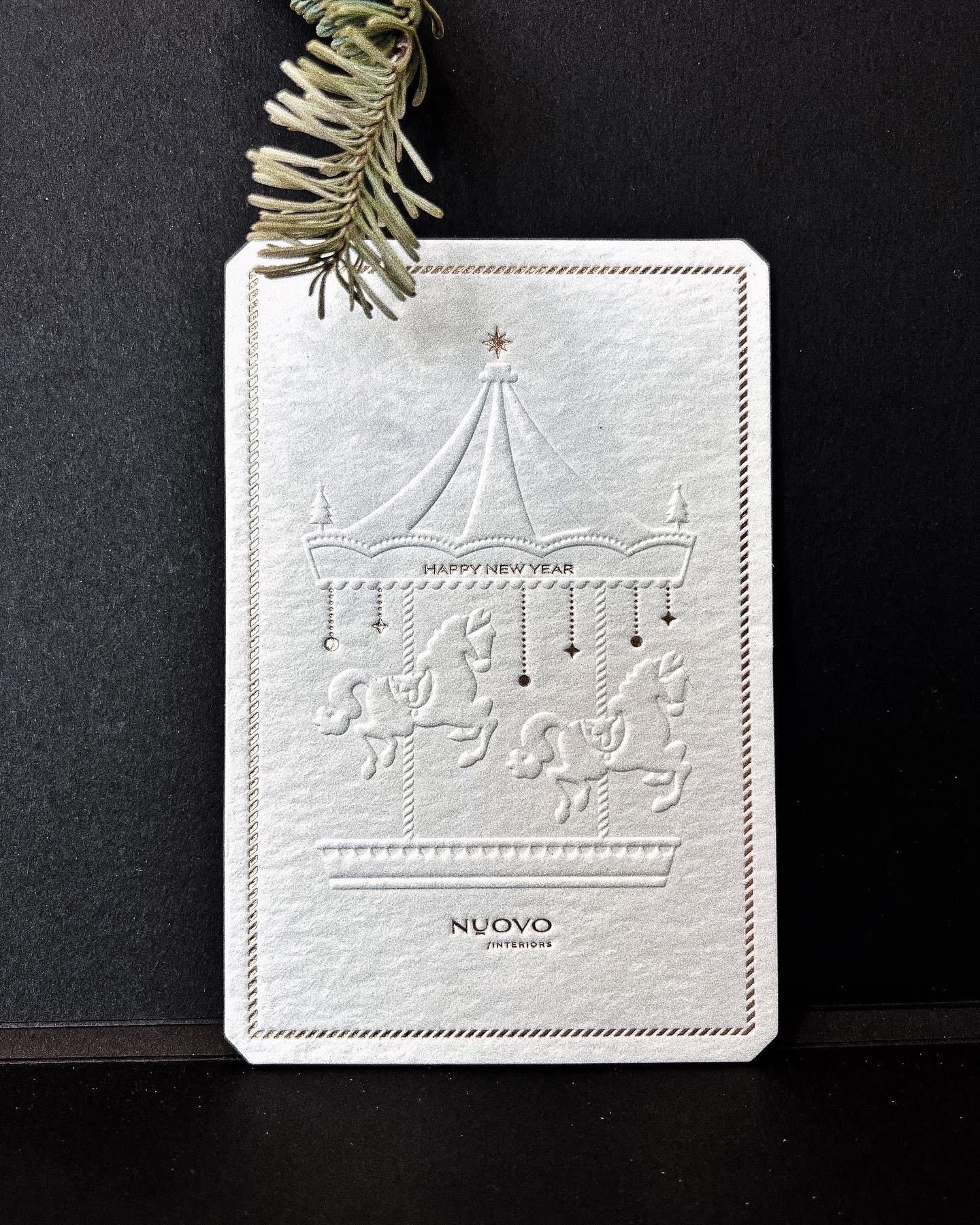
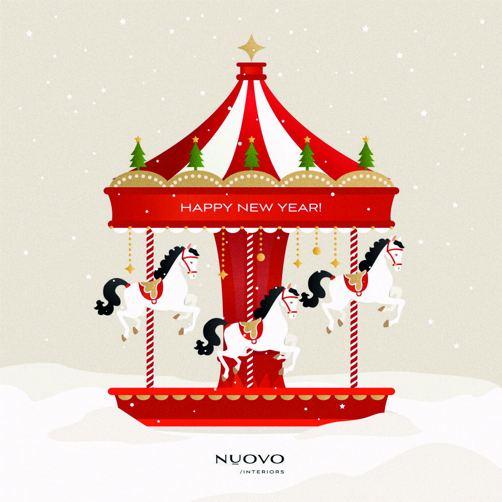
The snow-white symbol of Christmas will never melt in the homes of NOUVO customers, and a magical merry-go-round will always spin in a melody of happiness and love! This has been implemented by 2022.
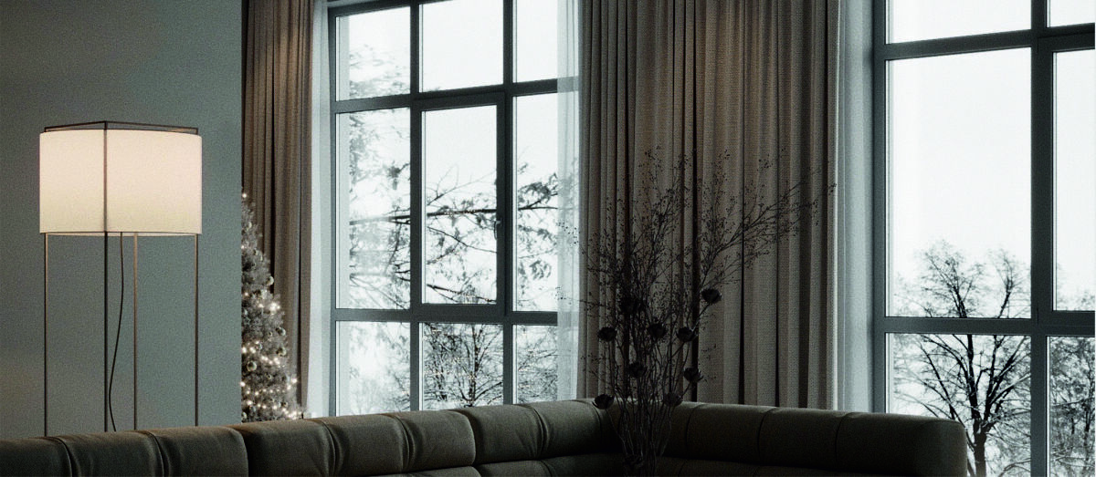
We have a lot of love for designing festive polygraphy. We will be sure to write to you in advance about the time to get ready for the festivities, and suggest the most inspiring solutions.
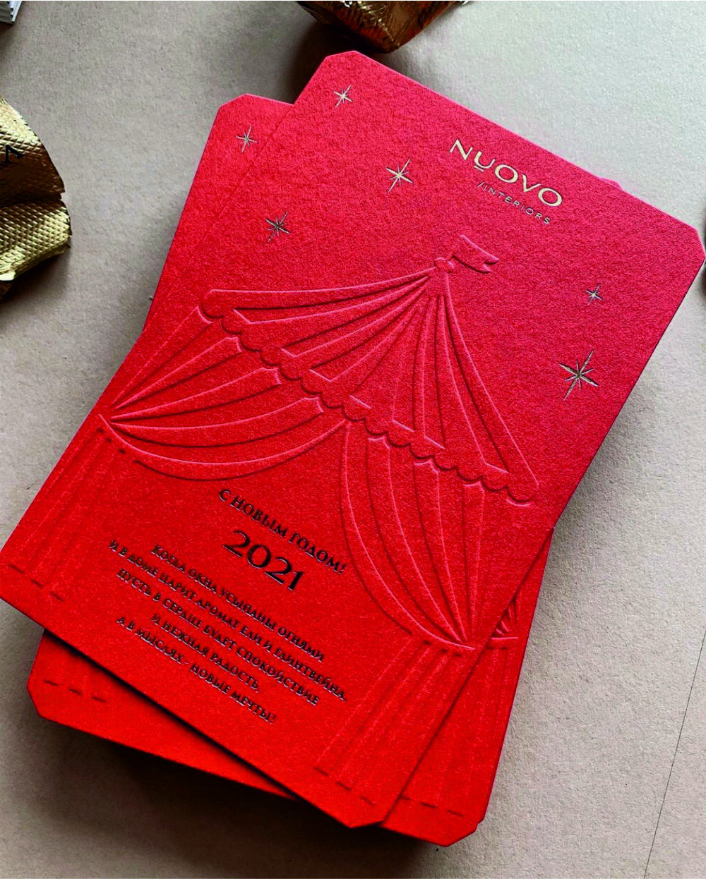
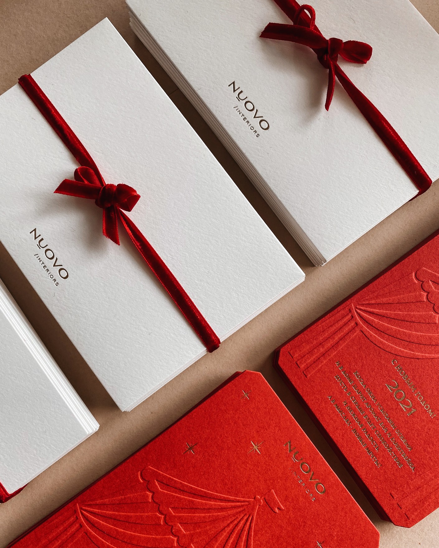
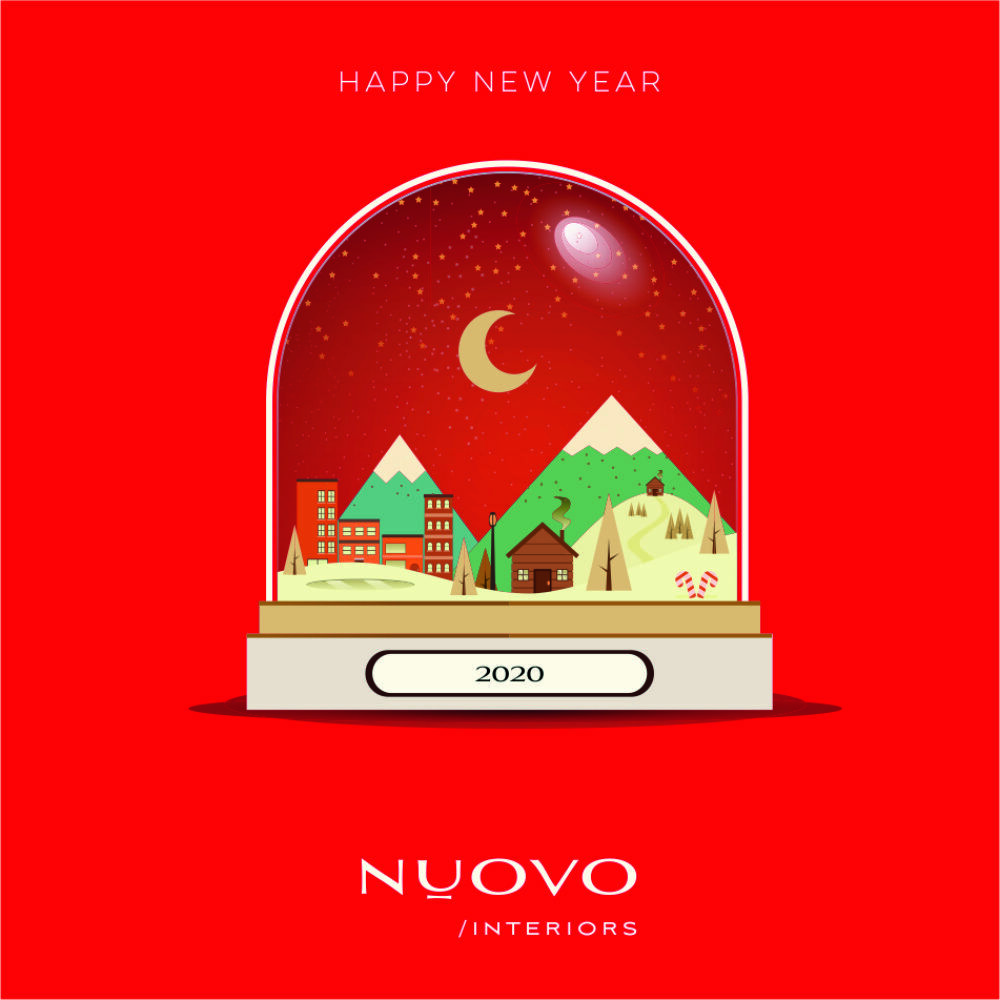
We chose scarlet as the leading colour of the festive concept for the year 2021. We created postcards with letterpress and foil stamping and branded envelopes. Graphic illustrations with Christmas themes support the mood in social media.
Thank you for your attention!
We will be happy to walk the path of creating branding for your company.
We will be happy to walk the path of creating branding for your company.