


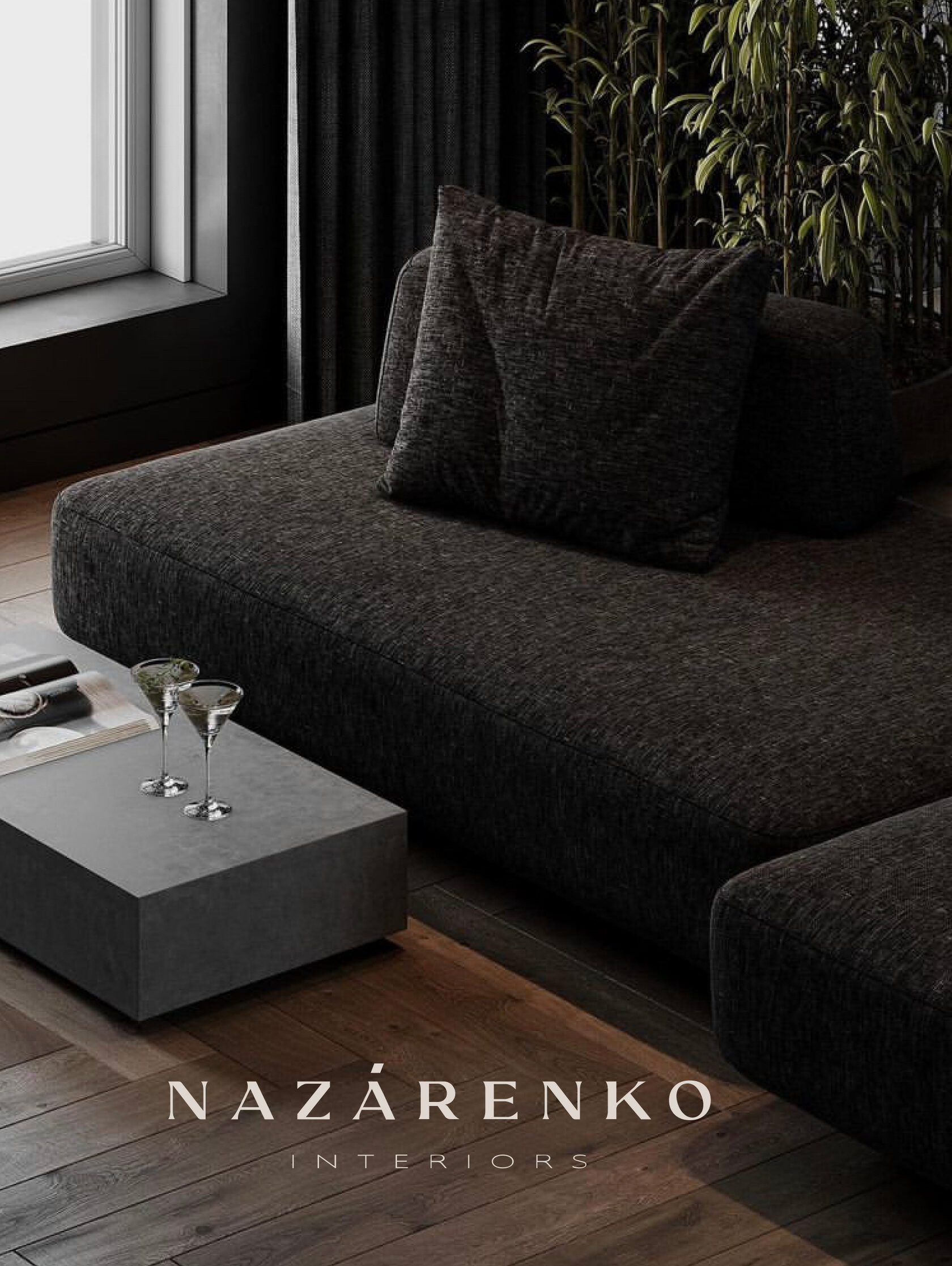
Branding case — Nazarenko


To design interiors in the style of minimalism is, it seems, to get to know the whole world, and to gather it into a single space piece by piece. To tame forms, volumes, textures in order to express all the innermost thoughts in one phrase. Gracefully, delicately and very precisely. We felt this basic foundation in Daria Nazarenko’s interiors and put these feelings into the character of the corporate style of her design studio.
Daria trusted us wholeheartedly and gave us creative freedom. As a result — we created a logo and corporate graphics, which incredibly harmoniously became a part of the life of the company.
Daria trusted us wholeheartedly and gave us creative freedom. As a result — we created a logo and corporate graphics, which incredibly harmoniously became a part of the life of the company.
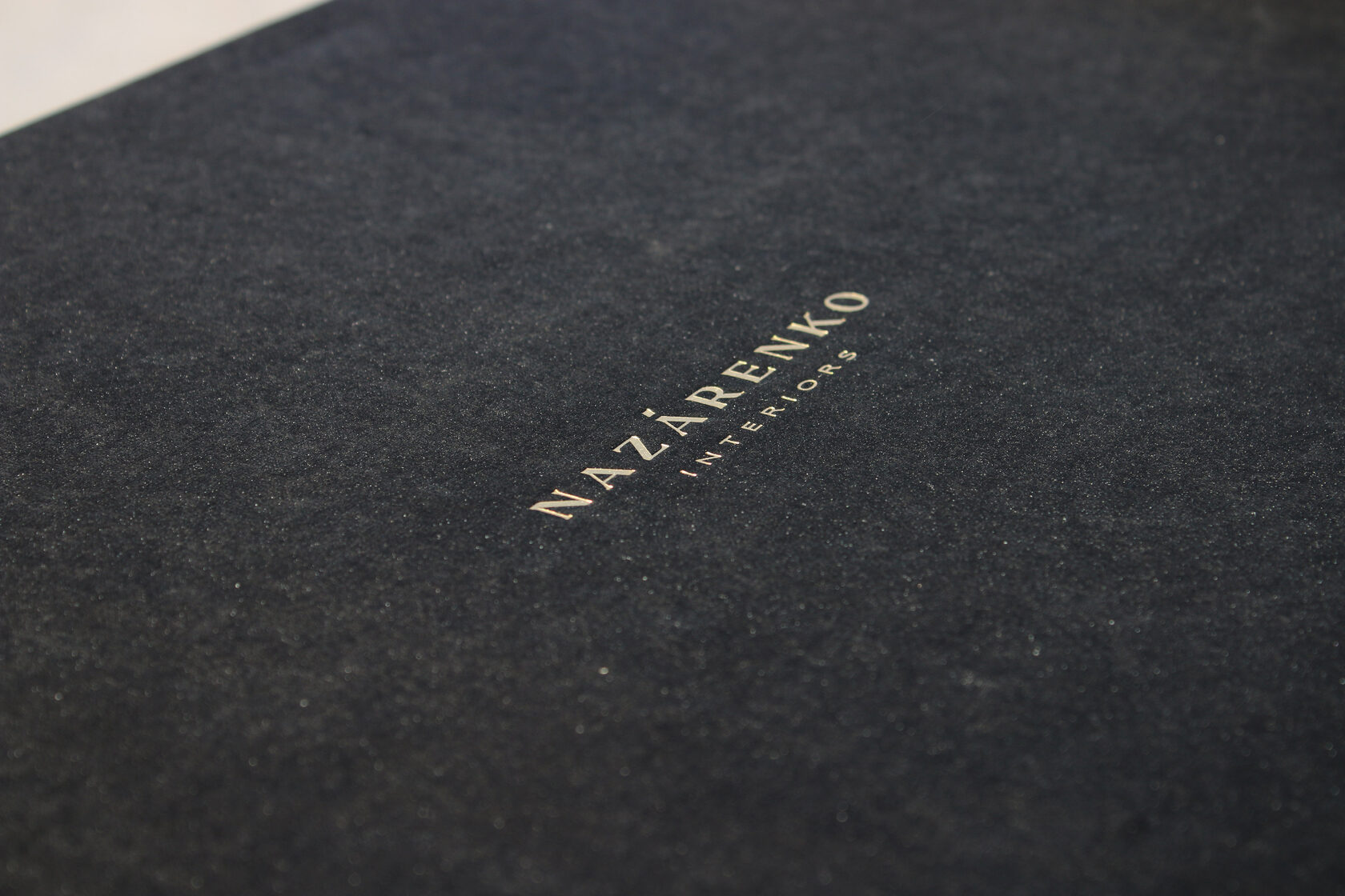
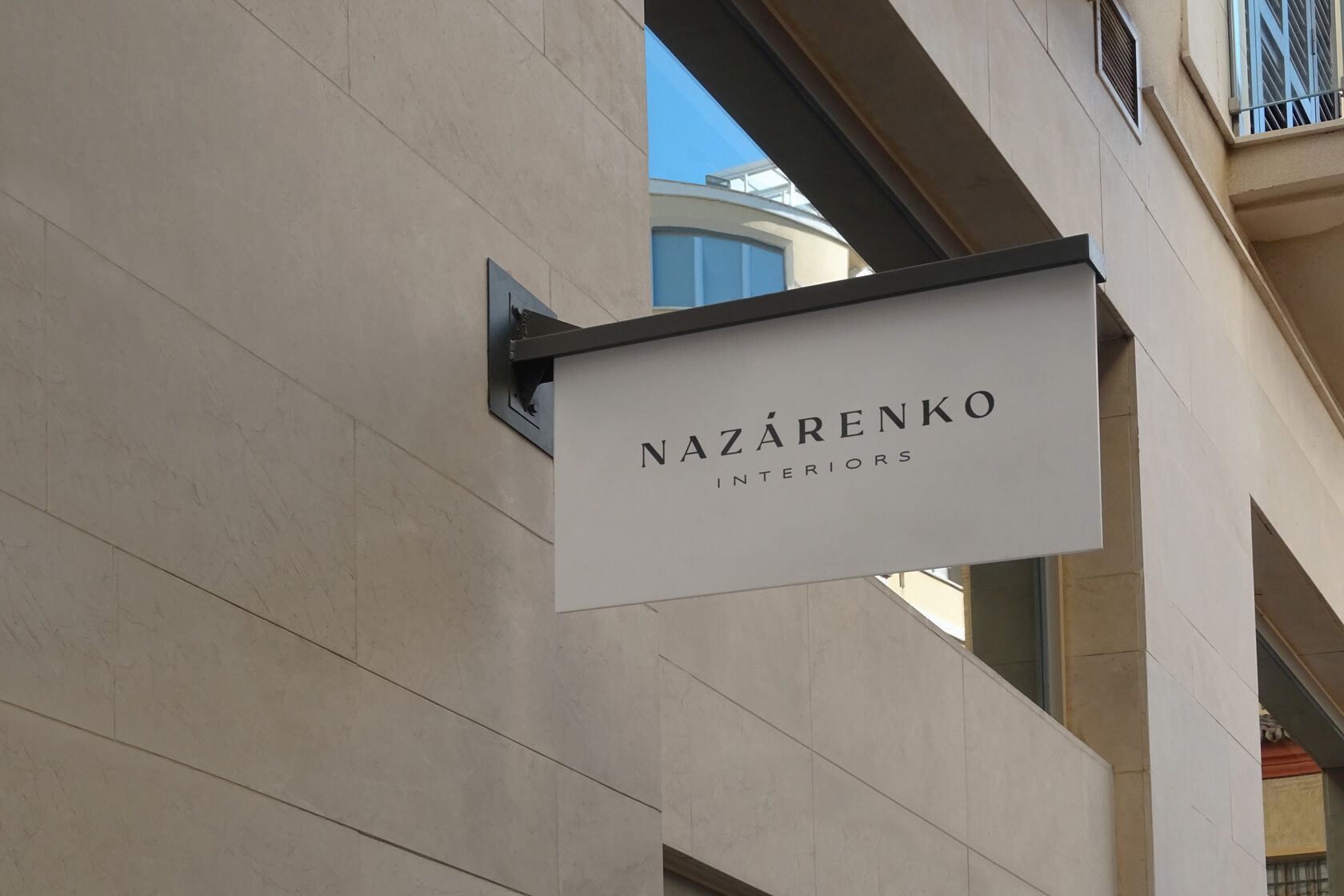
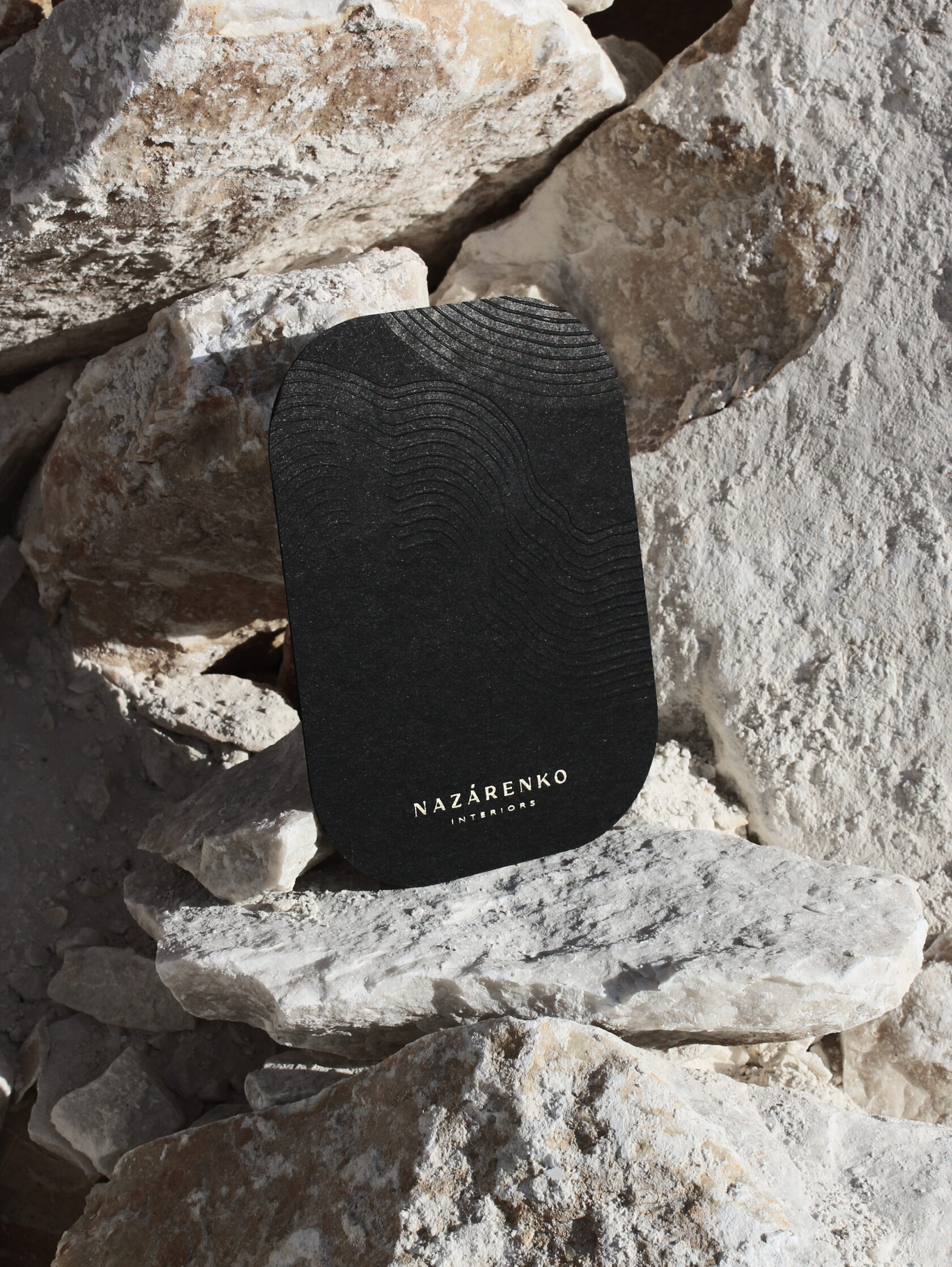
The logo reflects the mood of NAZARENKO INTERIORS interiors. The precision of the lines, brevity and elegance. The style is in the absence of superfluous details.
The austere and sophisticated logo intertwines with smooth corporate graphics, creating harmony. A combination of graphic precision and an unbelievably soft feel.
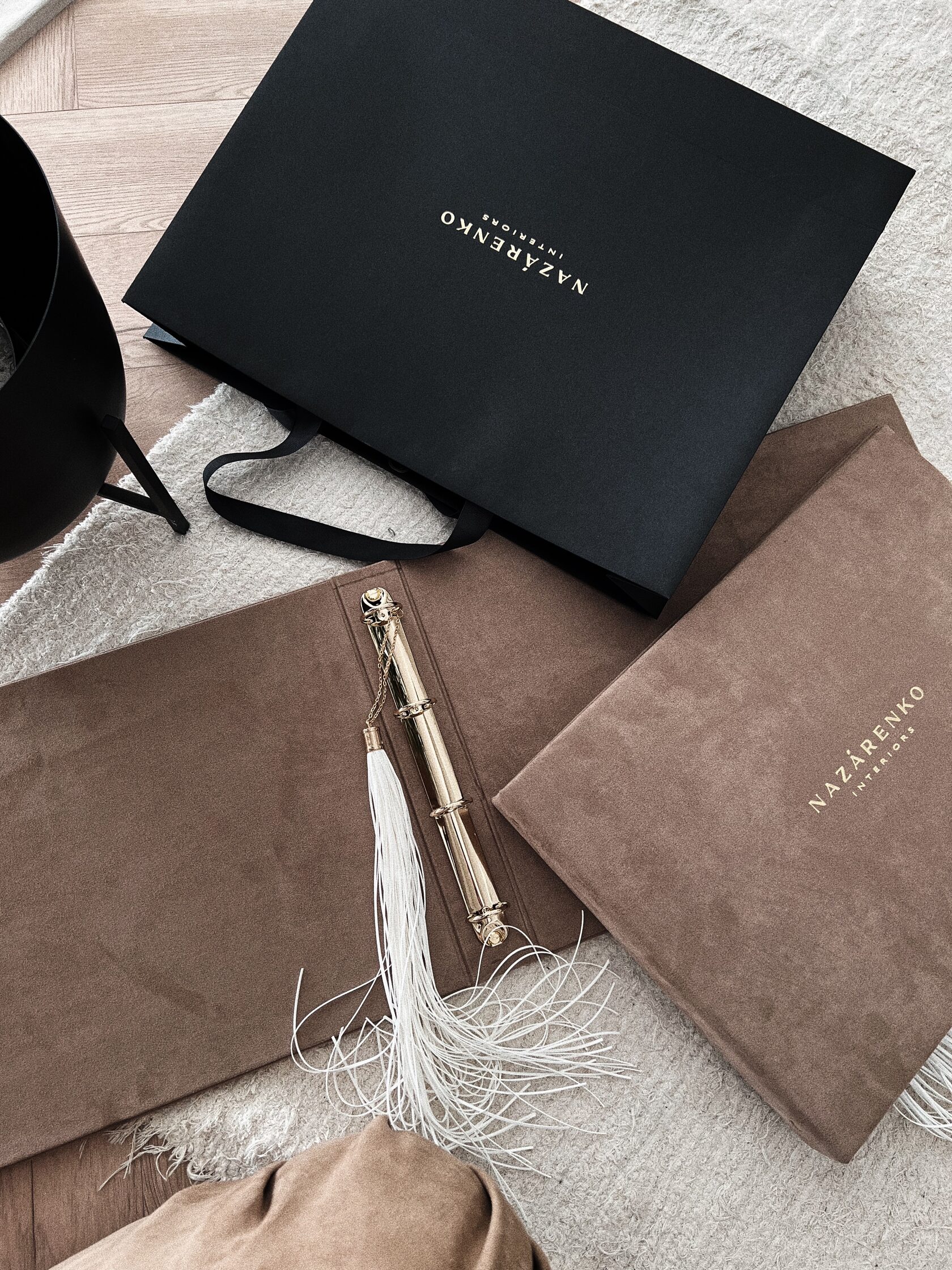
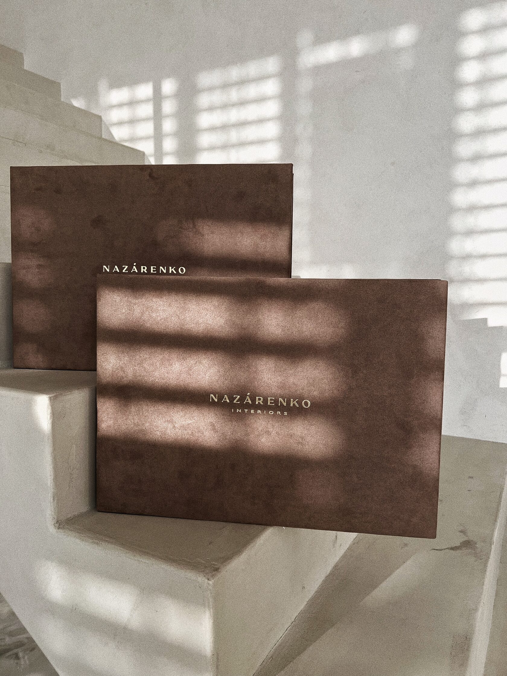
The design of the design project folder is minimalist. The exacting austerity is softened by the material — a pleasant coffee-milk coloured velvet cover. The logo is embossed in gold. Primness and delicacy. Like a perfect raff that combines tart espresso and delicate cream.
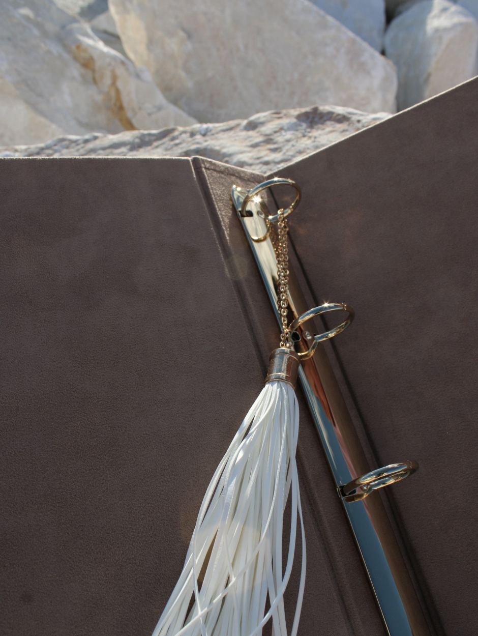
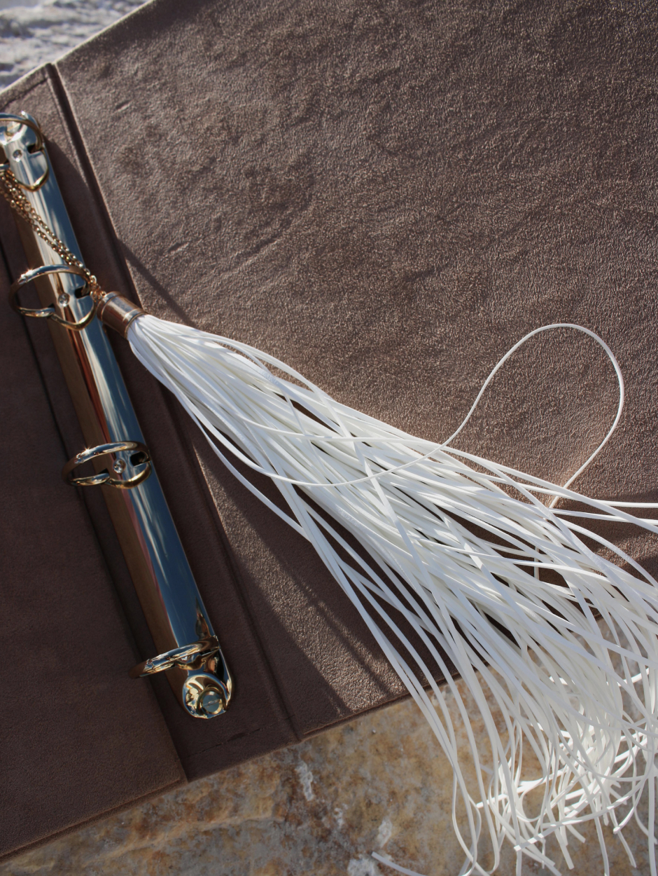
To touch the velvet texture of the album, to run a gentle brush with the fingertips, to feel the monumentality of intellectual work, holding a weighty folder in your hands.
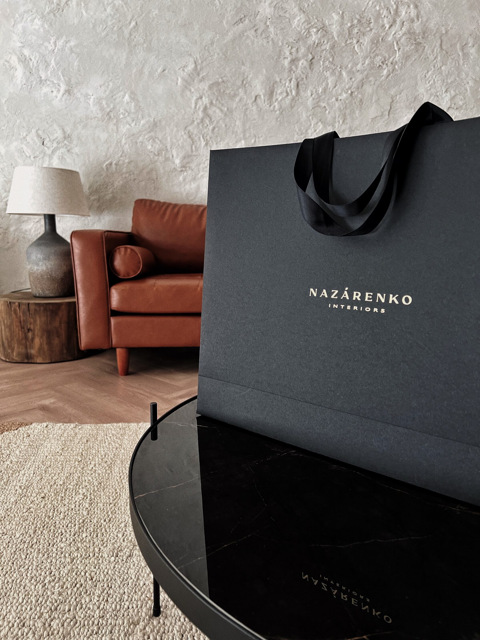
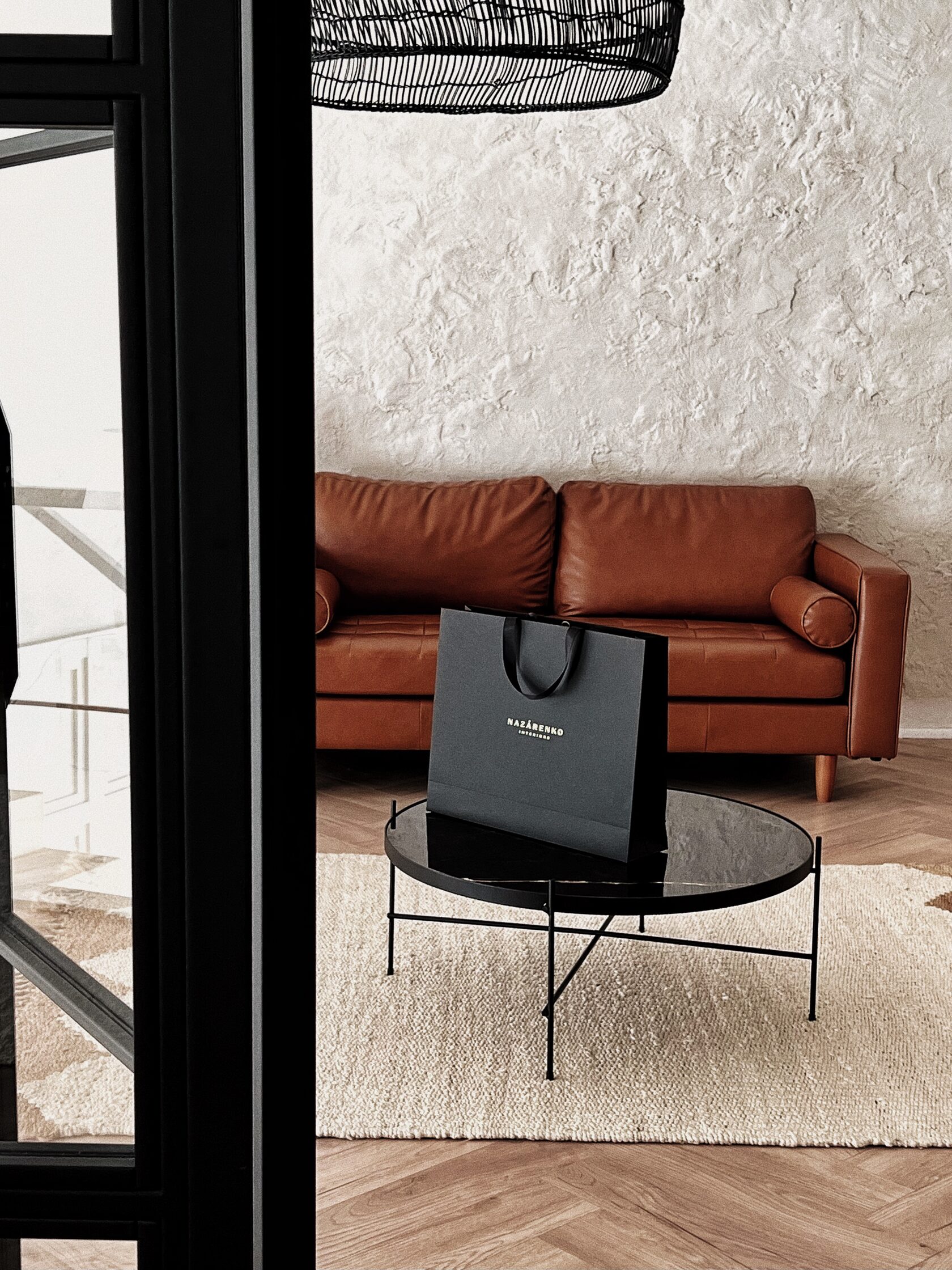
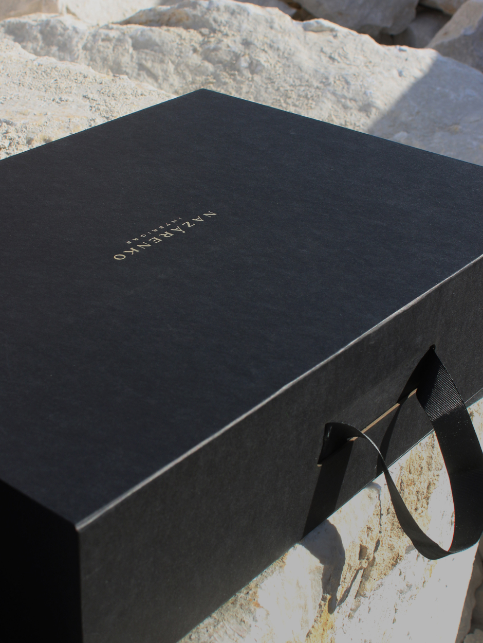
A perfect shape with crisp edges. Elegant black, the company’s signature colour, was the basis for a stylish, roomy package that fits perfectly with the designer’s box. The handles of the package are silky ribbons which shimmer in the light.

Graphicity, rigour and attention to detail are reflected in all elements of the project’s identity. In addition to the golden logo on the outside of the bag, the client will find a minimalistic monogram on the inside.
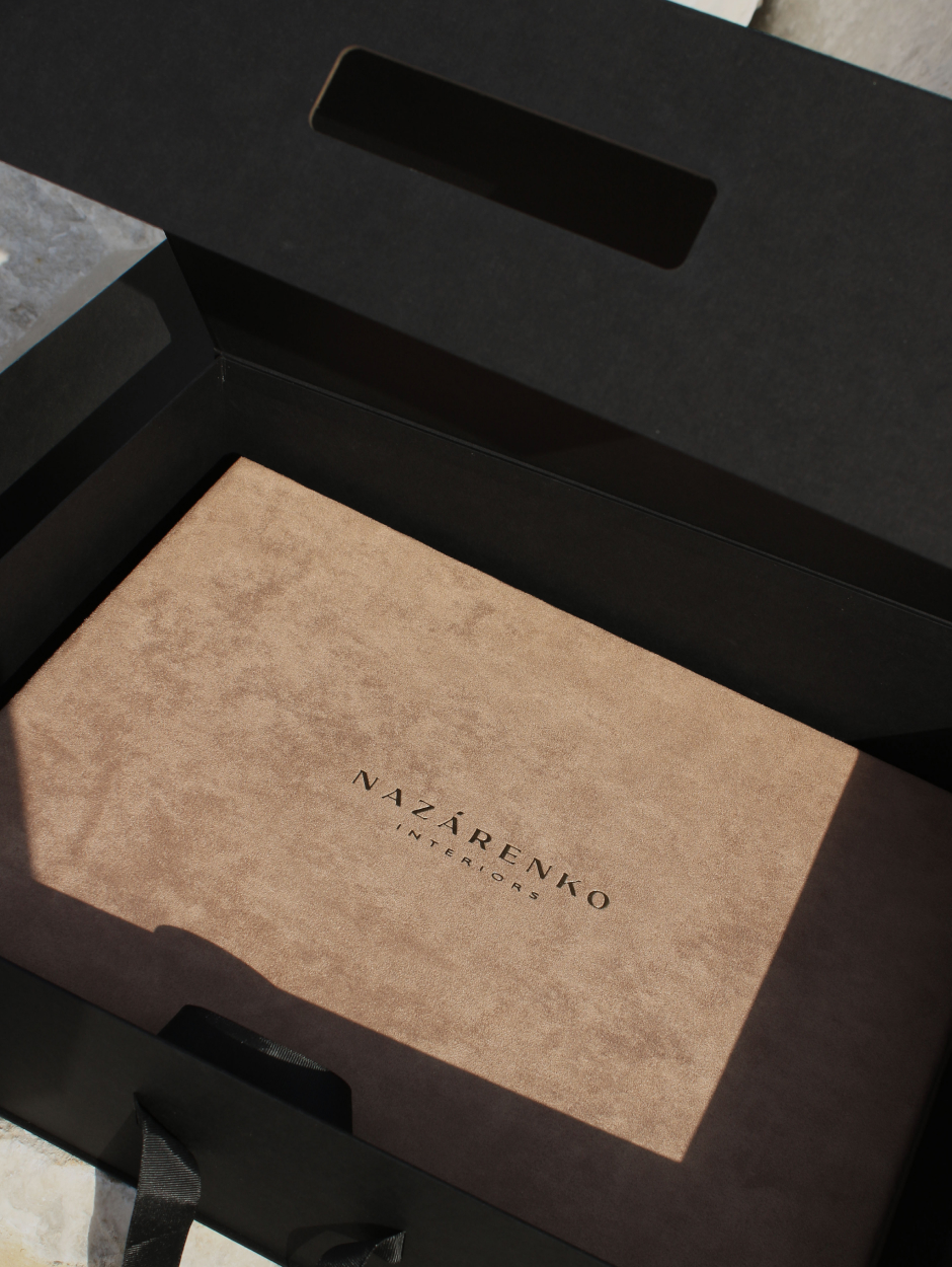
A solid box for a velvet folder with a design project is solid, reliable, fundamental. Its volume and depth are designed to fulfill Daria’s wish: to accommodate a gift box of chocolates is a pleasant surprise for customers.
The texture of the wavy lines that adorn the elegant minimalist postcards references the art of interior design.

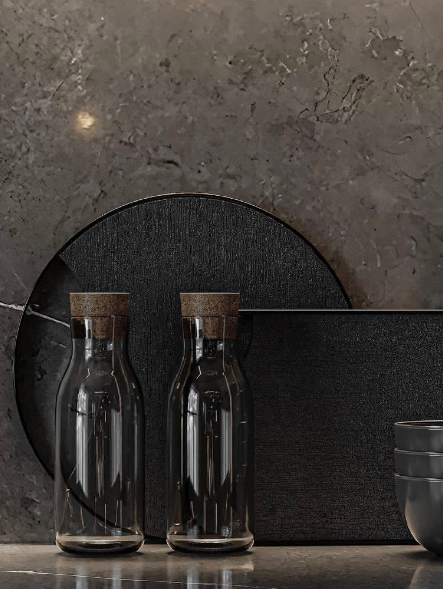
The concept of the brand’s graphics reflected the idea of an art object, which we were inspired by when we looked at Daria’s interiors.
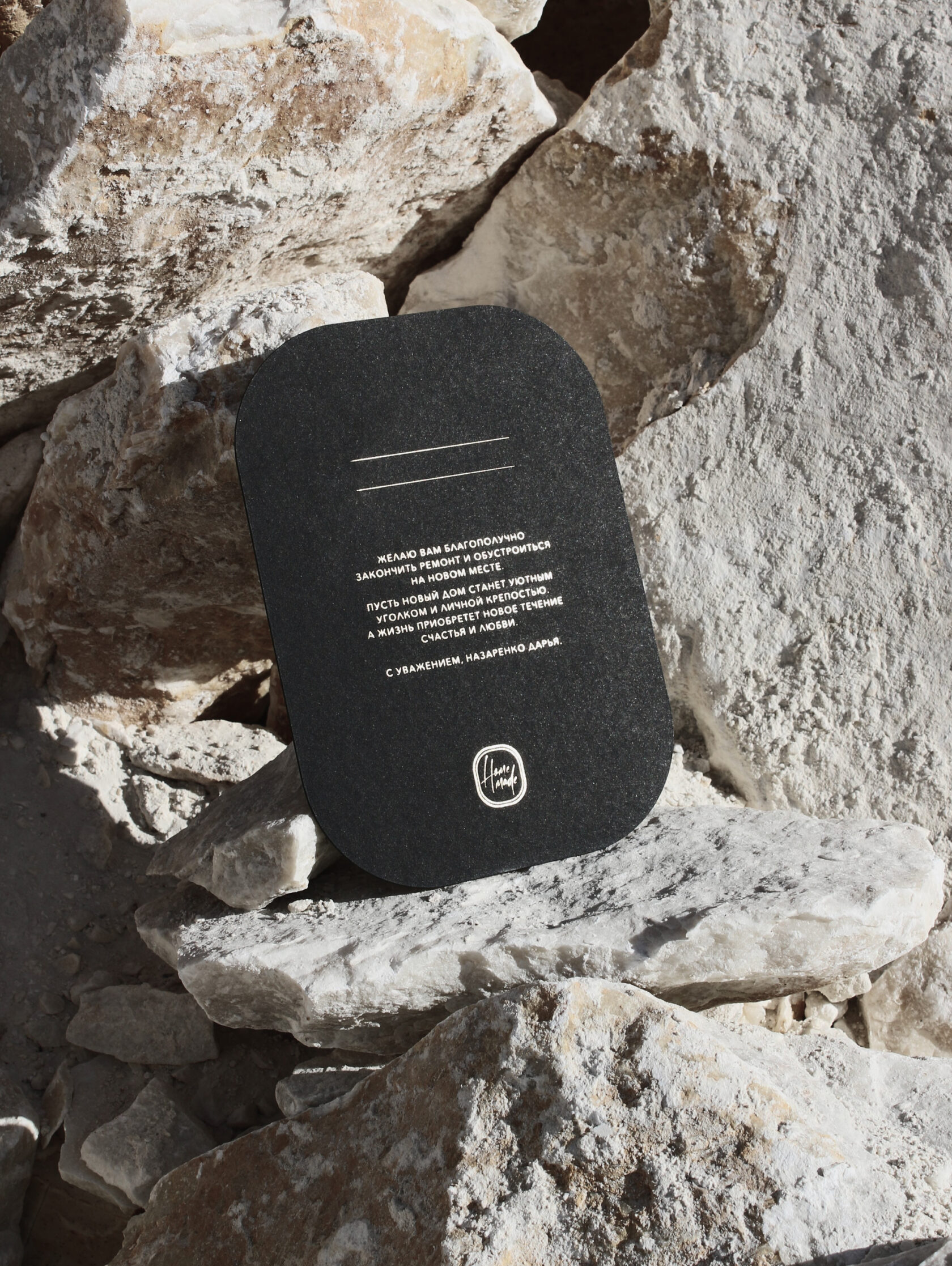
On a card made of thick cardboard, the text with wishes is embossed in gold. Delicacy and warmth towards clients is an inherent aspect of Daria’s approach to her work.
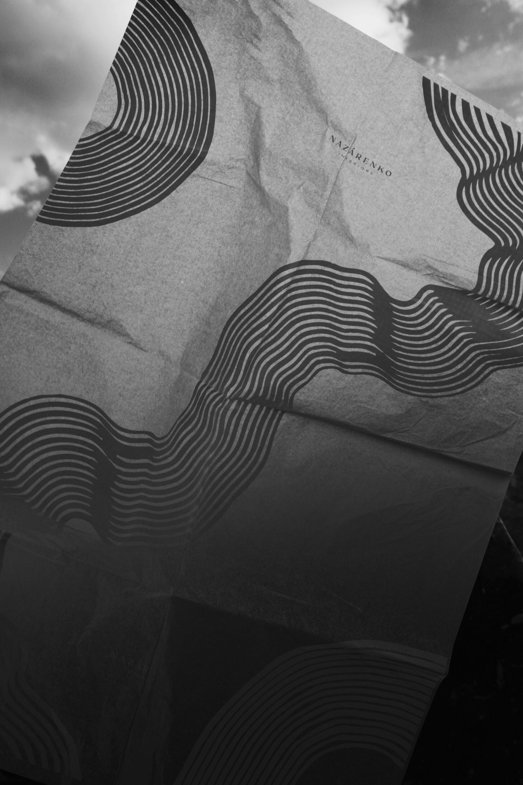
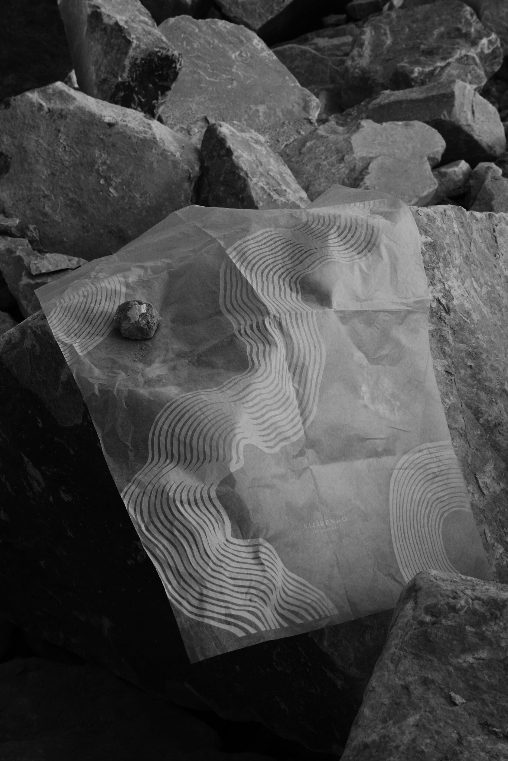
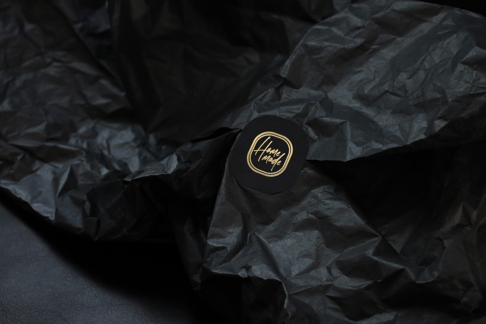
Branded translucent tischyu is the perfect addition to the brand identity. The weightless paper adds visual texture, making the album packaging with the design project visually complete.
Sometimes you don’t need superfluous words to tell a story. The visual of this project is rather about living silently, immersed in the aesthetics of the senses.