


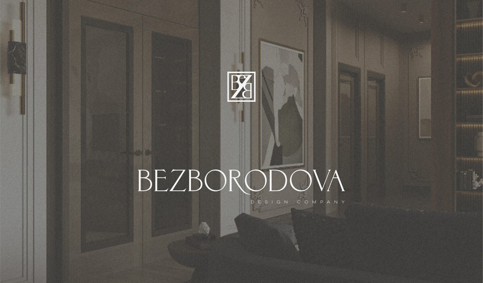
Branding case — Bezborodova


Cosiness, warmth and peacefulness are the associations with the interiors from Elena Bezborodova’s studio. Having been involved in design and architecture since 2008, the company’s founder felt the need for serious positioning and rebranding. Elena came to us with a full understanding of the studio’s authenticity.
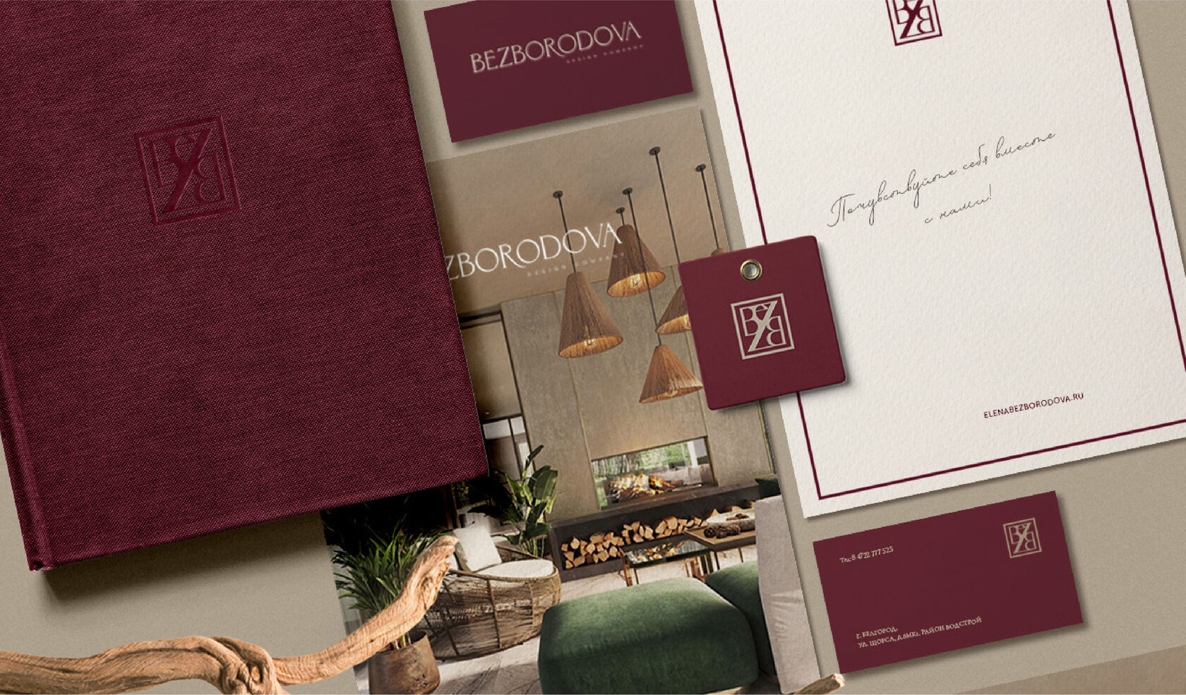
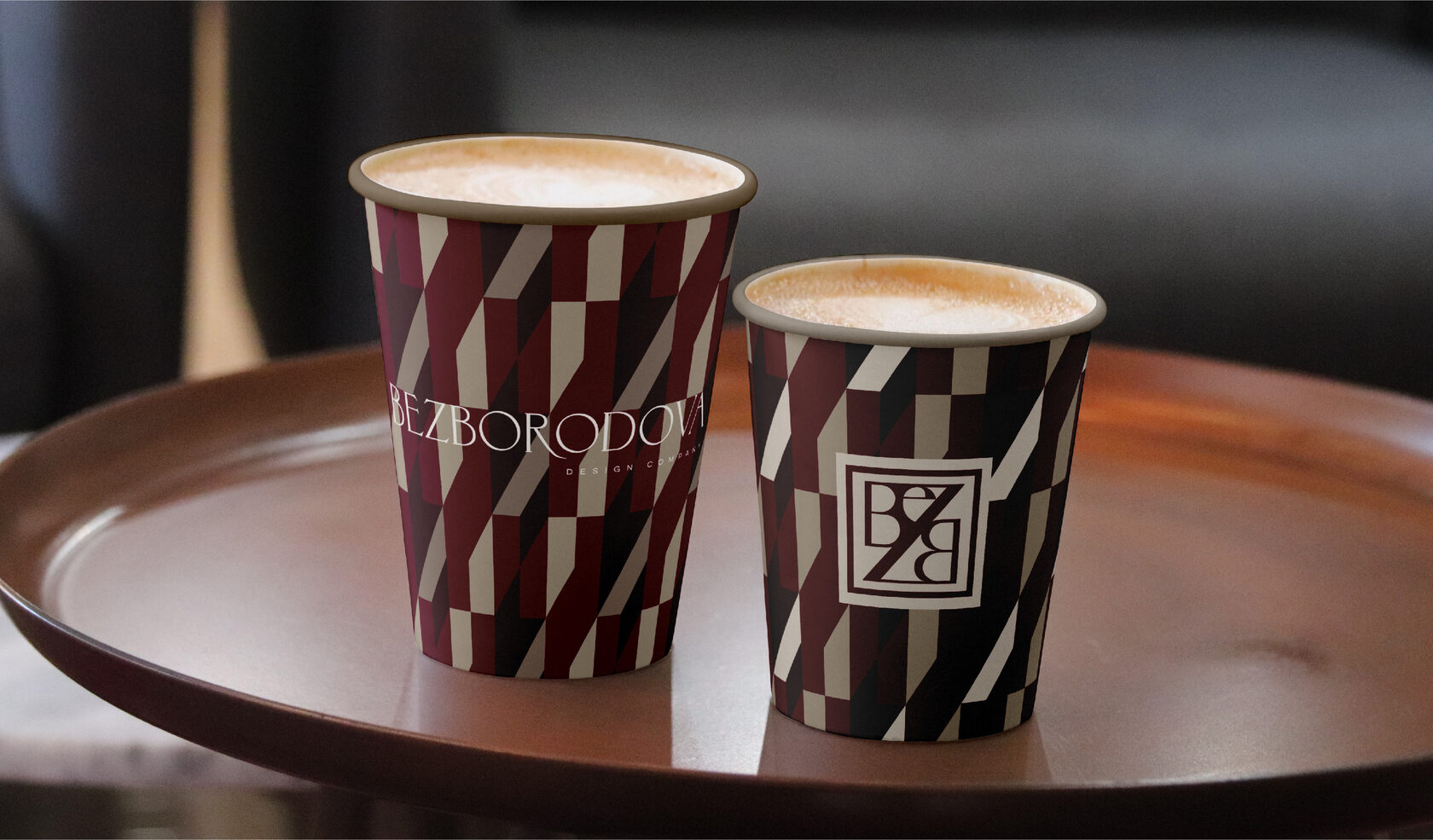
We designed a new logo, monogram and pattern for the company. The corporate identity was a new stage in the life of the company, and we are incredibly happy to be involved in such an important event.
We designed a new logo, monogram and pattern for the company. The corporate identity was a new stage in the life of the company, and we are incredibly happy to be involved in such an important event.
A team of nine people passionate about what they do guarantees flawless execution of textured, detailed interiors. The studio’s character is expressed in a charismatic monogram, which we have beaten into an animation. It may be used on the website, in advertising or in social media.
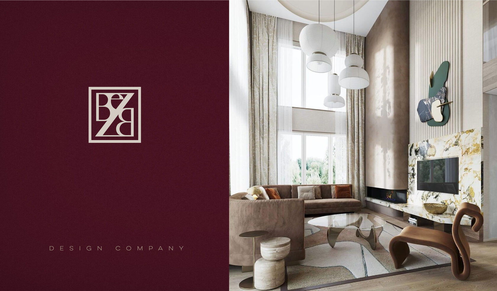
The typography of the logo is made up of elongated, neat letters and presents a fundamental construction. Intelligent, well-defined, impressive. A logo that catches the eye and doesn’t let go without absolutely loving it.
A logo with a festive and expressive look that tells your customers at a glance how the company approaches its work: responsibly, efficiently and effectively.
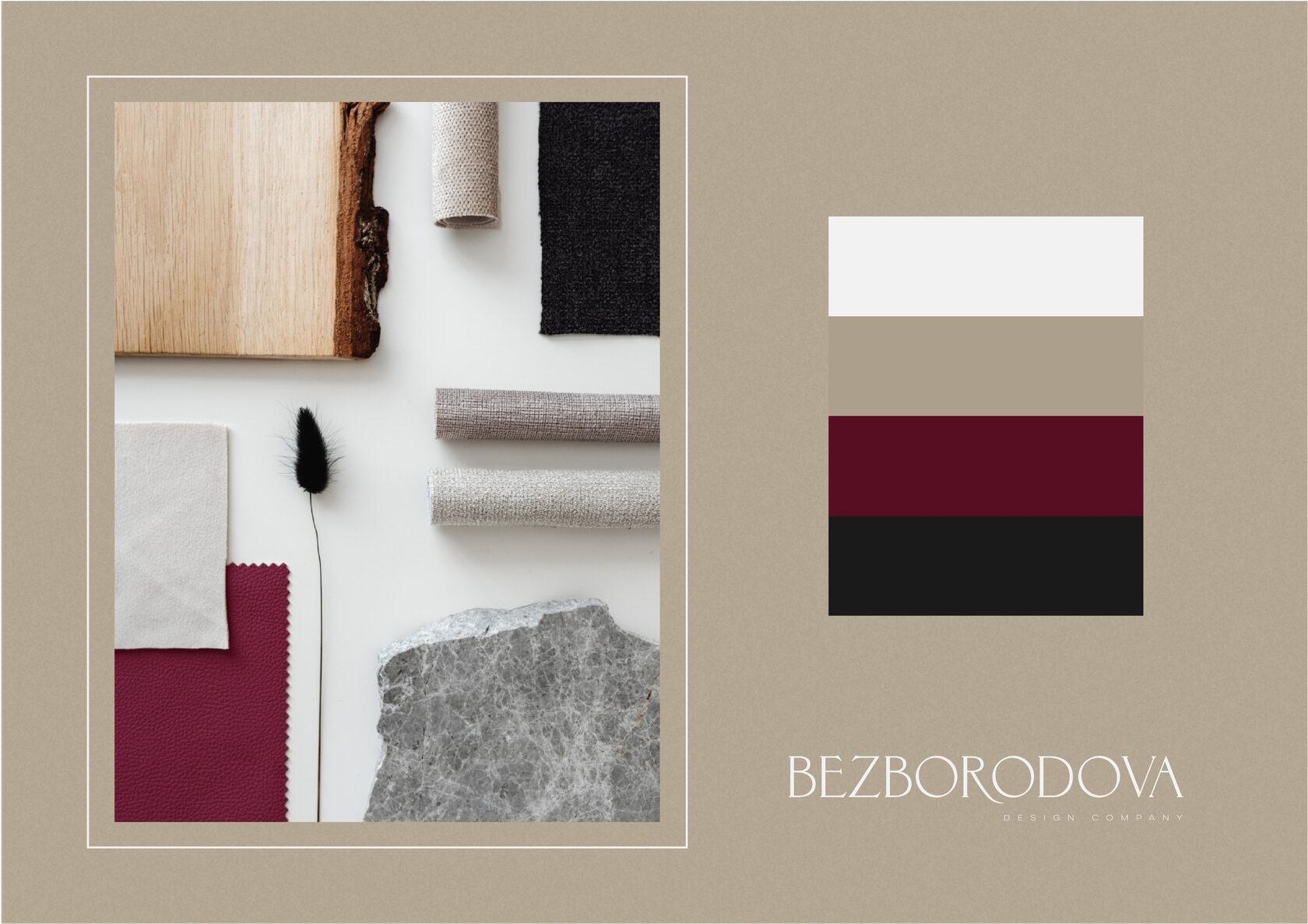
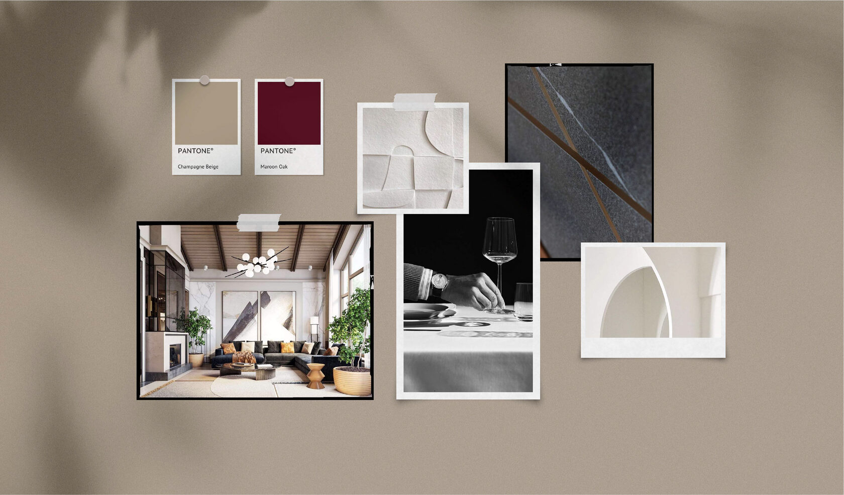
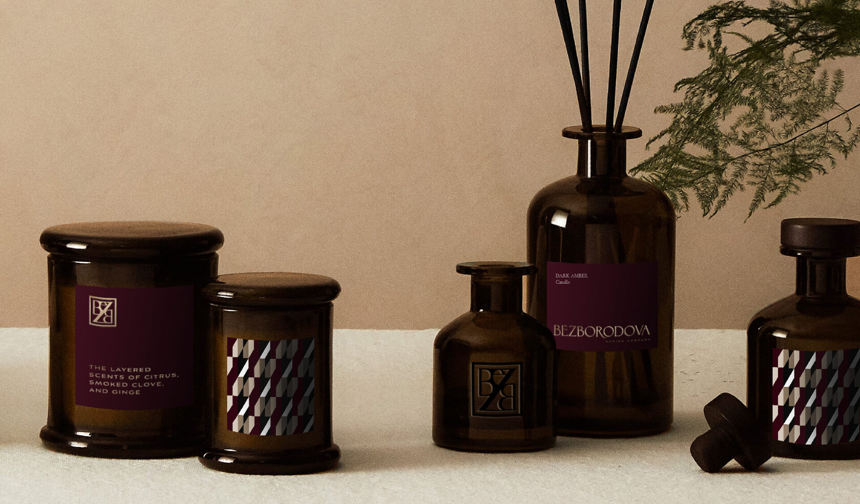
Colour as a self-perception for the company. Depth of black, sensuality of burgundy, gentle innocence of white and soft grace of champagne. A combination of contrasting tones that underline the significance of every detail.

The company plans to go beyond the region. The goal of the logo is to blend harmoniously into any environment, while at the same time catching people’s eyes. Whether it is dynamic Moscow, romantic Sochi or noble St. Petersburg.
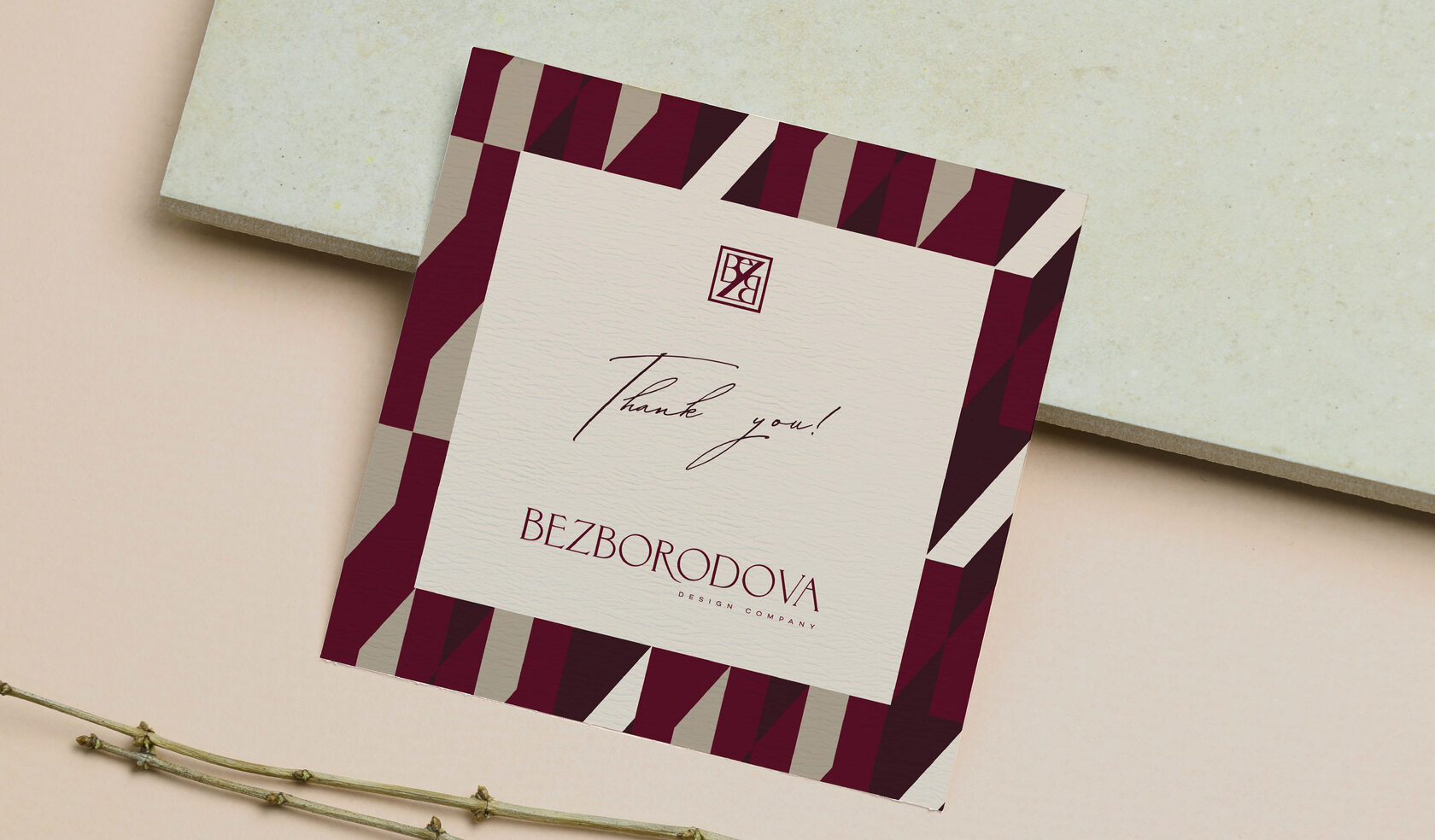
Studio projects attract perfectionist aesthetes. Those for whom style and company reputation are important. These are people with a broad outlook, who want to implement their original ideas and get a modern functional interior, fully adapted to their taste and needs. They will certainly appreciate a company card with the sincerest wishes from the designers.
The company philosophy is to reflect personality in the environment. Interiors not only reflect a person’s inner world, but also inspire them to do something more. Exclusive fragrances for the home or specially developed cosmetics for the bathroom in brand-name bottles are details that make the home unmistakable.
Personalisation in the logo is very important to Elena. Its exclusivity and originality. The austere but sophisticated logo shows her love for beauty and high quality design.

The company’s identity has a vibrant, multifaceted character. As vintage wine, which it is pleasant to drink with a pleasant conversation with interesting interlocutor.
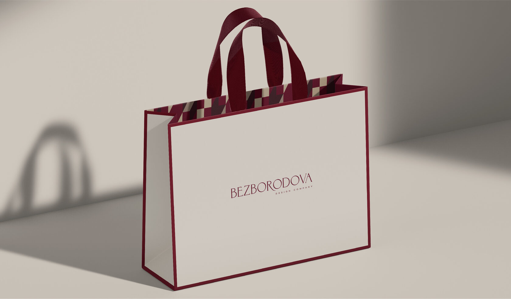
The burgundy outline of the gift bag is an interesting detail which outlines the shape and creates a mood. But just look inside! Like a bright lining in the most austere jacket of an Italian fashionista — a technique that always causes a WOW effect!
Dramatic conflict of geometry in signature colours. Some time after we approved the pattern, Elena shared that it was a one hundred percent hit. The pattern is so in tune with her personality that the desire arose to create a silk scarf — and wear it with special pride and love.
"I am what’s around me." We help our clients express their character through corporate identity. And we know for a fact that the new visual will attract exactly 'his' people.

He who has tamed the magic of colour has learned to control his state of mind.
